The Divide // Concept to Completion
I wanted to take some time to organize the progression of thought and process that went into my most recent art project, The Divide. After living with (or more like “living”) this work for a while, I realized that it had many meanings to me. Once it was printed, framed, and installed prior to the opening, I sat down to write my statement, but didn’t feel right just offering viewers a single paragraph.
Writing a good statement is hard. They often end up being too vague, inaccessible, limiting, or just incomprehensible. I’ve always felt that art is a uniquely personal experience, and is different for everyone regardless of what the artist thinks or says. There is no right or wrong interpretation. So while I want to share some of my ideas about this work, I also want to offer a bunch of different ways for people to access the work, so they find their own jumping off points, in order to form their own questions and answers.
That said, here is The Divide, from concept to completion, along with what I’m calling my “process-statement.” Hopefully it helps viewers build bridges to more interesting questions than the ones that I encountered along the way.
01 — Origin
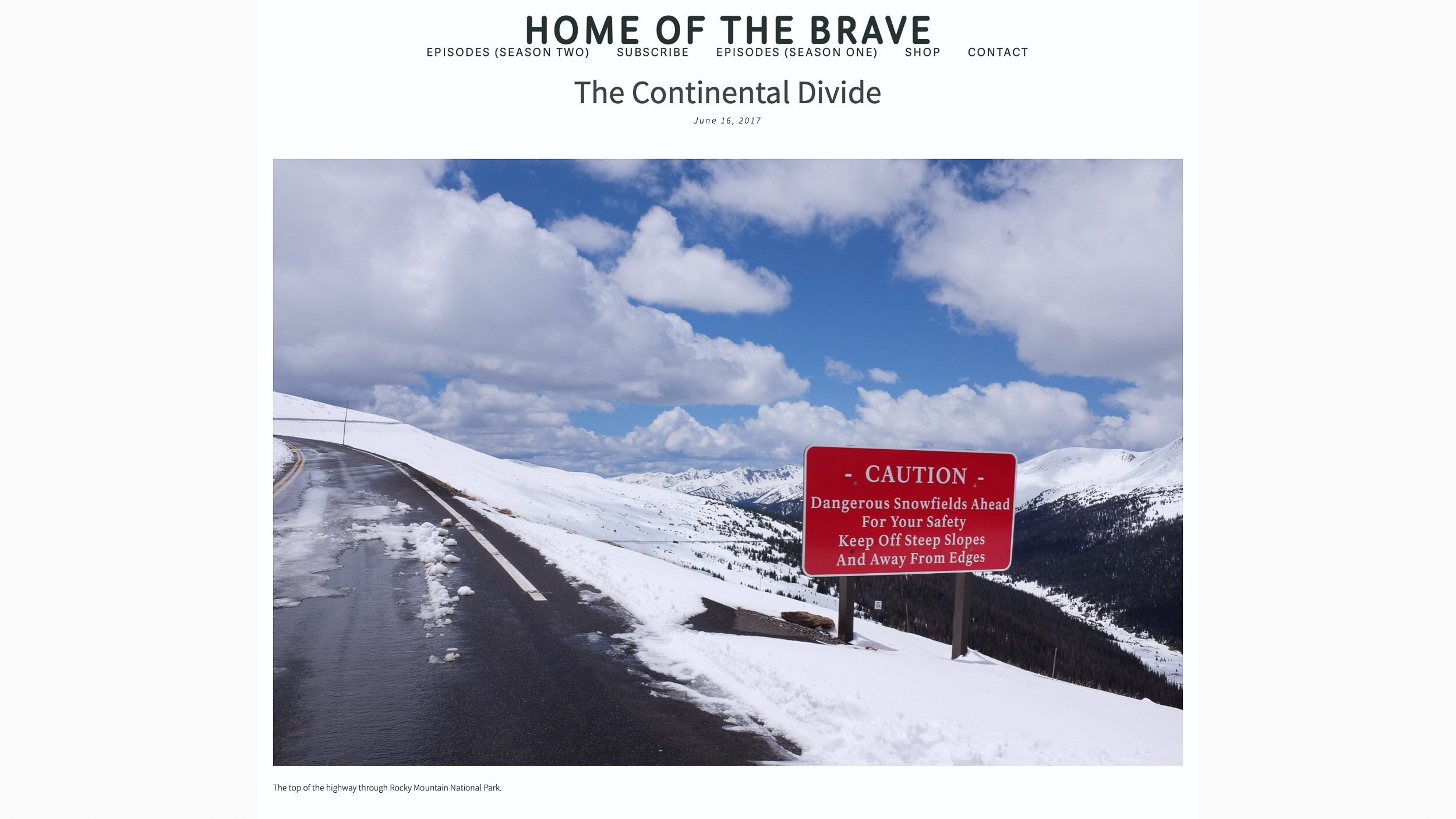
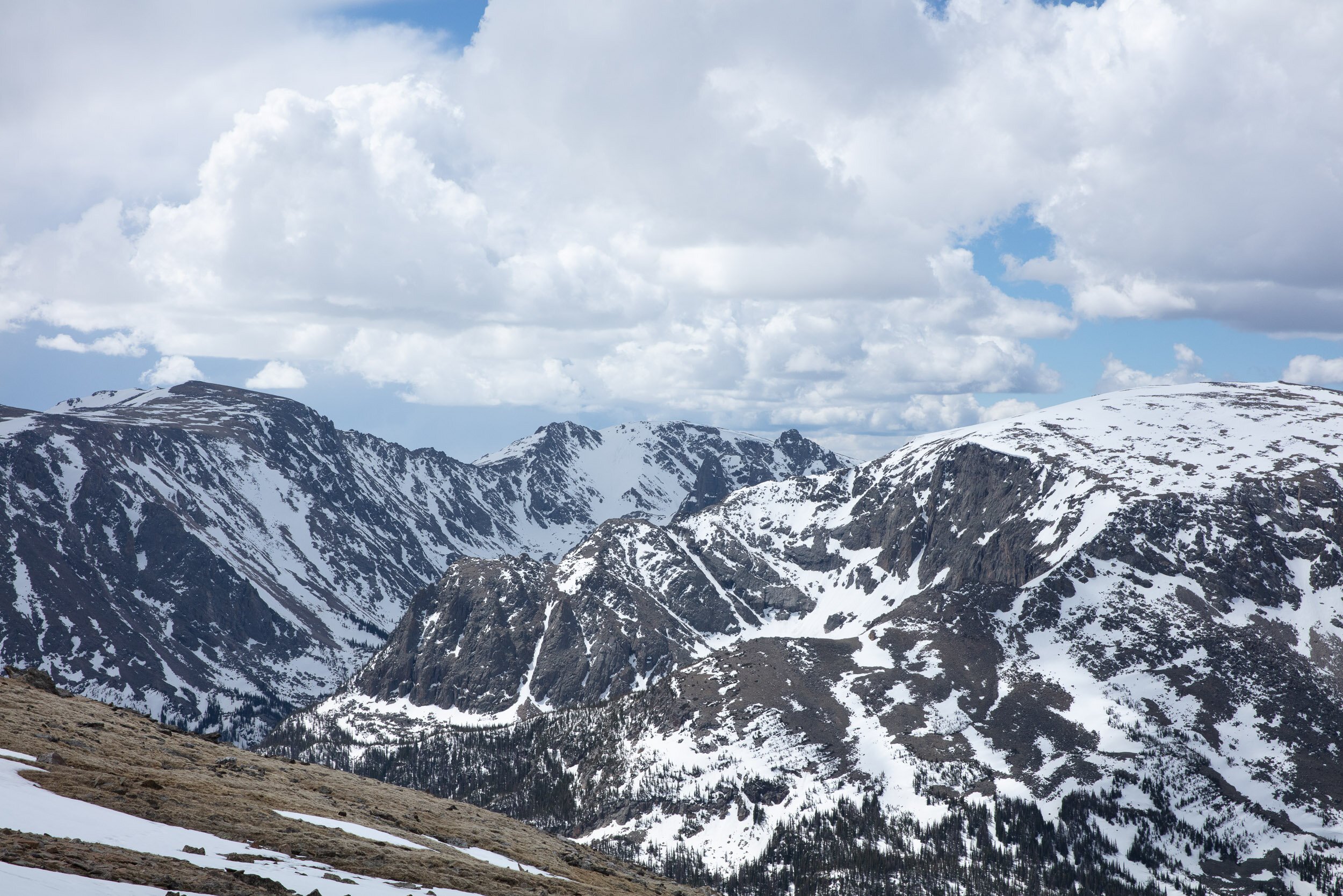
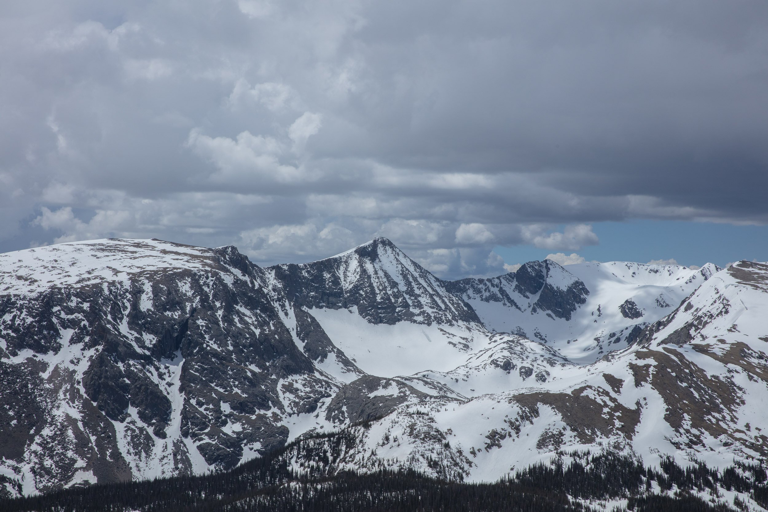
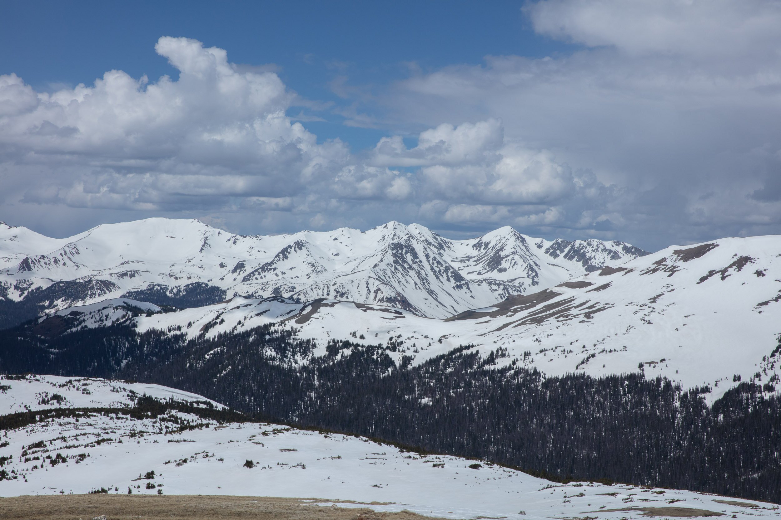
The original inspiration for this project came from a podcast called Home of the Brave, by Scott Carrier. In the two-part series, he travels to Colorado to talk to Trump supporters to try to understand their point of view. As with all of Scott’s storytelling, it was heartfelt, moving, and beautifully crafted. And as I drove through the Eisenhower Tunnel (and under the Divide) for the thousandth time, I realized that living in Colorado presented me with an opportunity for an interesting project in my own backyard.
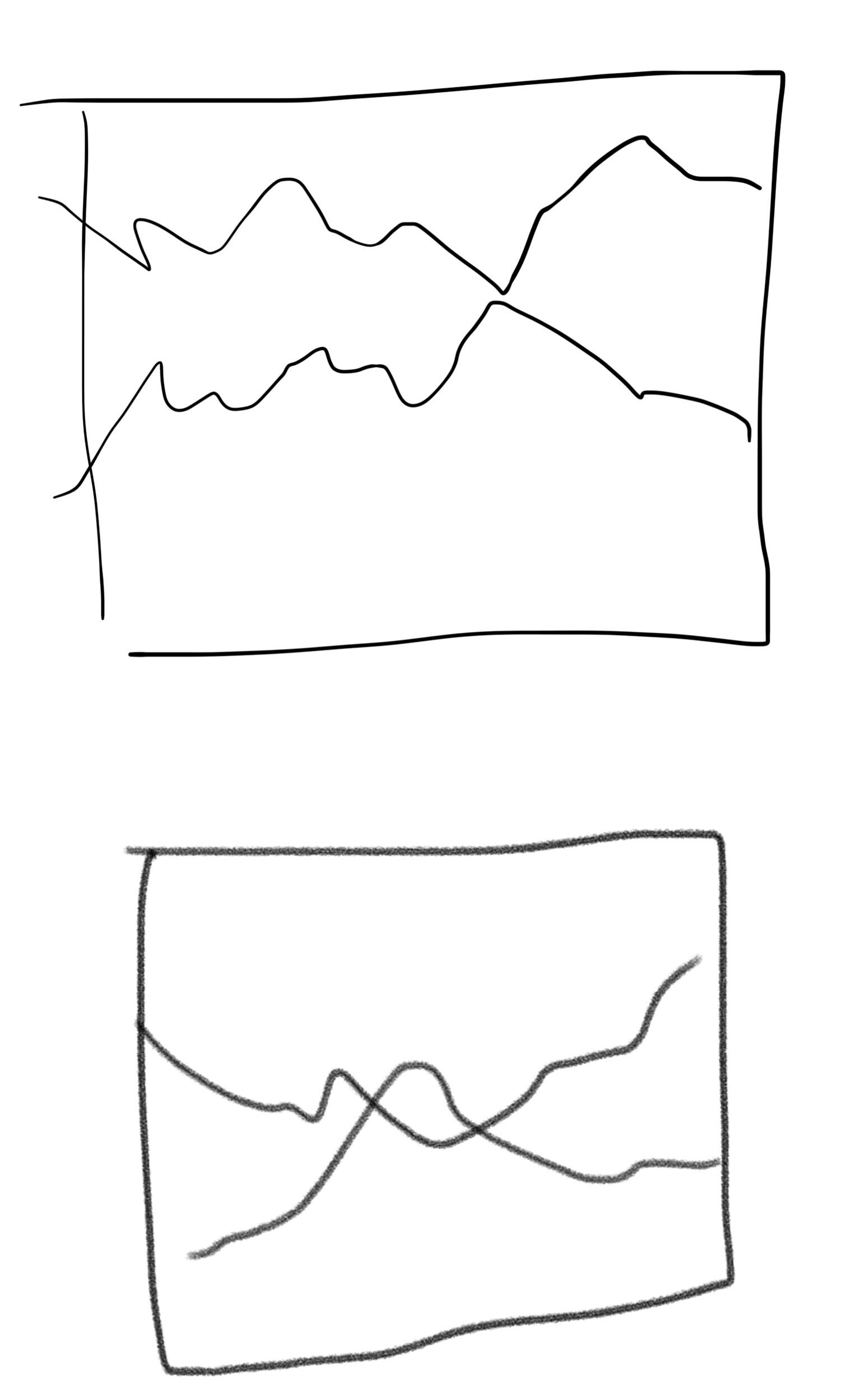
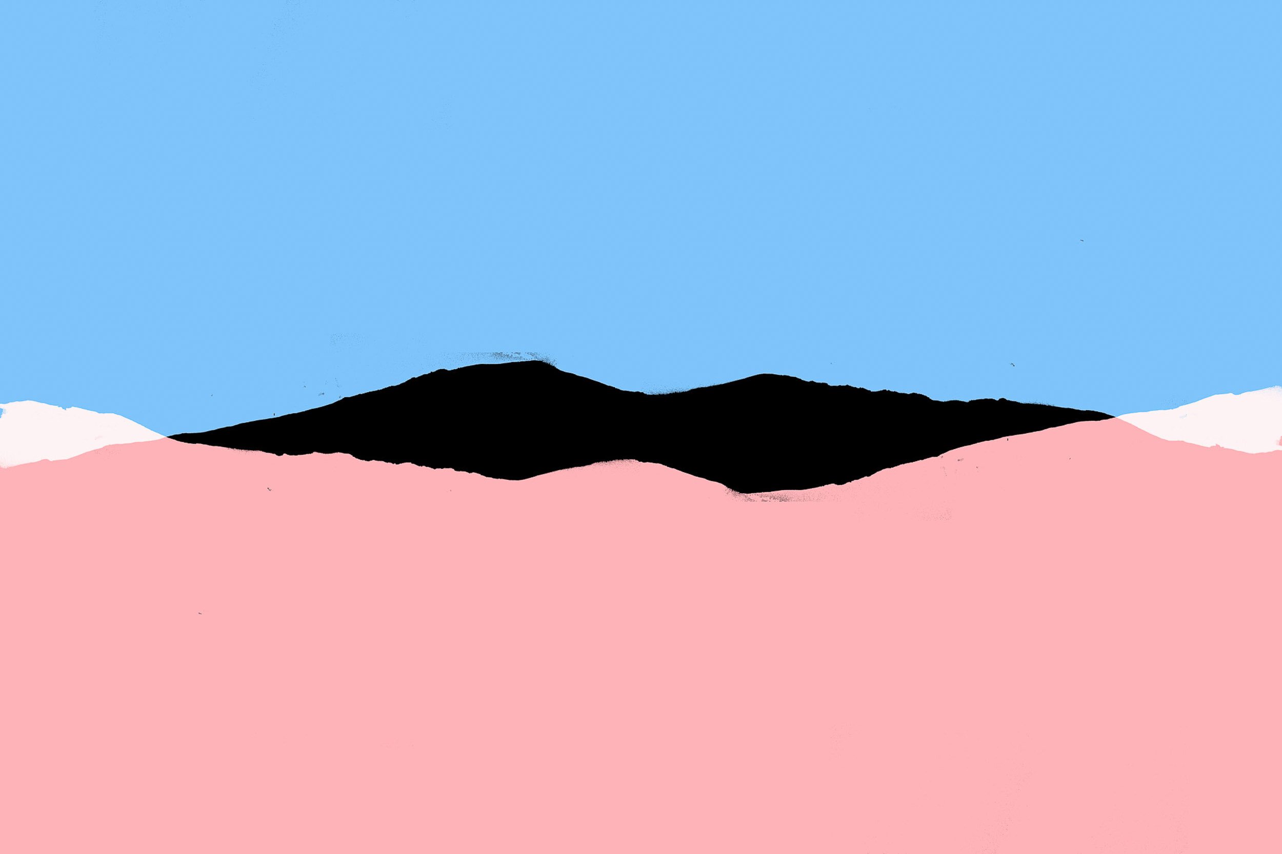
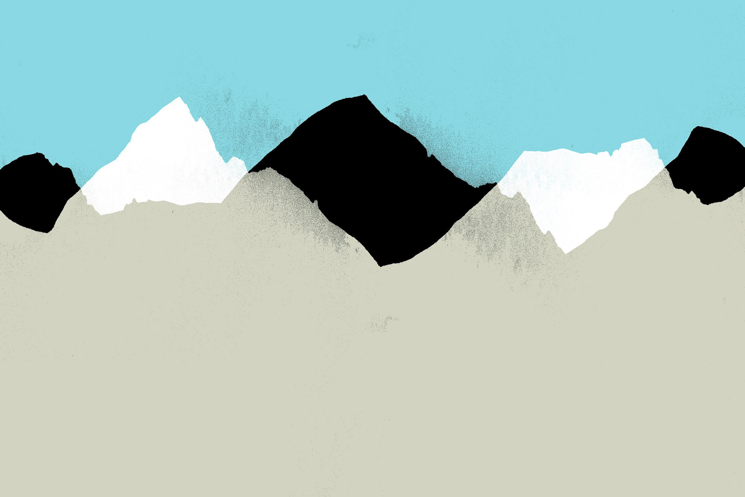
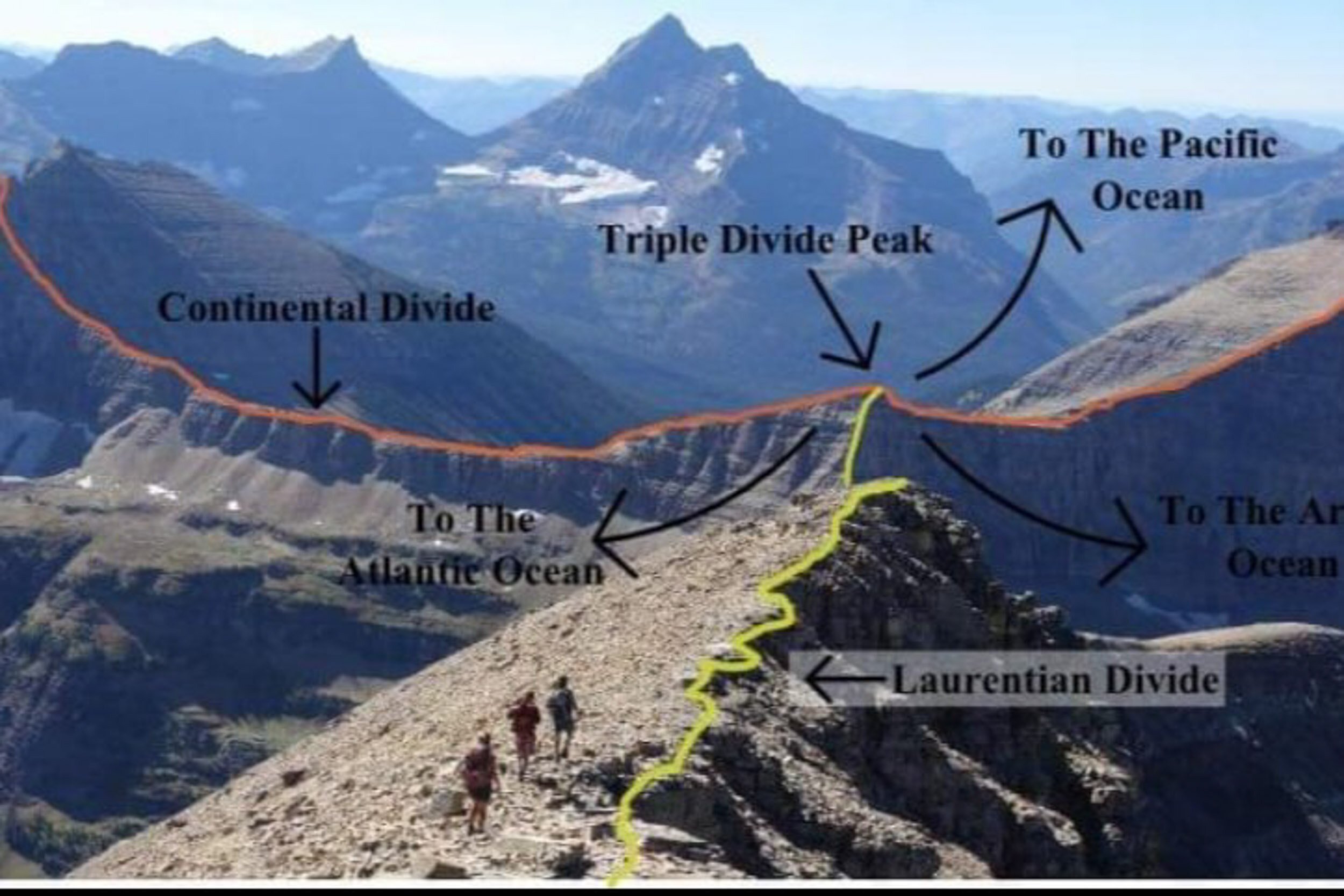
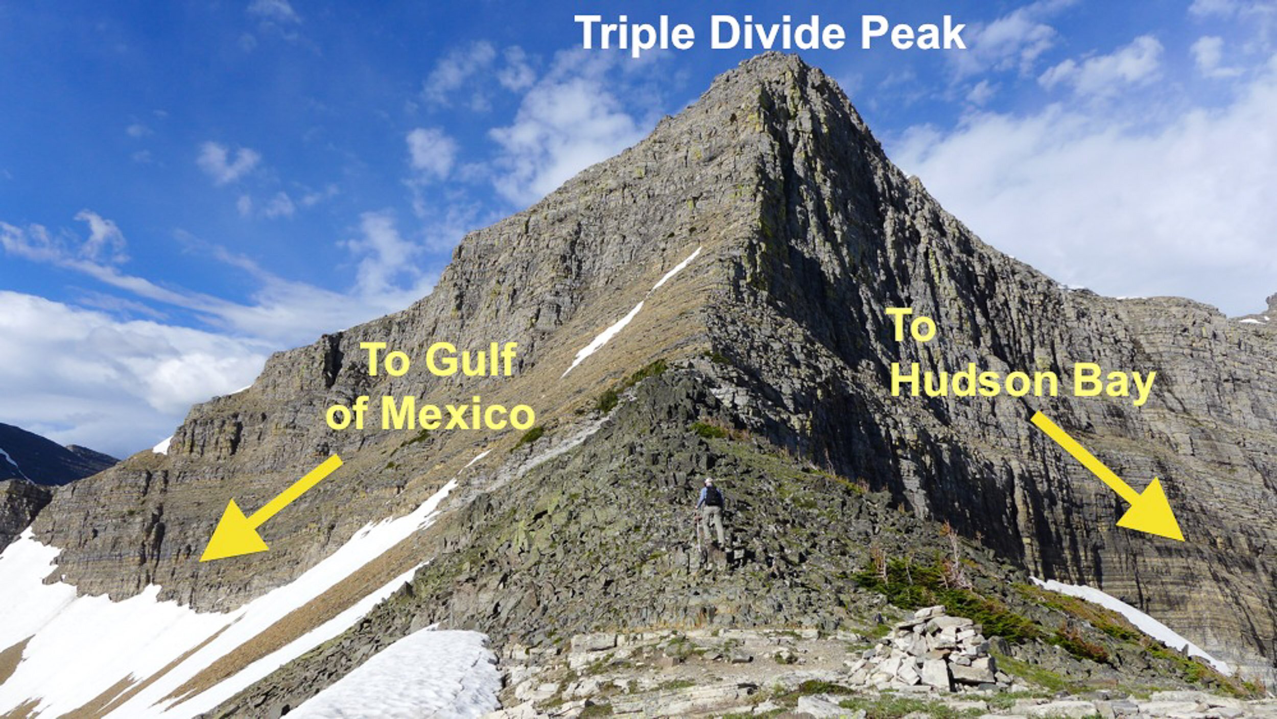
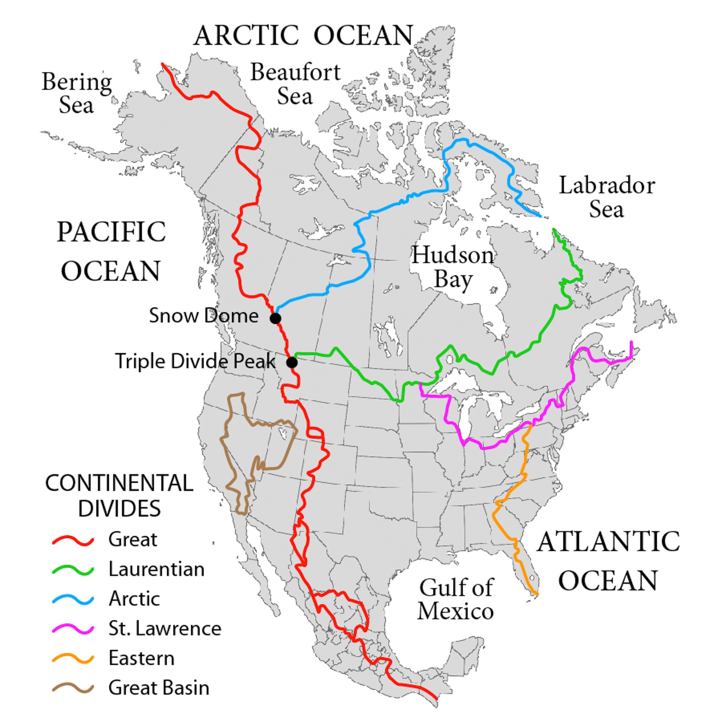
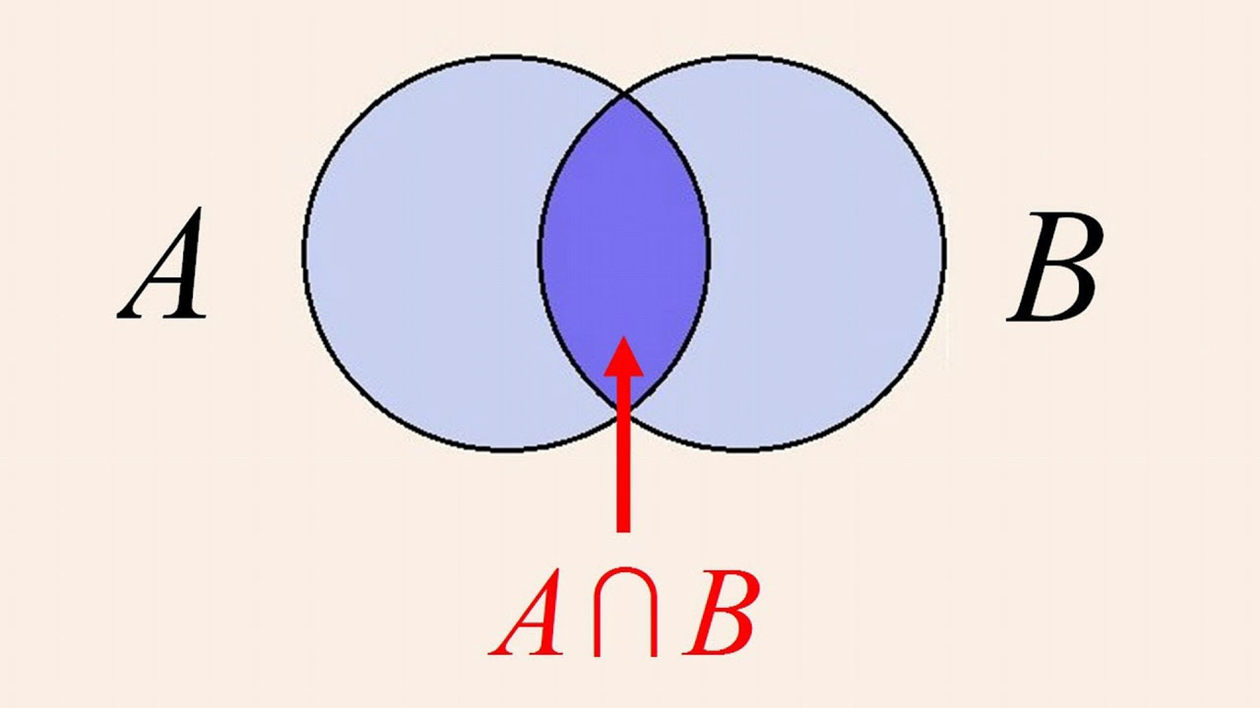
From there, I started reading about the geographic version of the Continental Divide and sketched a few drawings of two lines overlapping to make a shared area, like a Venn diagram. I also learned about a place in Montana called the Triple Divide — a single peak that sends water in three different directions. But for purposes of this project, I was interested in the ridgelines that divide in two, as a simpler metaphor for polarization. Here in Colorado, the Divide sends water to either the Pacific or the Atlantic, and there are tons of places to access it — by car, foot, bike or ski. I had already photographed many of these places, as I have always been drawn to their clean, alpine aesthetics.
Ultimately, it was this idea that two raindrops that are essentially the same can fall on a ridge, and by a wild act of fate, end up thousands of miles apart — the same way that two people born in the same town, on the same street, or in the same family, can end up thousands of miles apart, ideologically.
02 — Concept
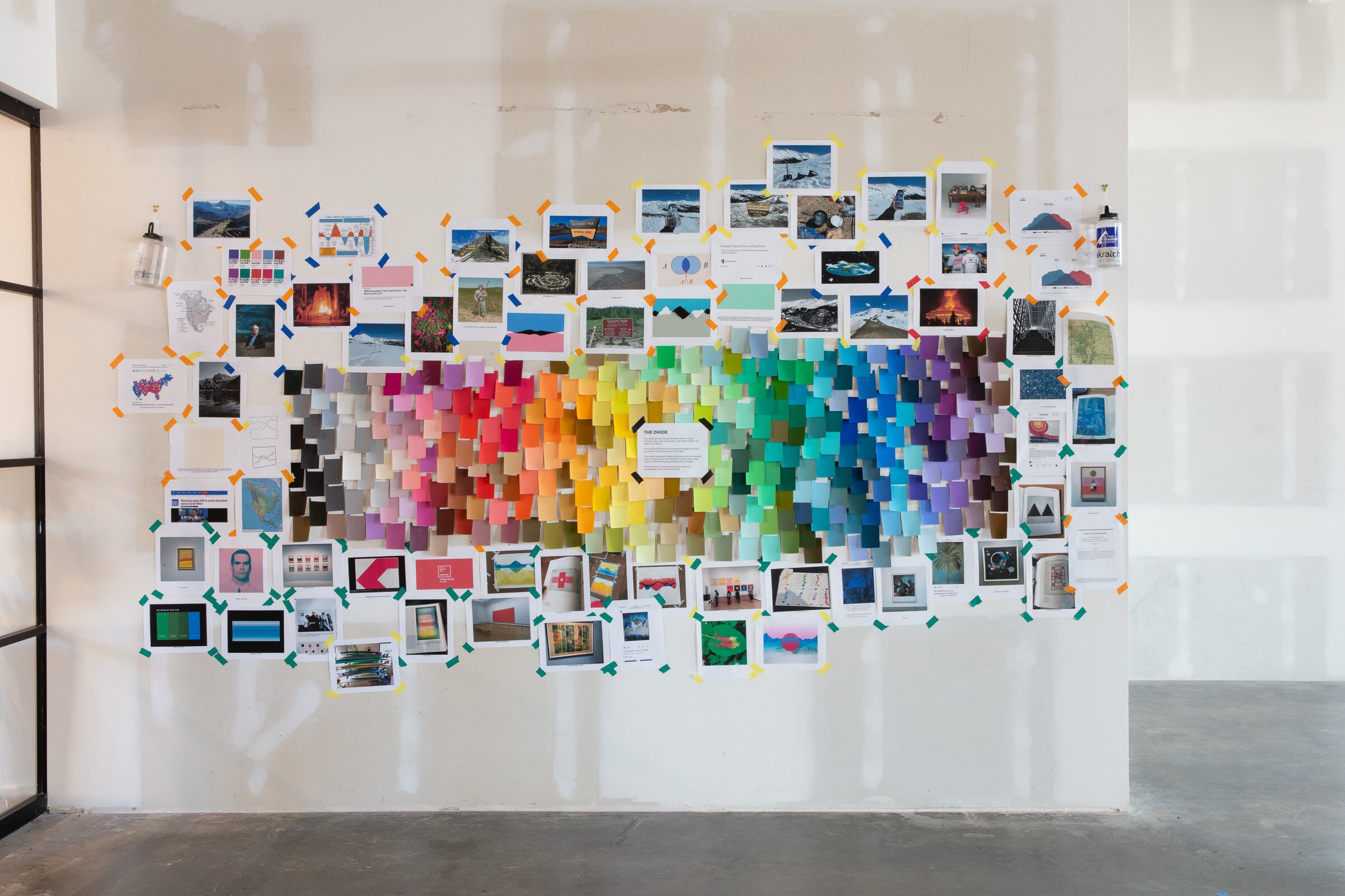
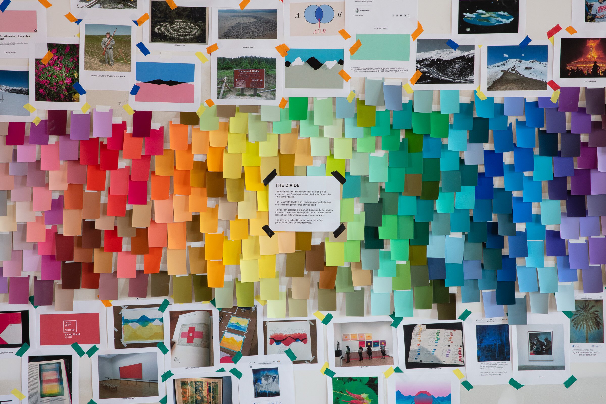
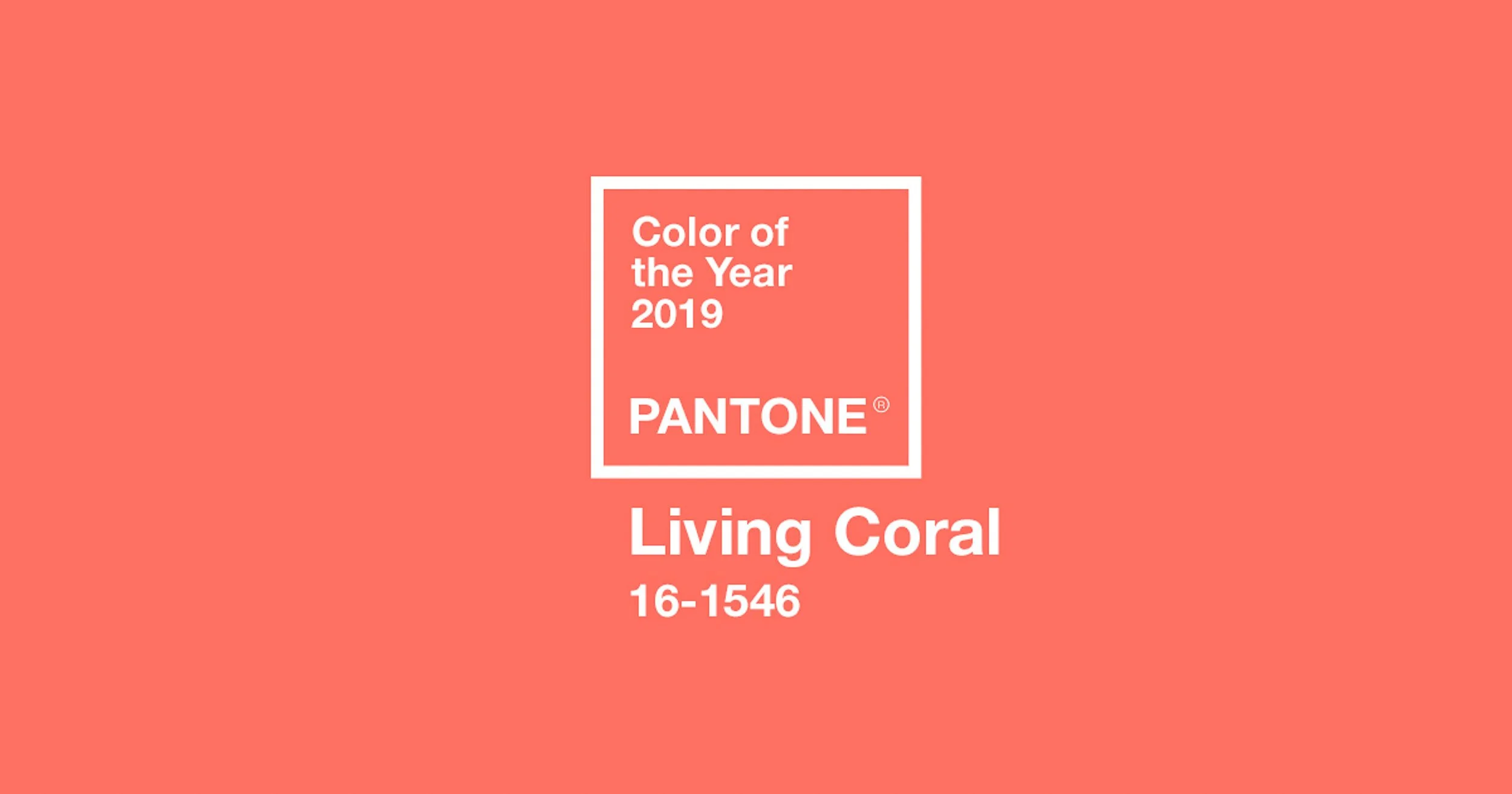
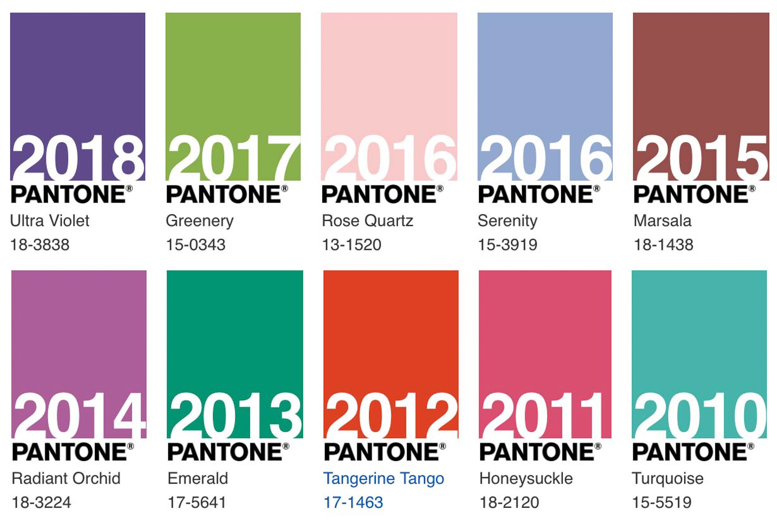
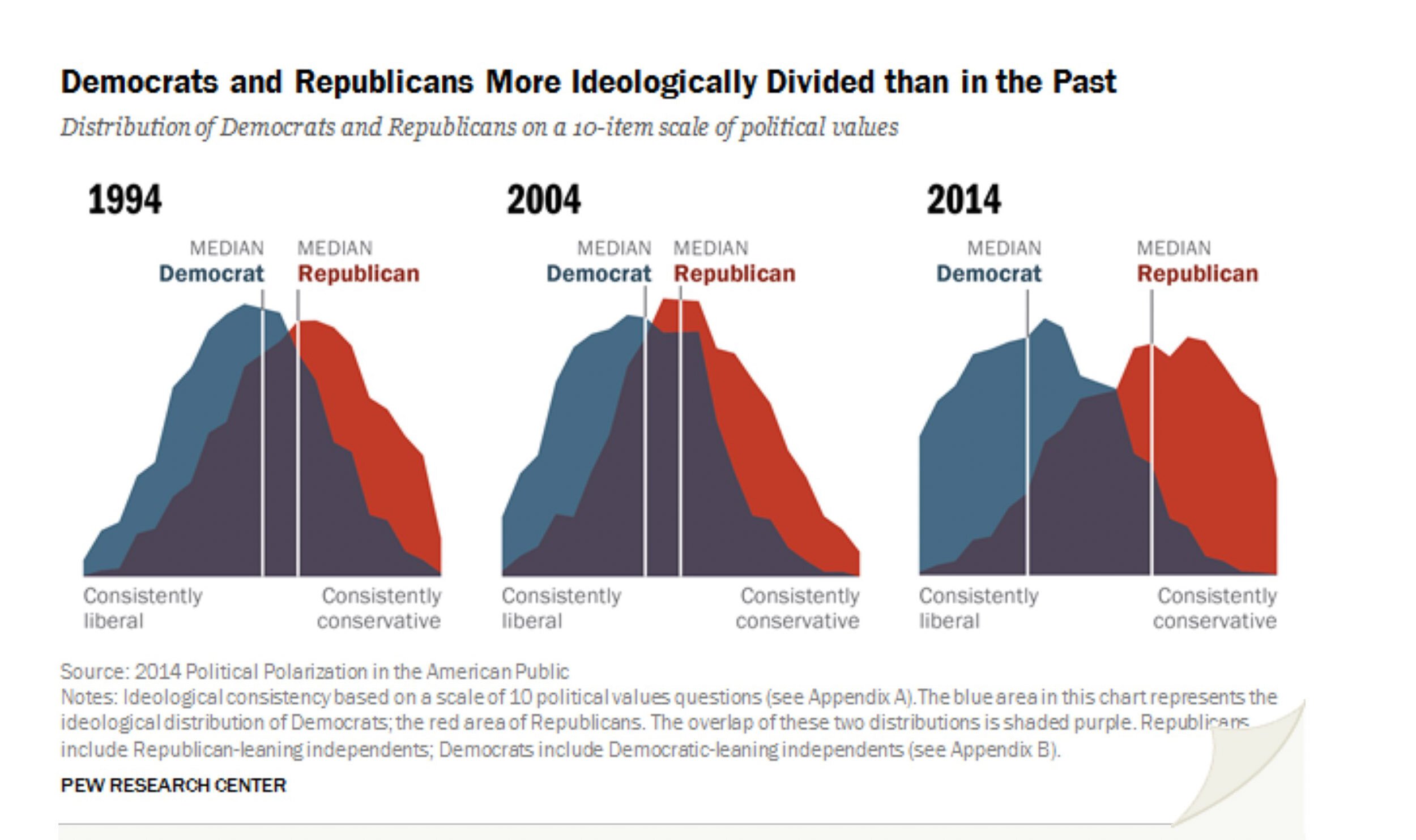
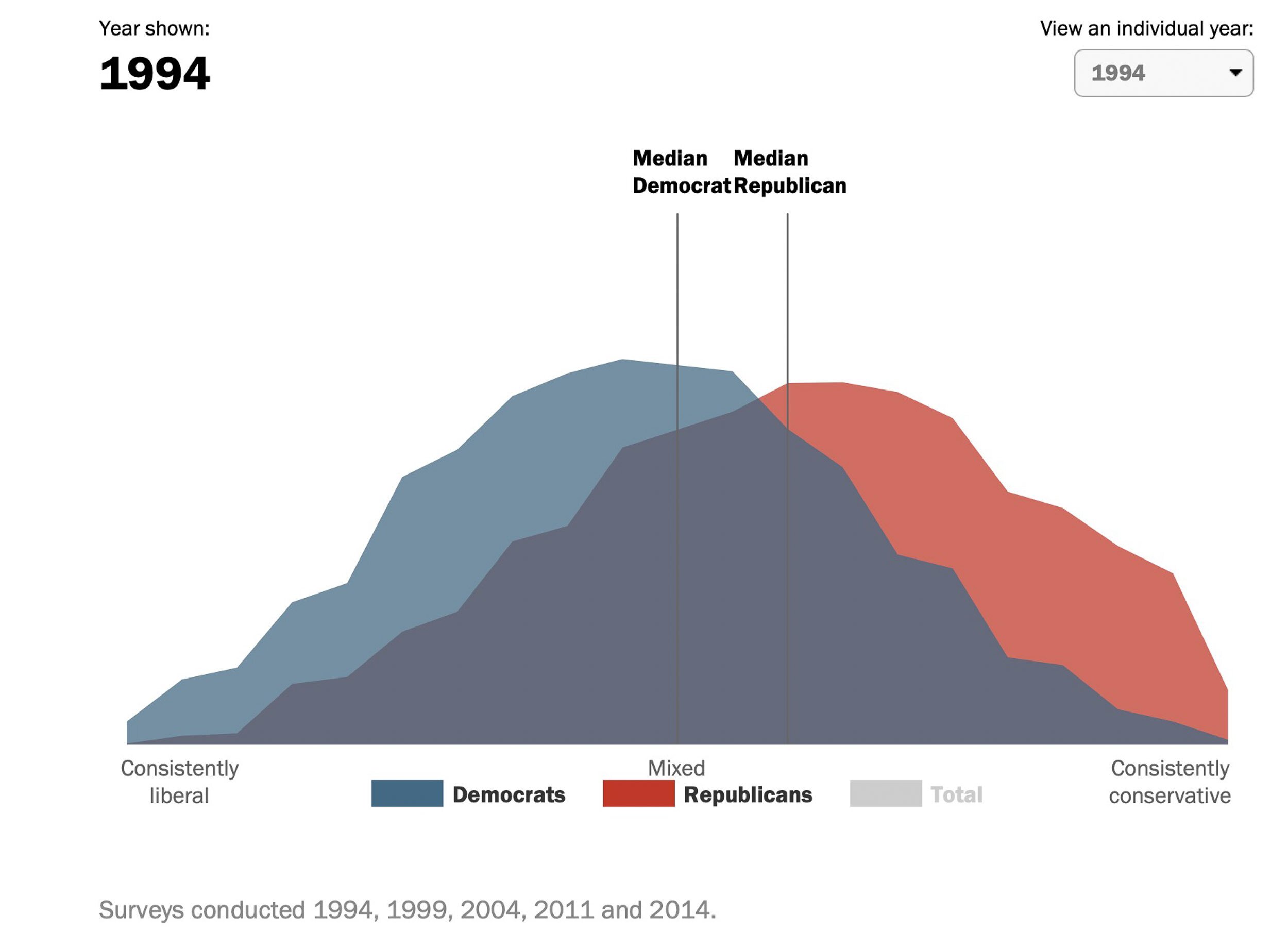
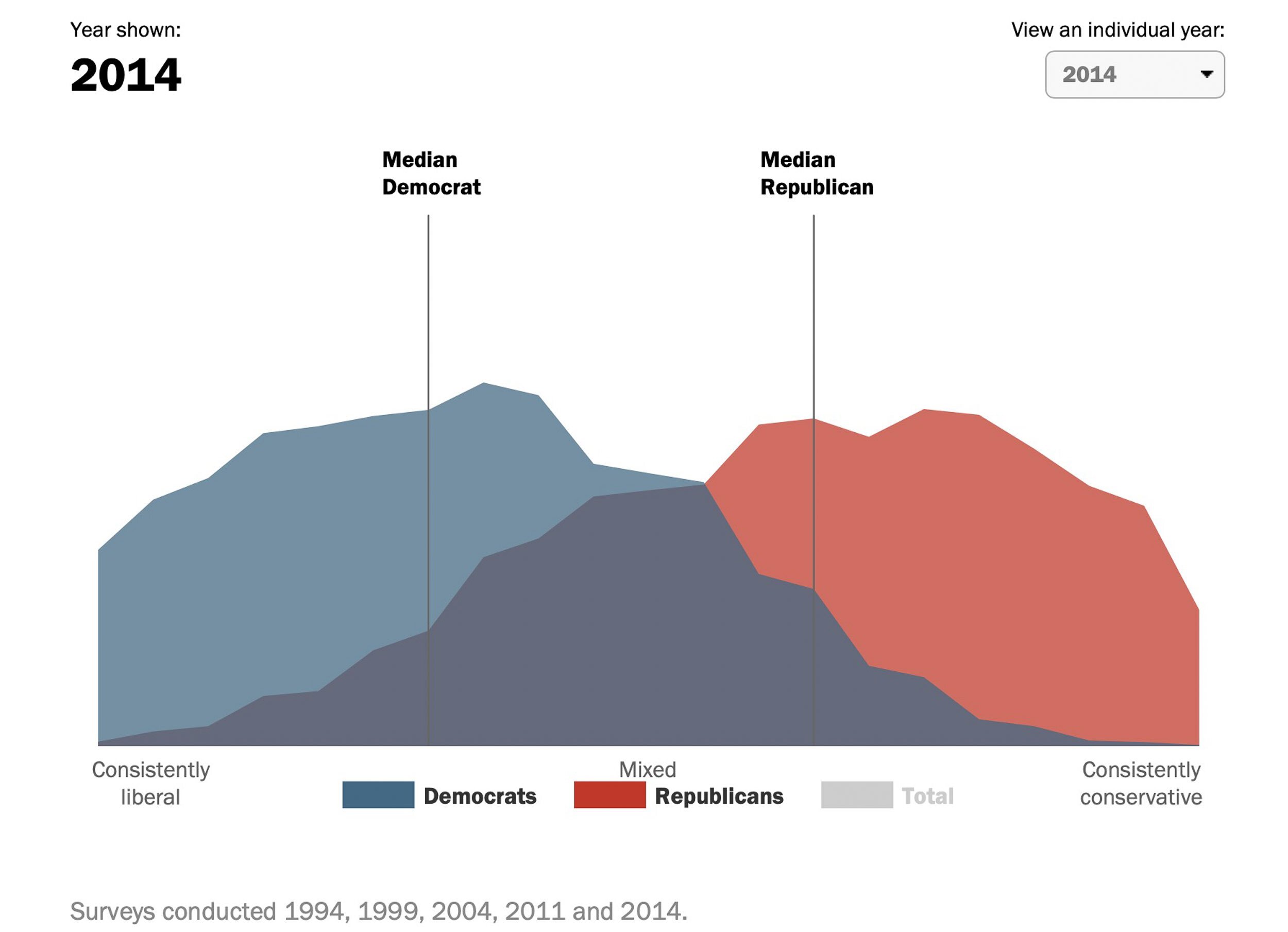
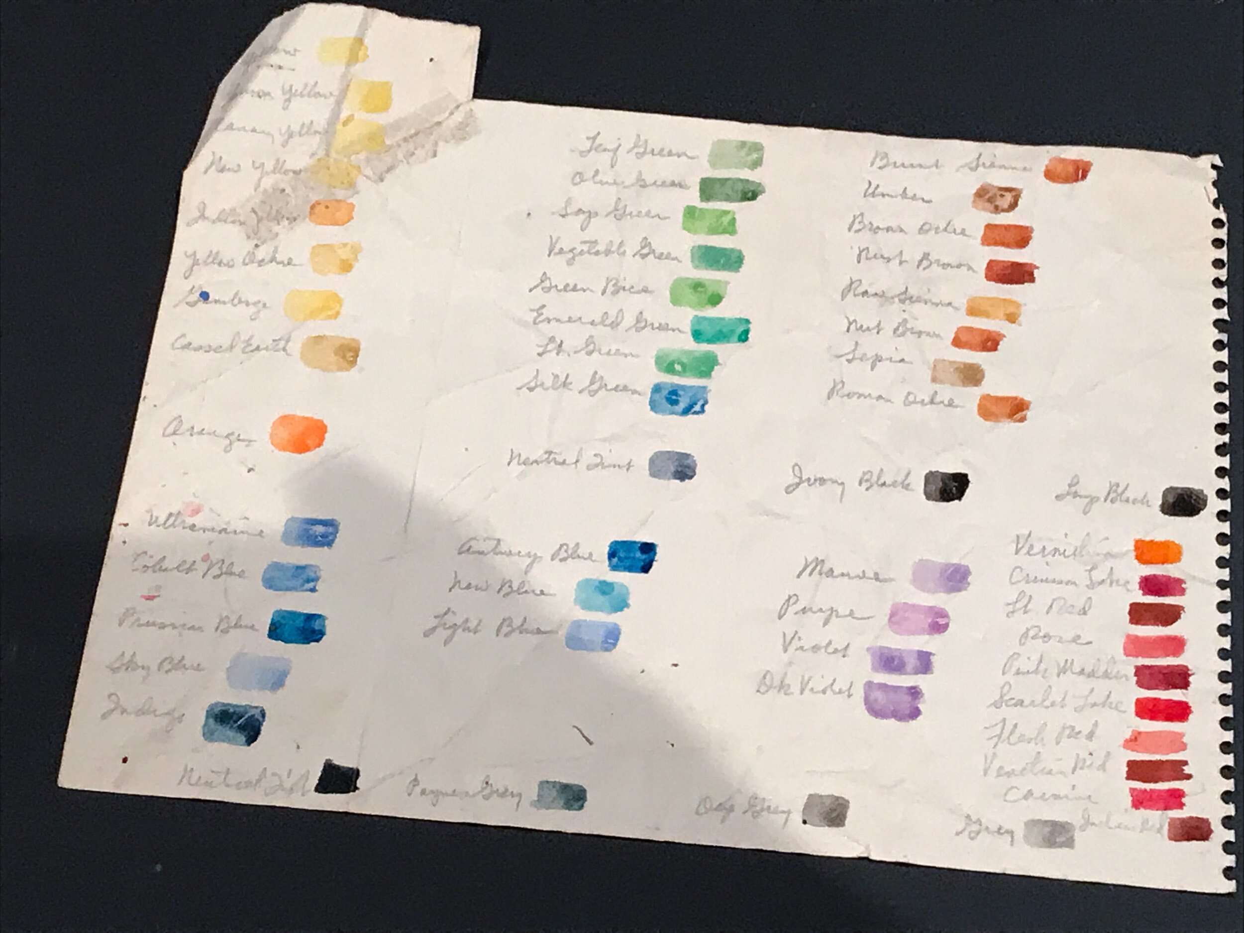
After having a better understanding about what the Continental Divide actually is, and on which parts I wanted to focus, I started thinking about a central idea for the project. From the Venn diagram, I moved on to infographics and how we organize information by assigning colors to categories, and sometimes to groups of people. Why are democrats blue and Republicans red? Why does Pantone get to decide the “Color of the Year” and how do they go about choosing it? Is there an average color value for the Earth, or for the Universe? Do we associate certain colors with certain emotions or ways of thinking?
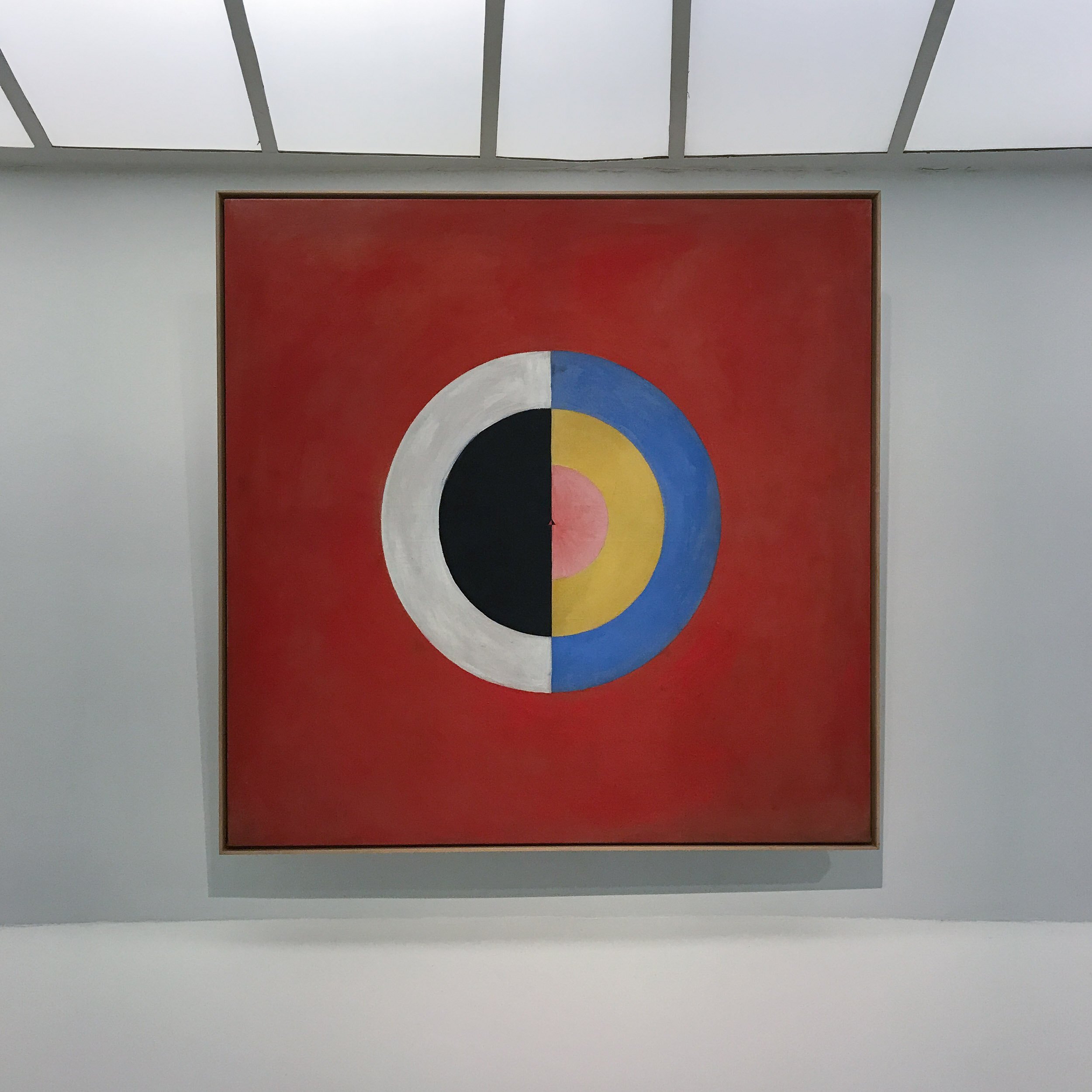
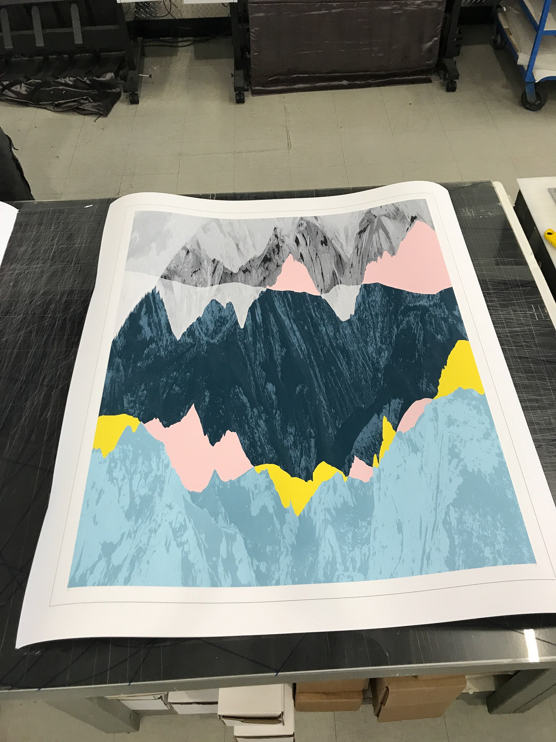
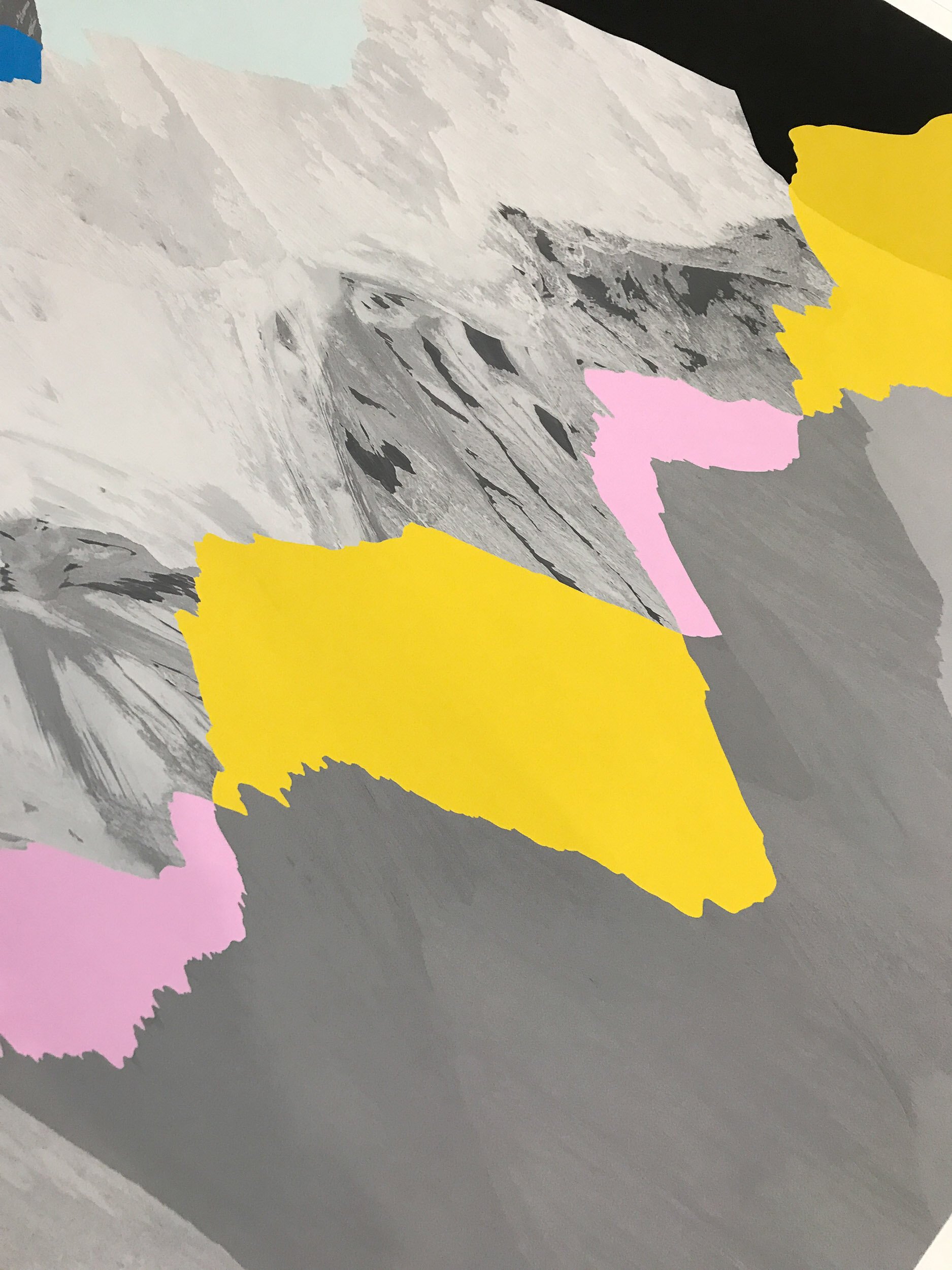
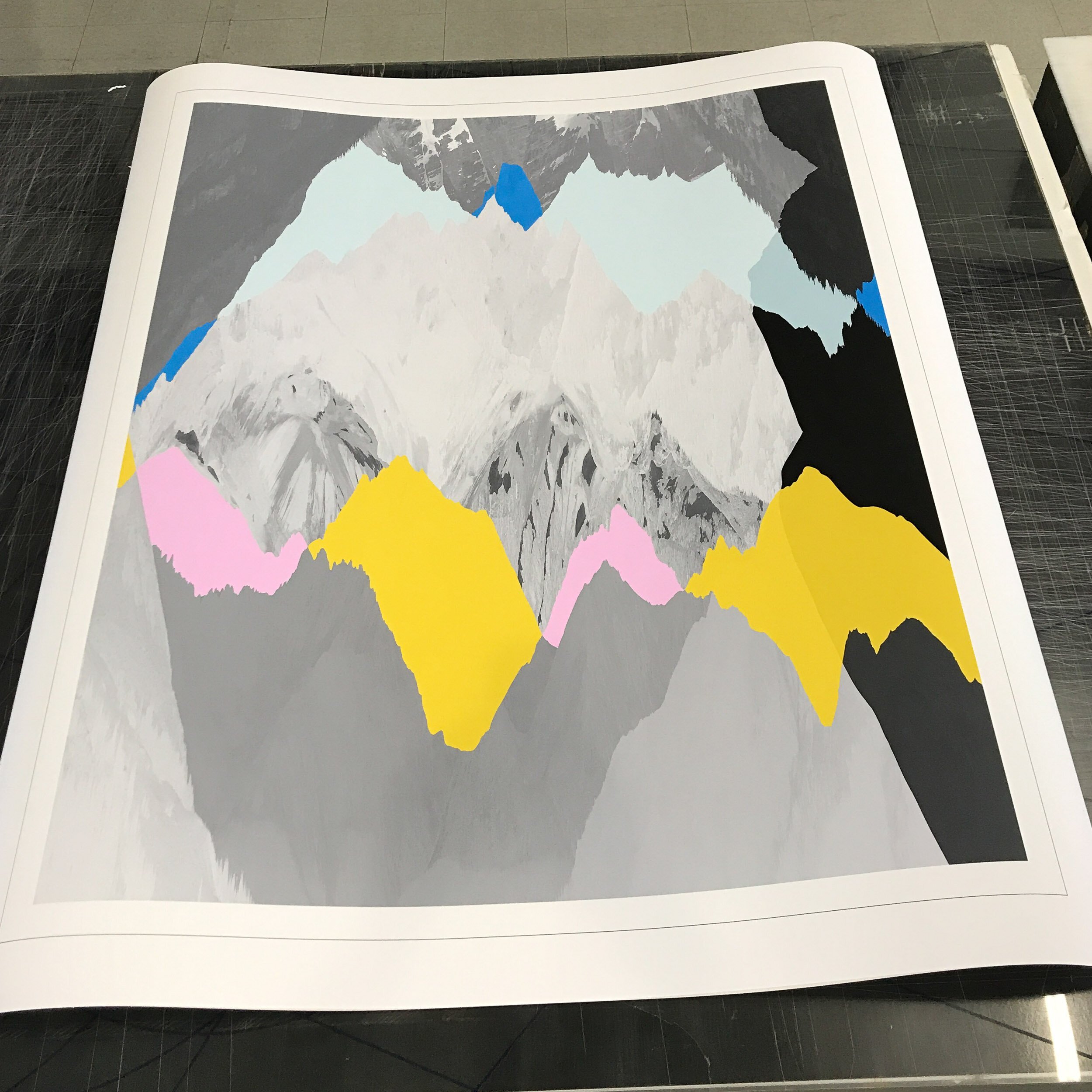
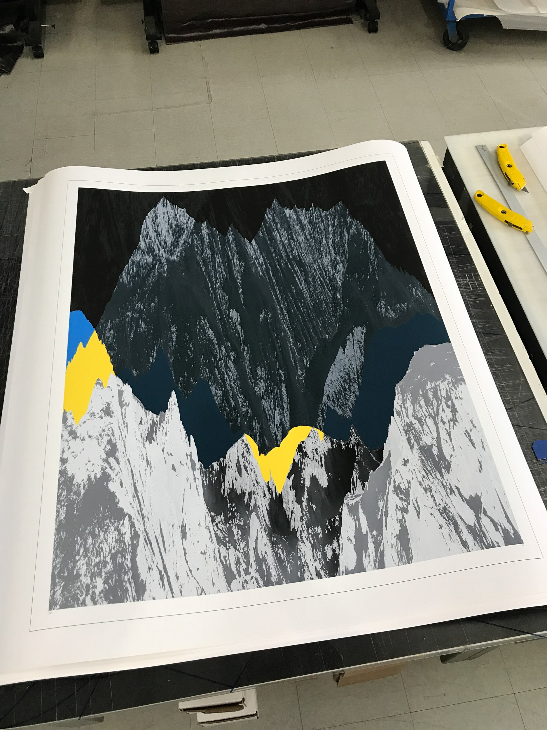
So color became an important part of this project. I reread Josef Albers, studied color theory, and got myself a set of Color Aid cards. I spread the color cards out and worked at pairing them in unexpected ways, to see if they had ideas or feelings to reveal. I started looking at charts and infographics, and how they used color and shape to make statements about different groups and ideologies. Some of these even looked sort of like mountain ridge lines.


03 — In the World
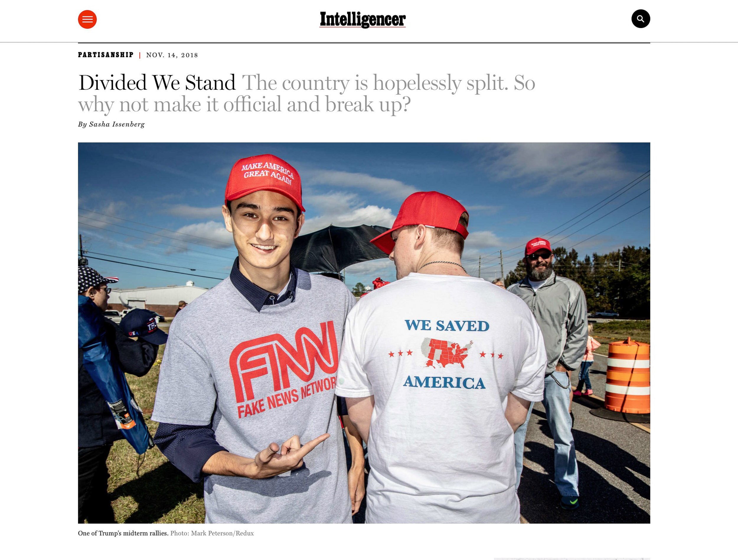
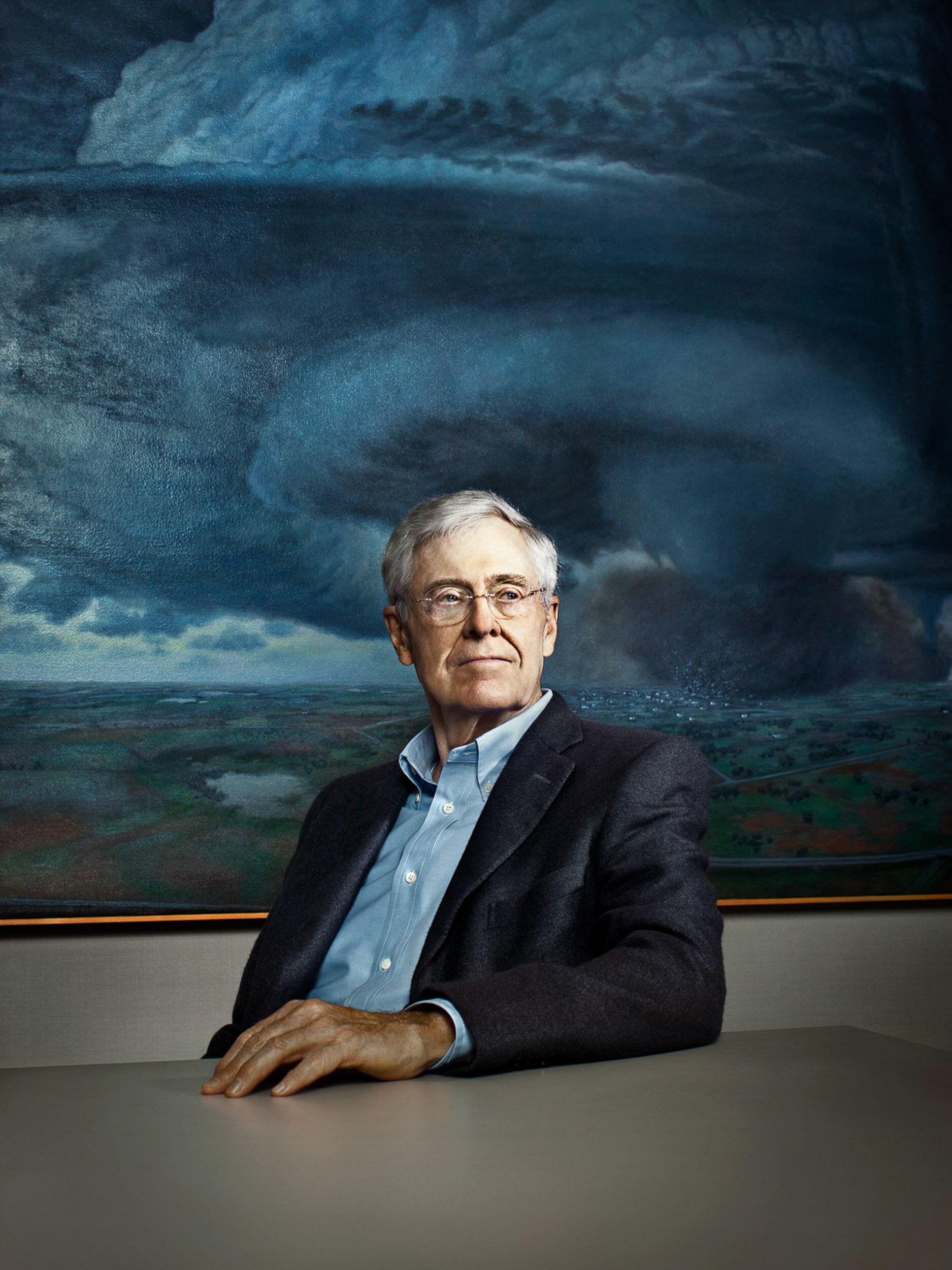
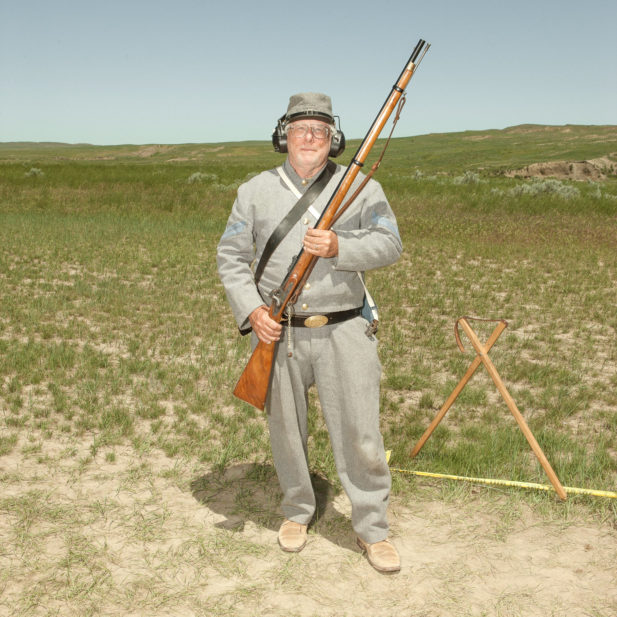
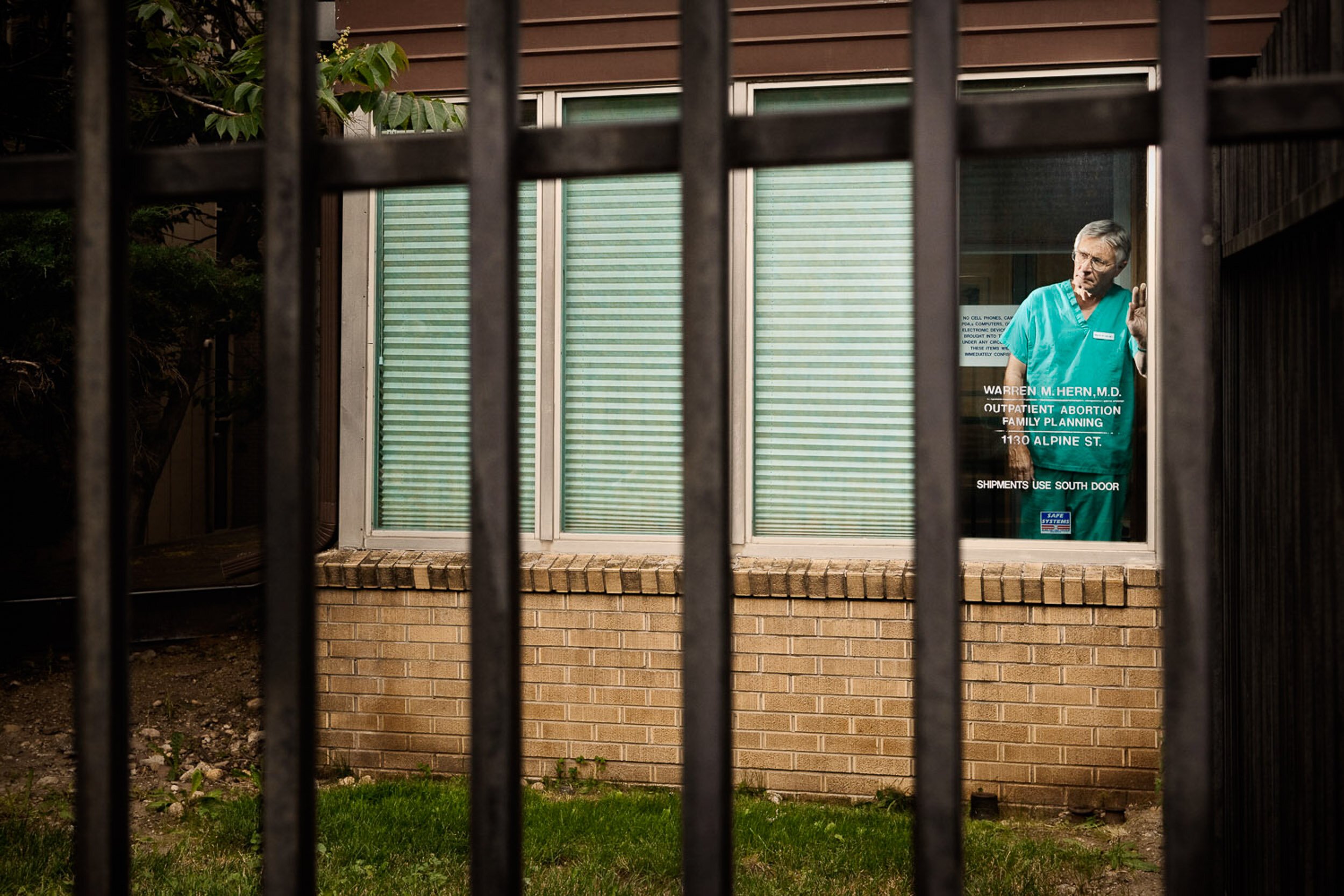
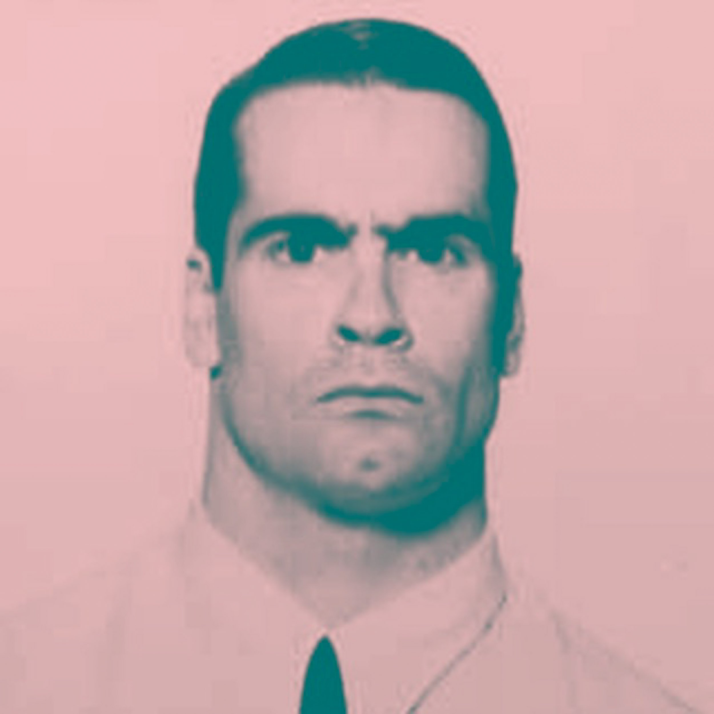
Now that I was spending a lot of time thinking about division, and the various ways that polarization and convergence are illustrated and displayed, I started noticing it around me more often. Especially in the news — stories about how divided we are as a country, how this may or may not be caused by the internet and its echo chambers, and how this divide is actually getting wider, with no signs of coming back. I started collecting headlines, and thinking about what polarization looks like. I also thought about some of the people I have photographed that are especially polarizing: from Charles Koch to late term abortion specialist (and Boulderite) Dr. Warren Hern both of whom receive regular death threats.
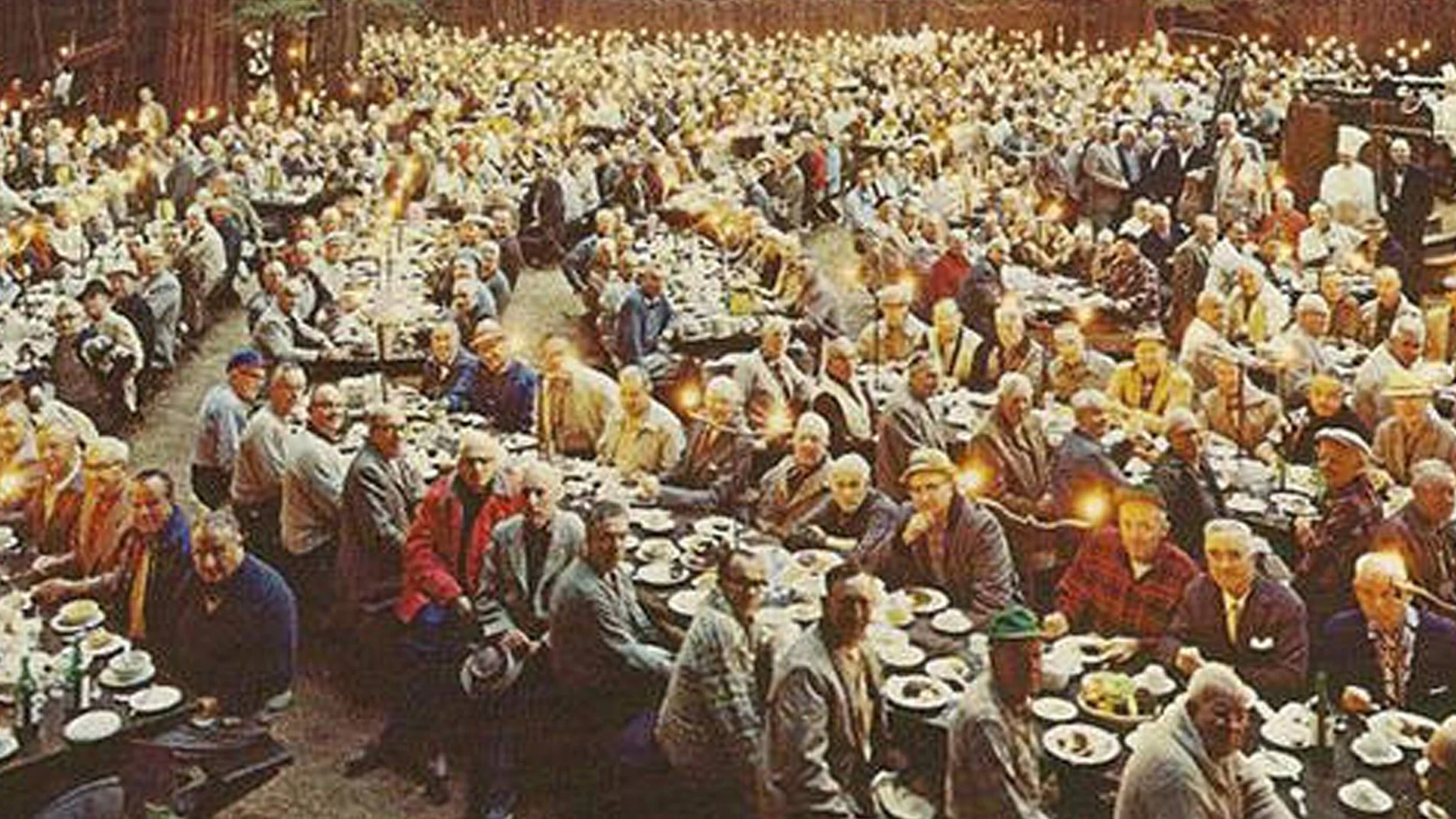
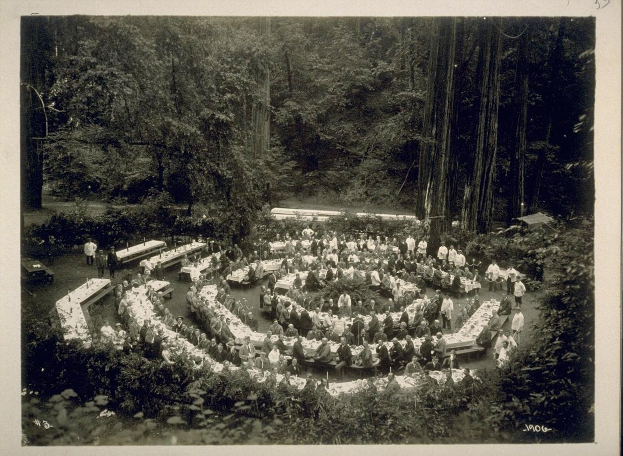
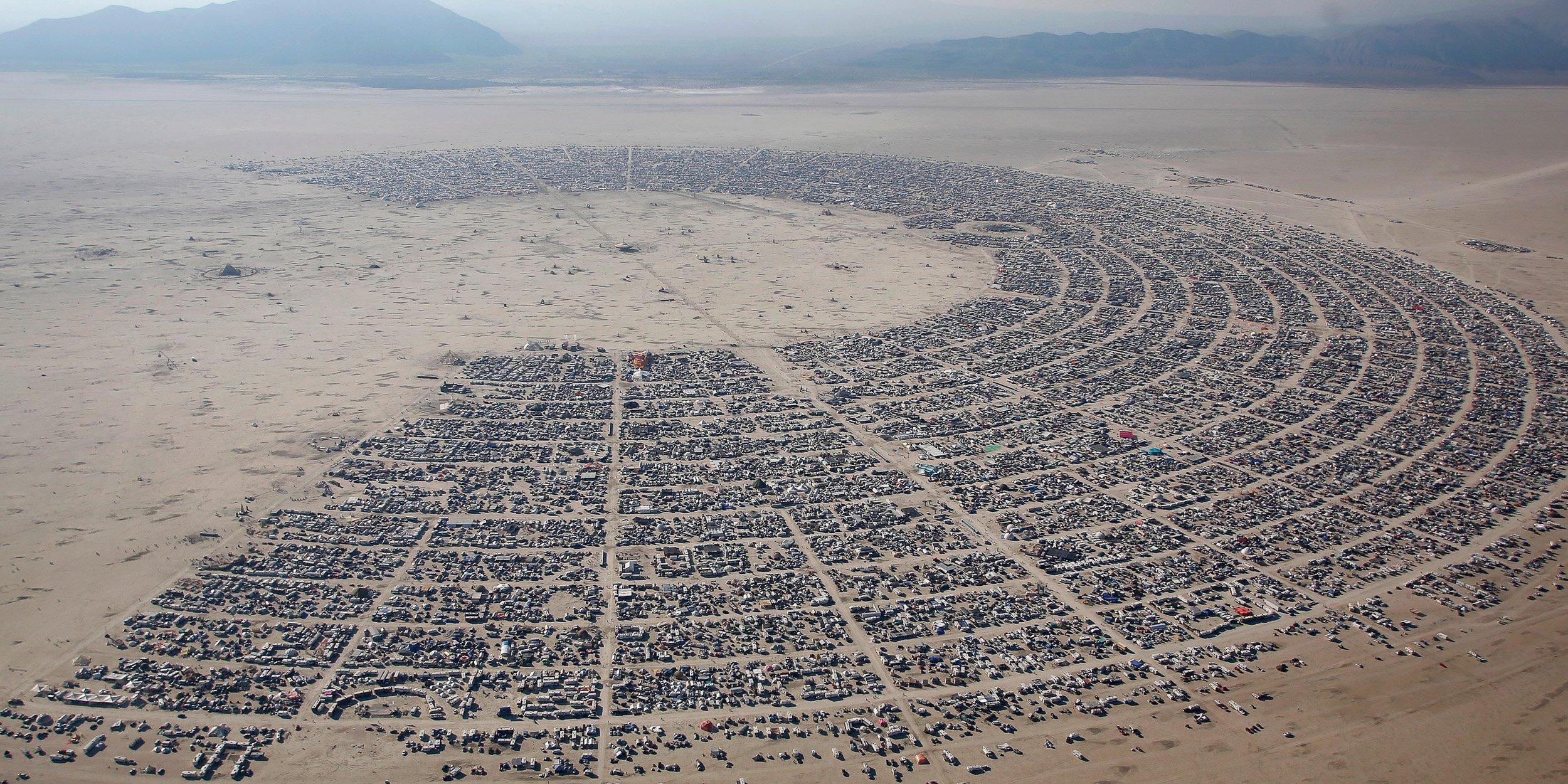
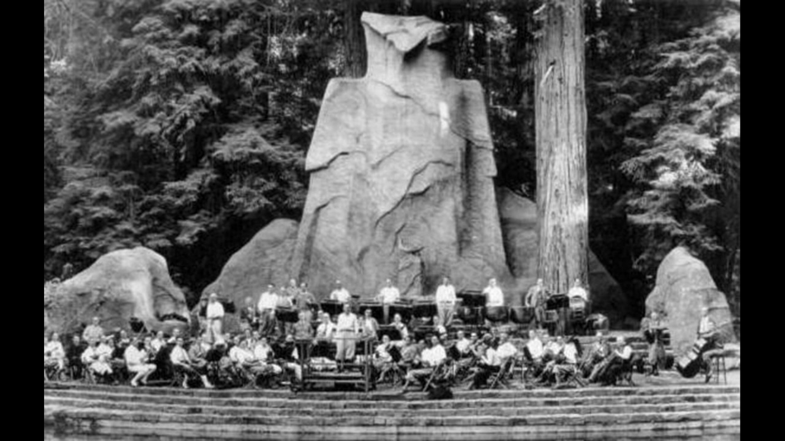
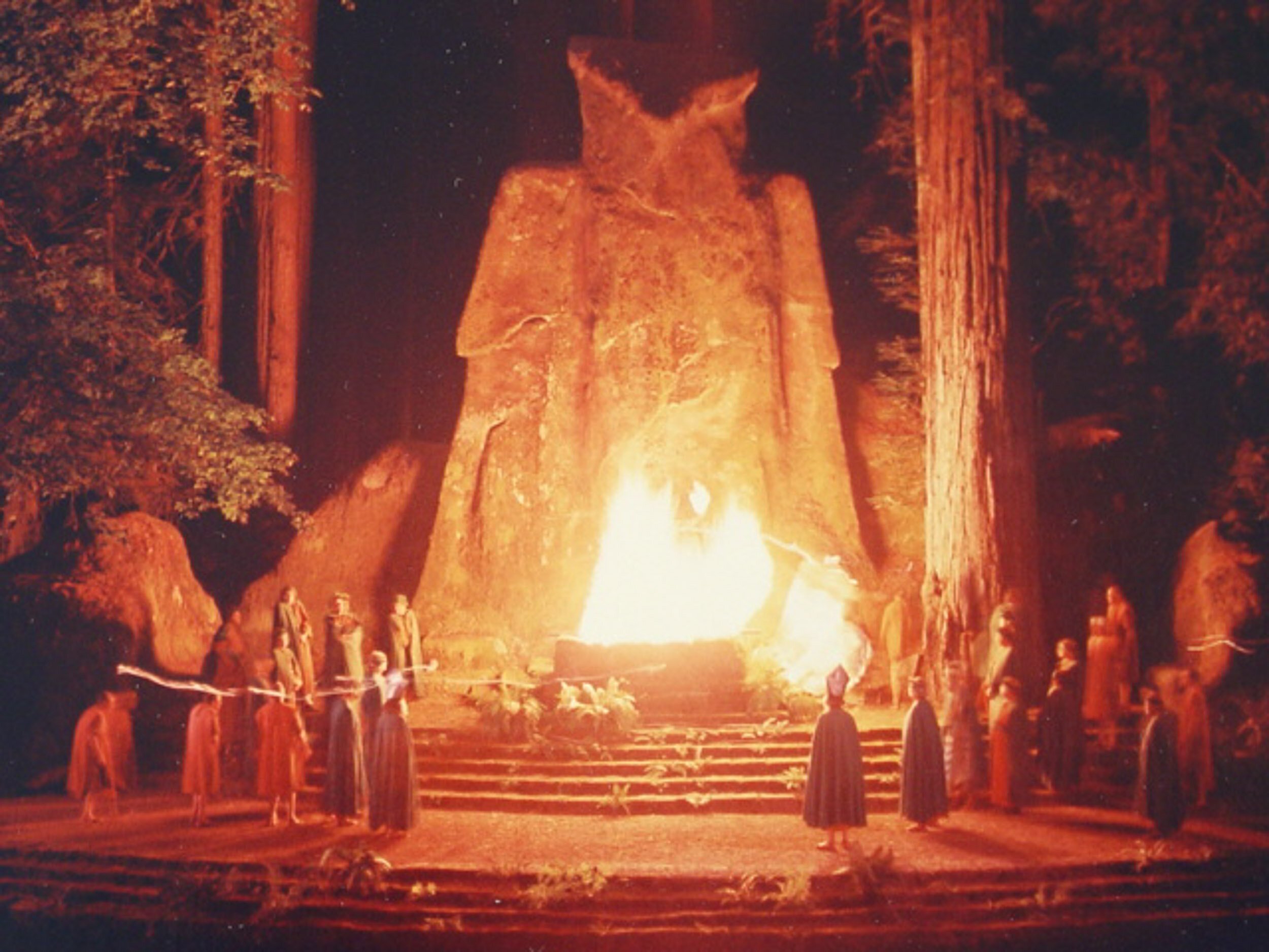
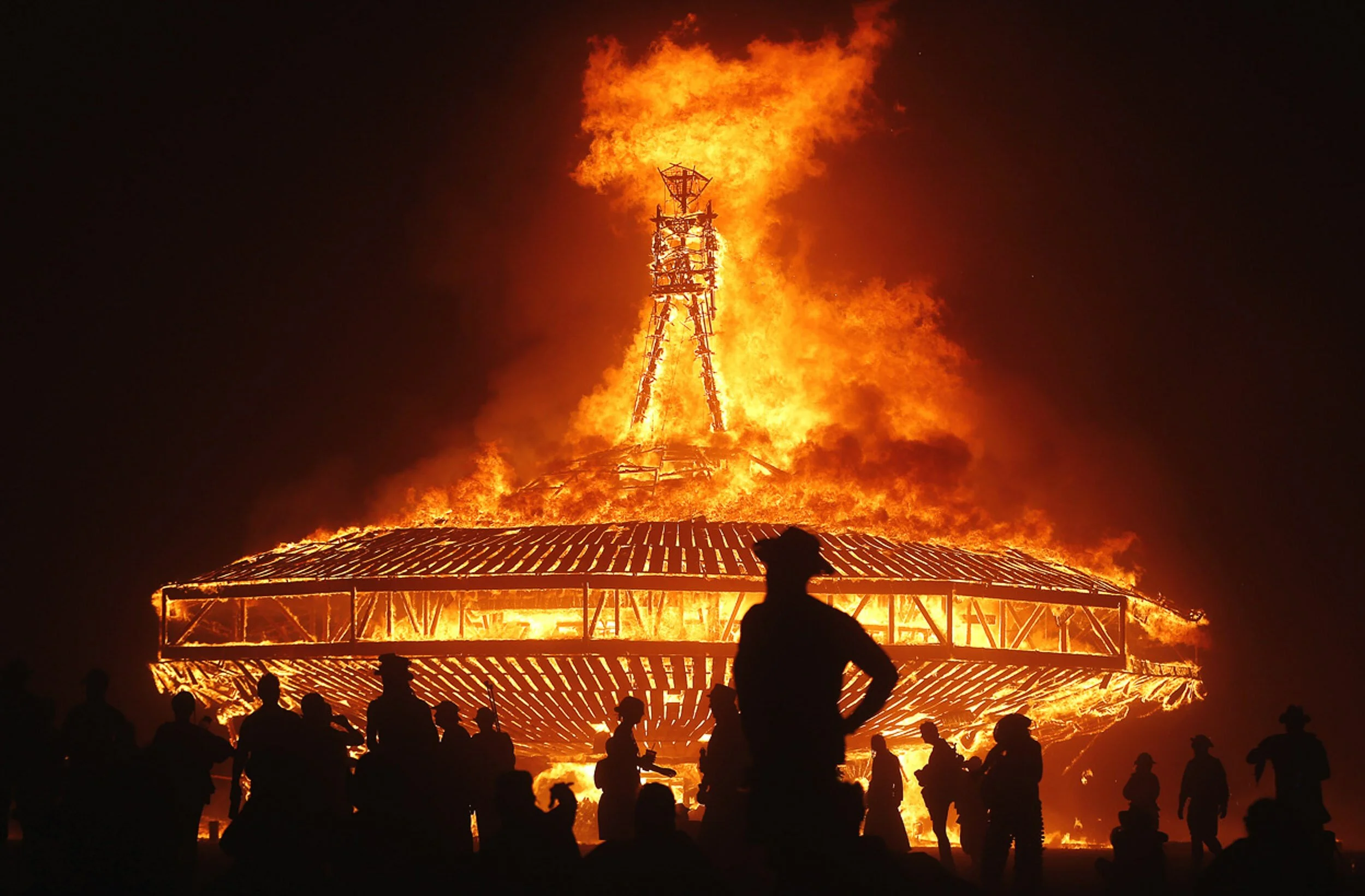
In June, my wife and I were invited to be guests at the Bohemian Club’s Spring Picnic. Having lived in San Francisco for 10+ years, I’d heard a lot about the Bohemian Club. It’s a very exclusive, mostly conservative group, that was orignally founded in 1872 by a group of Bay Area artists. We had lunch at a camp where Ronald Reagan was previously a member, we met politicians and executives as well as artists and musicians, all of whom are drawn to an ancient redwood grove to camp for several weeks, commune with nature, and burn effigies in elaborate secret ceremonies. It’s like Burning Man for Republicans. After a lovely day there, I found myself thinking that despite the vast ideological differences that separate Burning Man from the Bohemian Club, there are still some things that the two tribes have in common.
At this point I knew that I wanted to make work that was about division, but also about convergence, and the areas where we meet. What does it look like when two groups are pushed to opposite ends of the spectrum, but still have a few places where they overlap?
04 - Inspiration
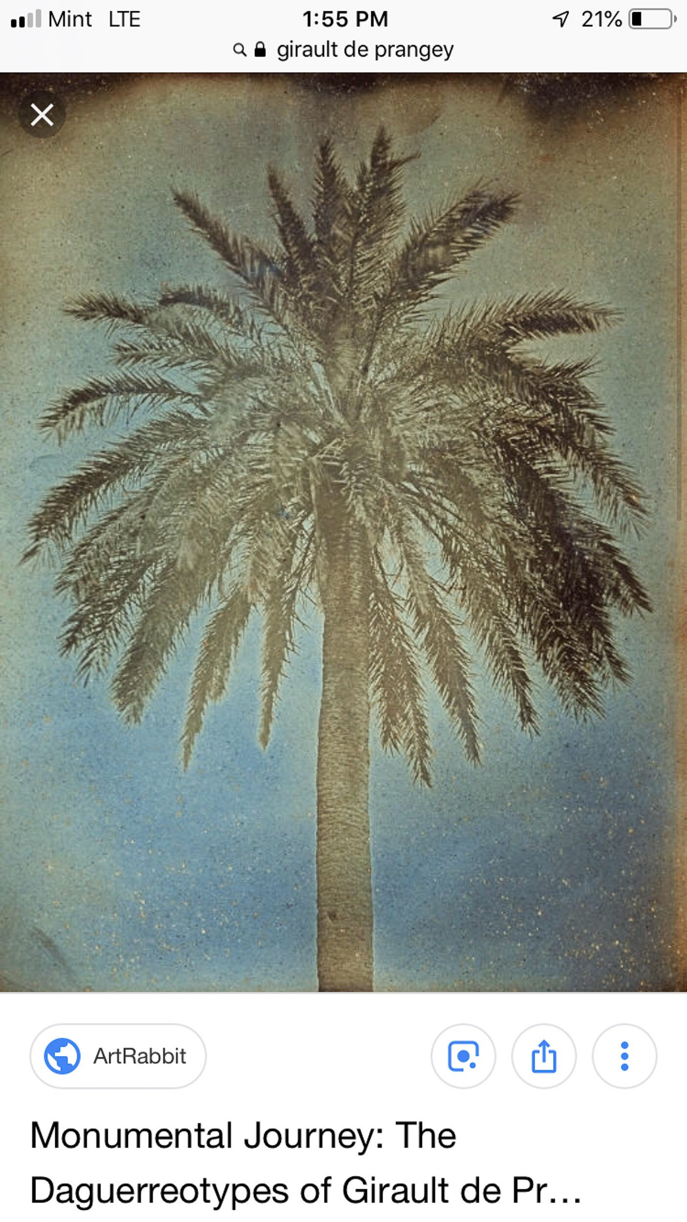
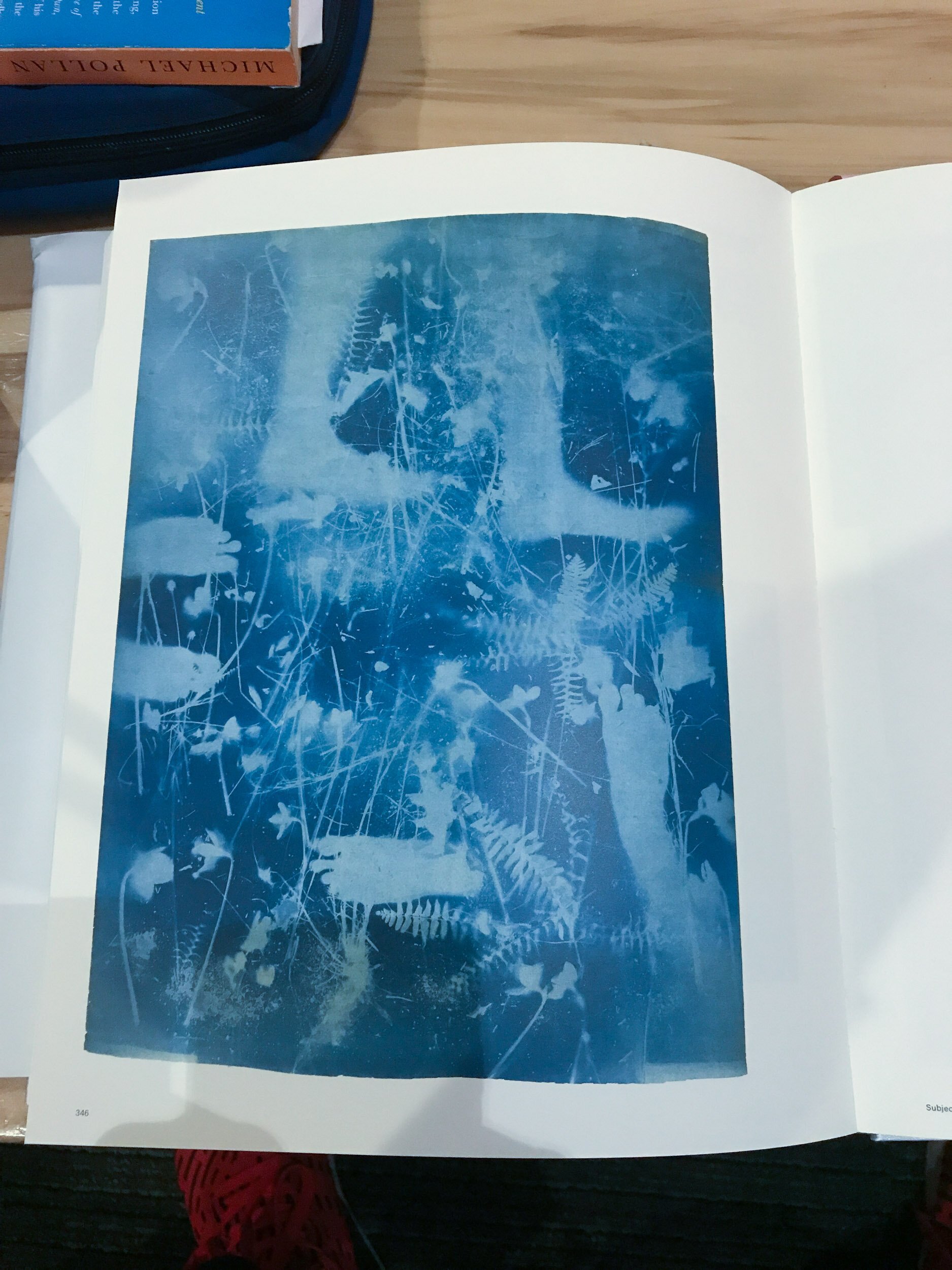
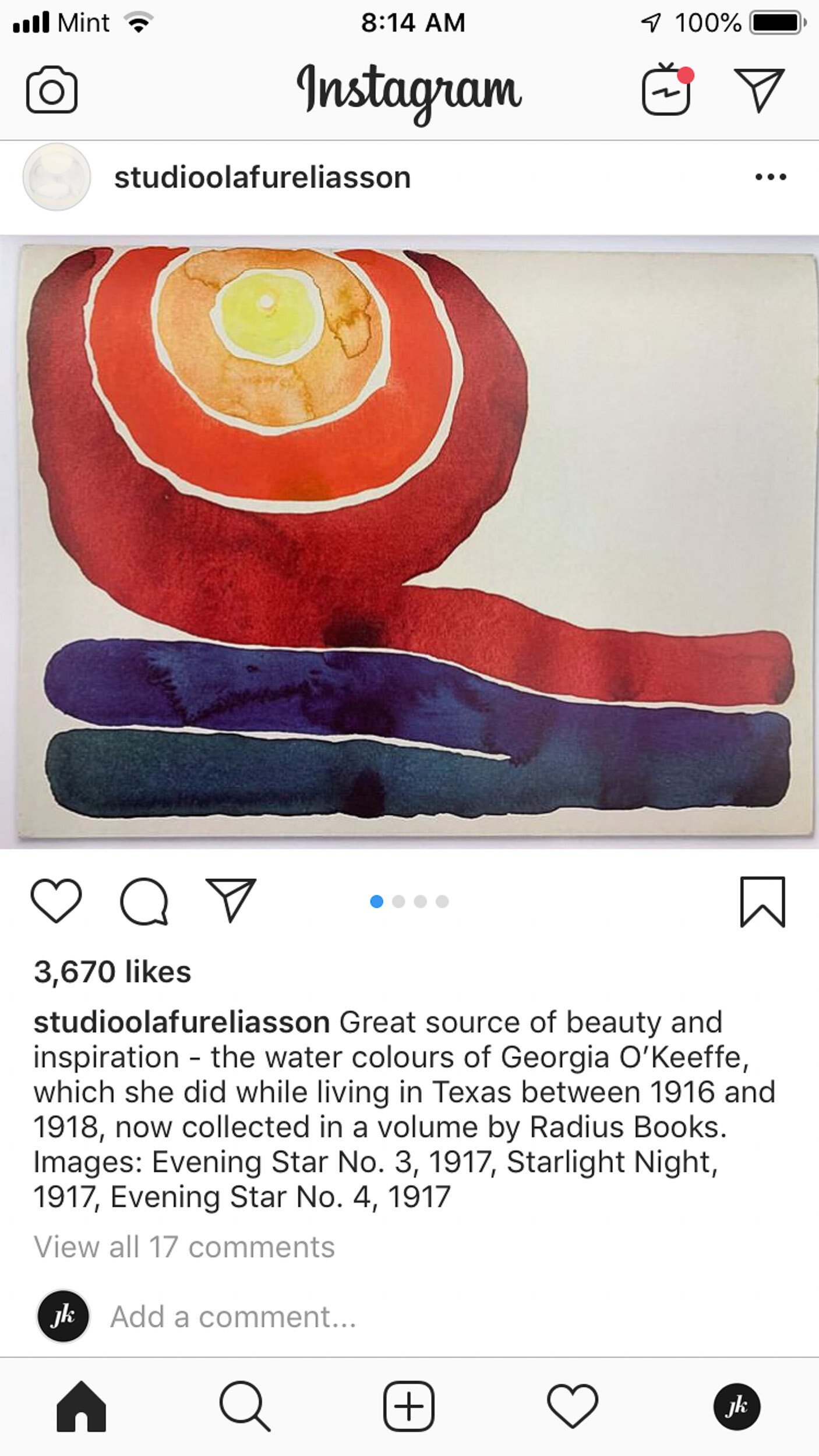
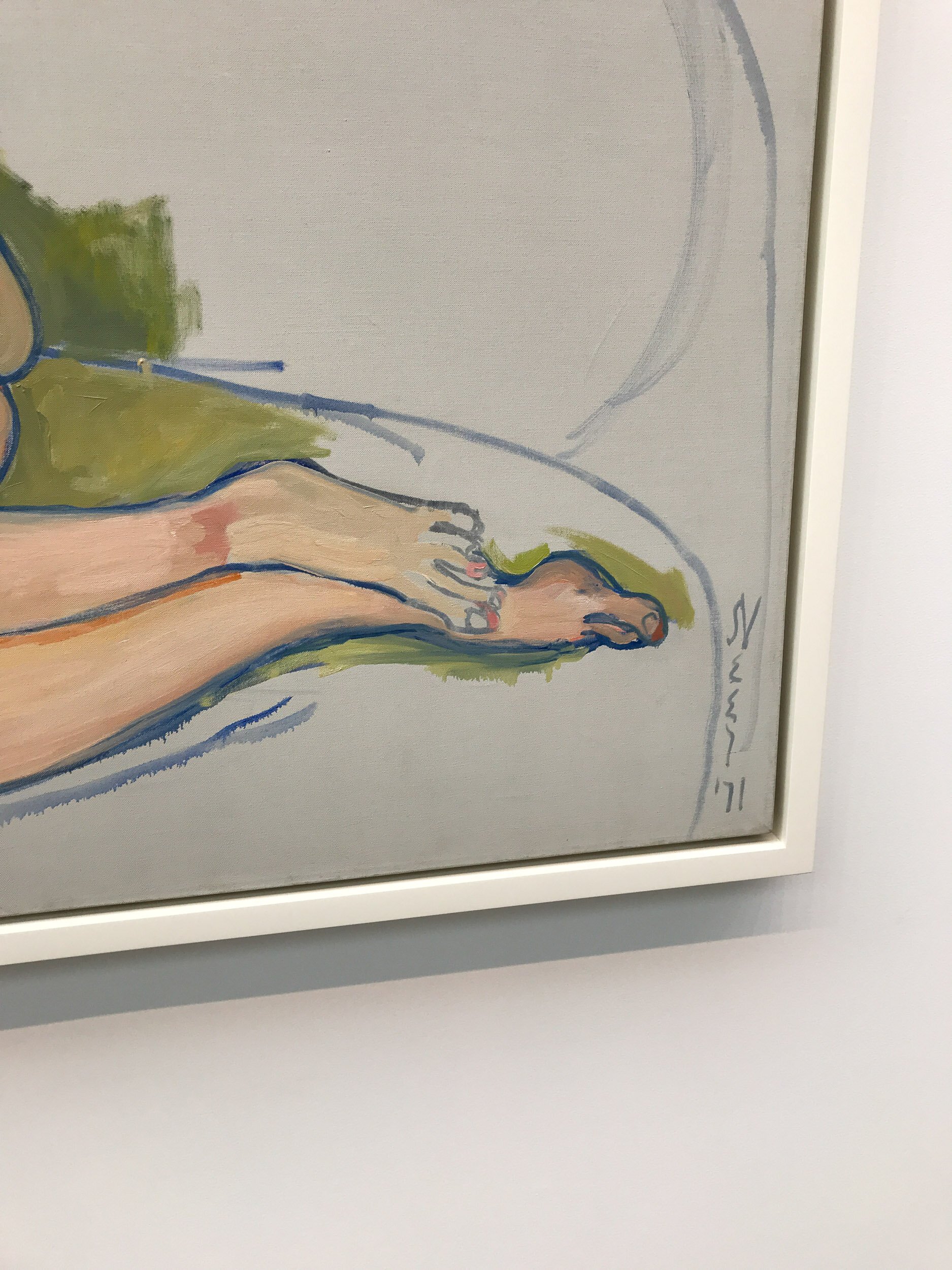
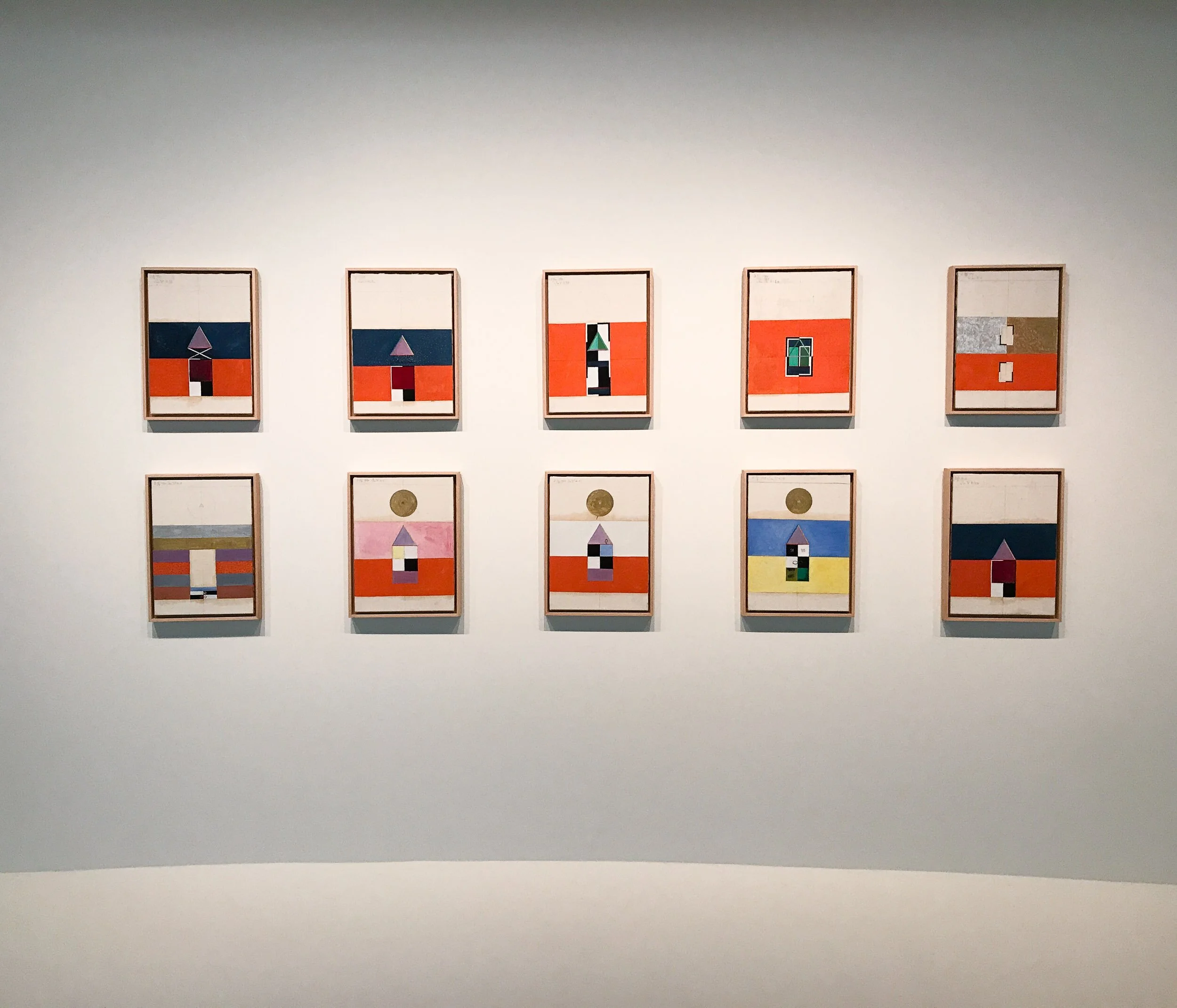
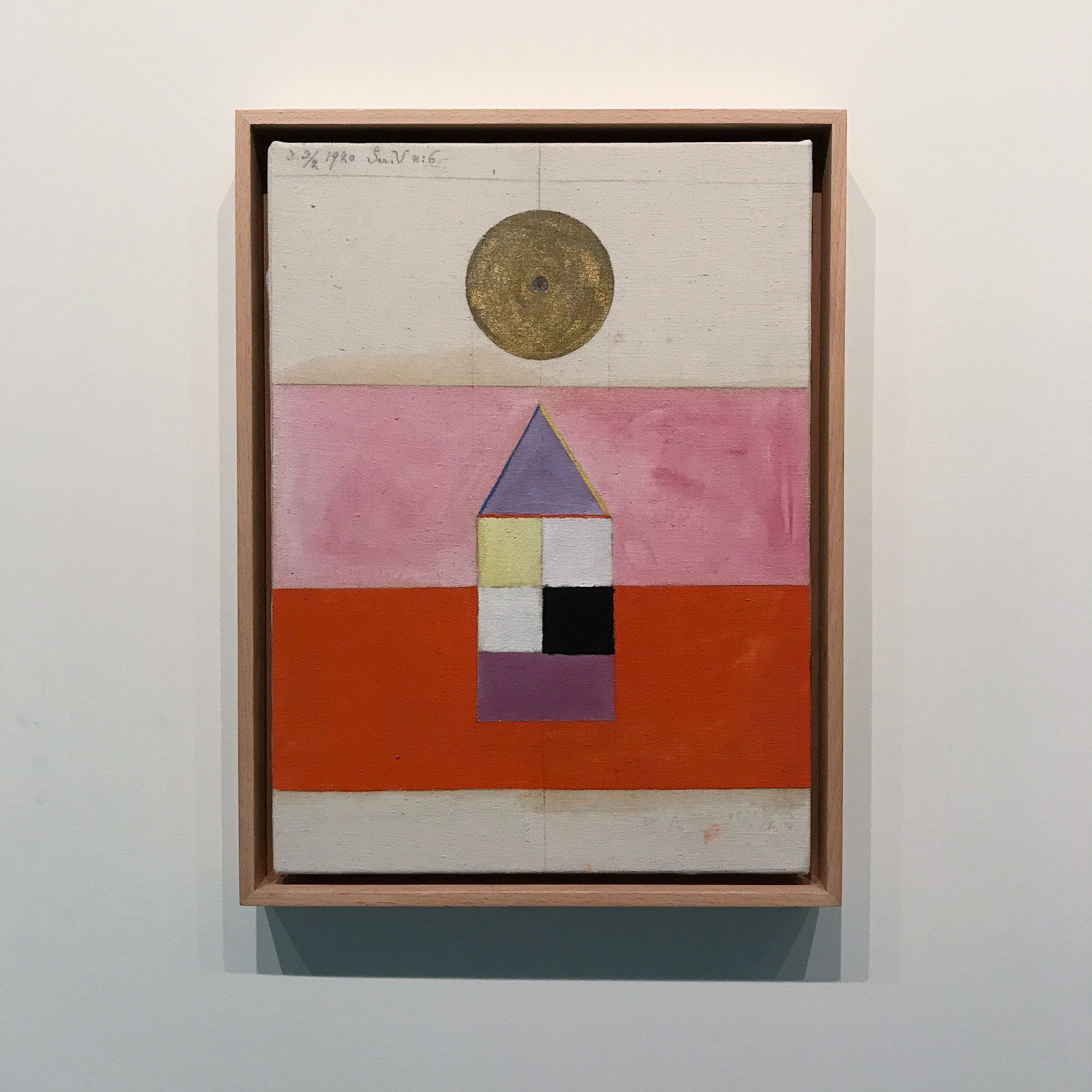
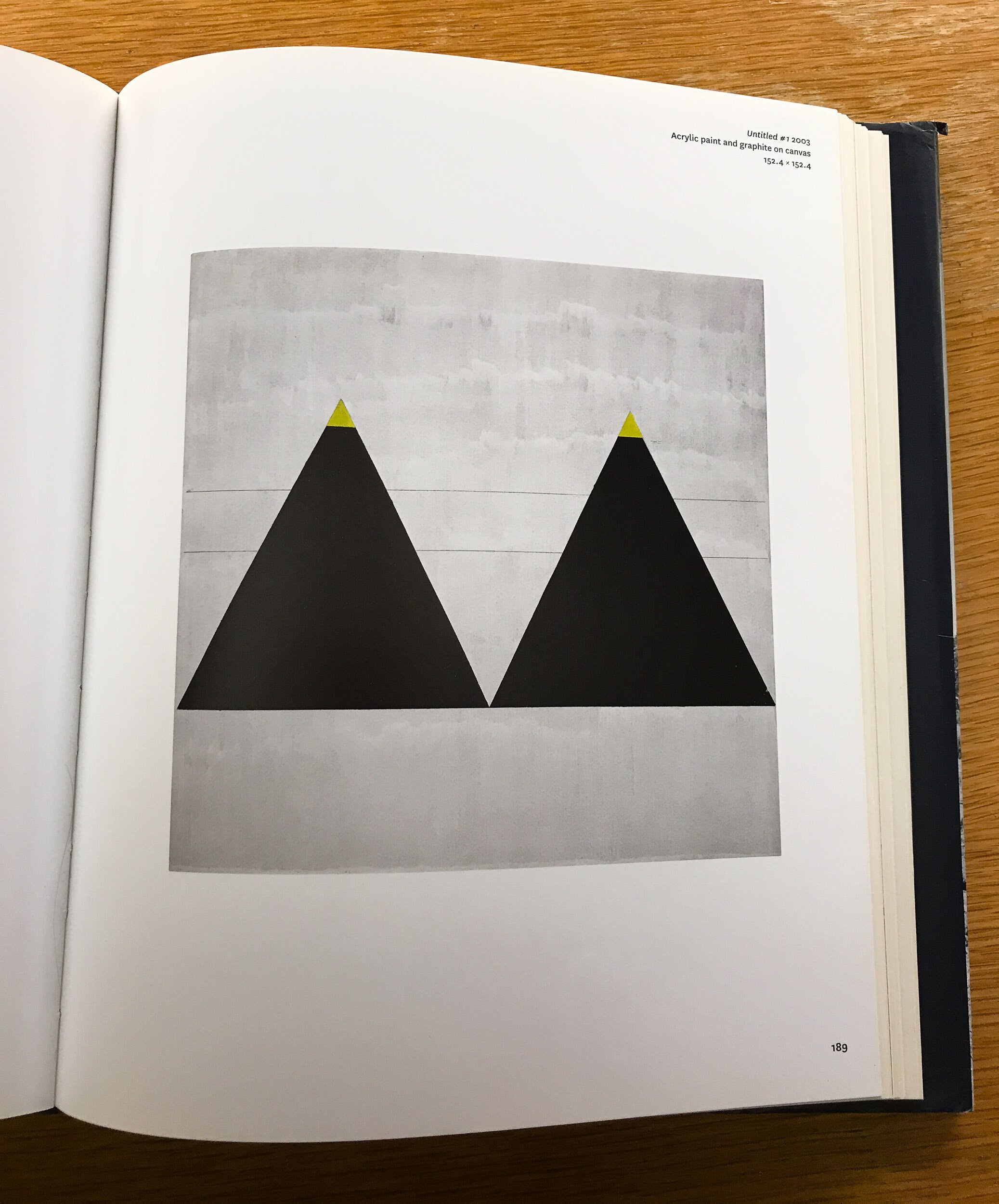
I’m always looking at and reading about art, but at this point I had a project in mind, so I started gathering inspiration from other artists and works. Sometimes I was drawn to their message, other times to their technique or presentation. The inspiration I collected came from everywhere: museums, books, musicians, social media, blogs, travel, and across a wide range of media: painting, illustration, graphic design, abstract expressionism, photography, all of it.
I believe that all artists are unavoidably influenced by the artists that come before them. Most new ideas are just an unexpected combination of two or more old ideas. I knew that I wanted to reference a lot of the work that I’d seen while working on this project, as a way to pay respect to the ideas that came before mine.
05 — Snowmelt
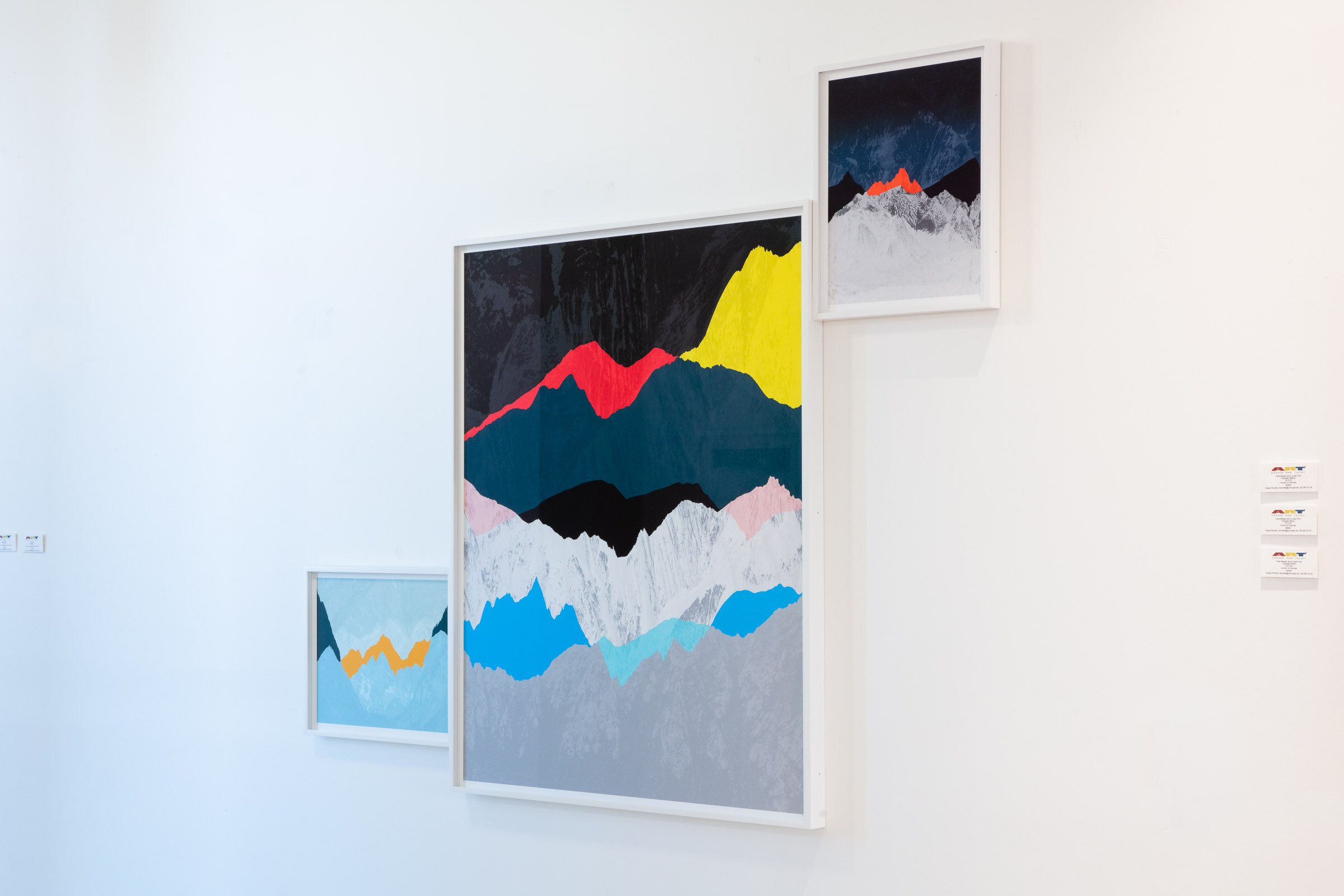
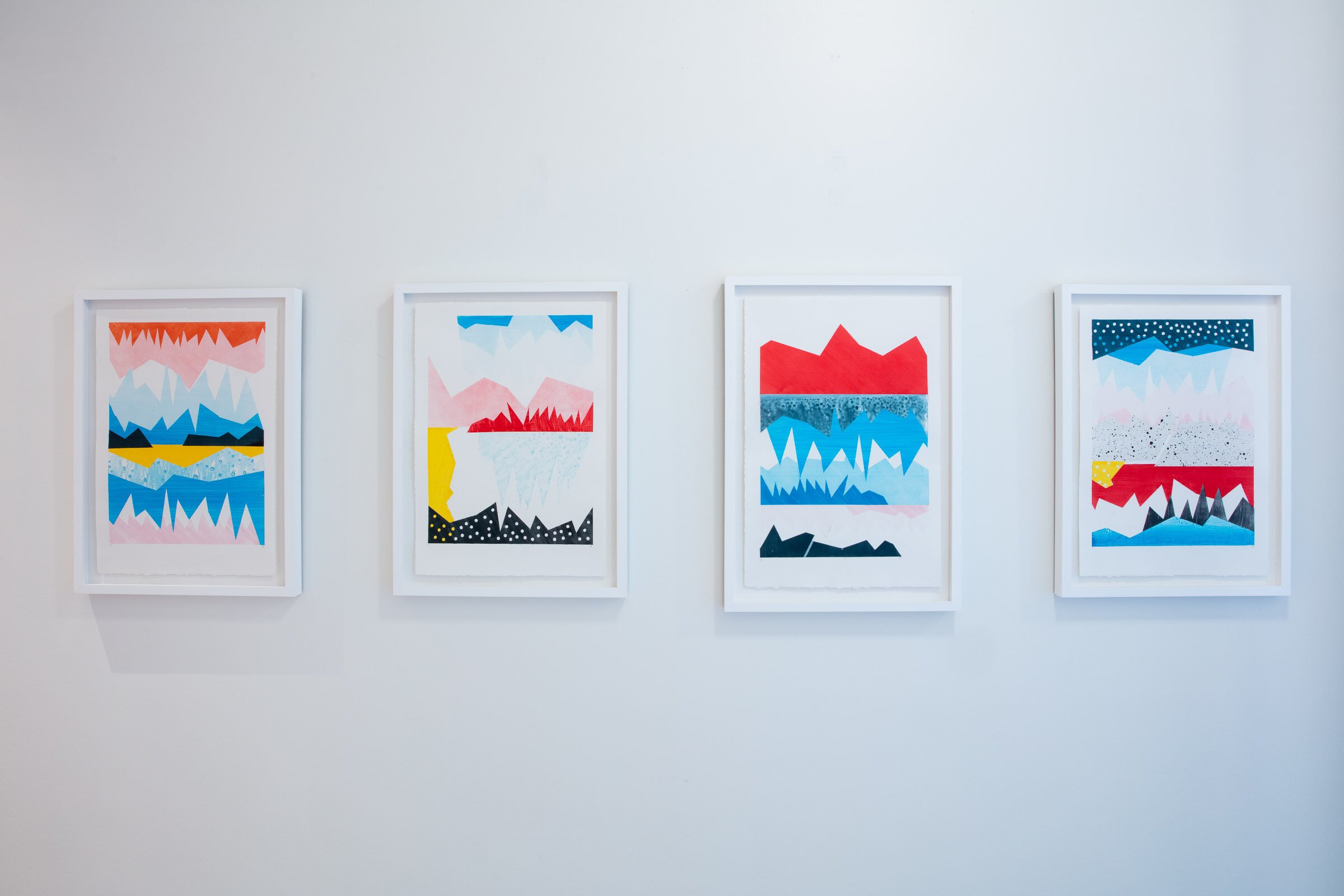
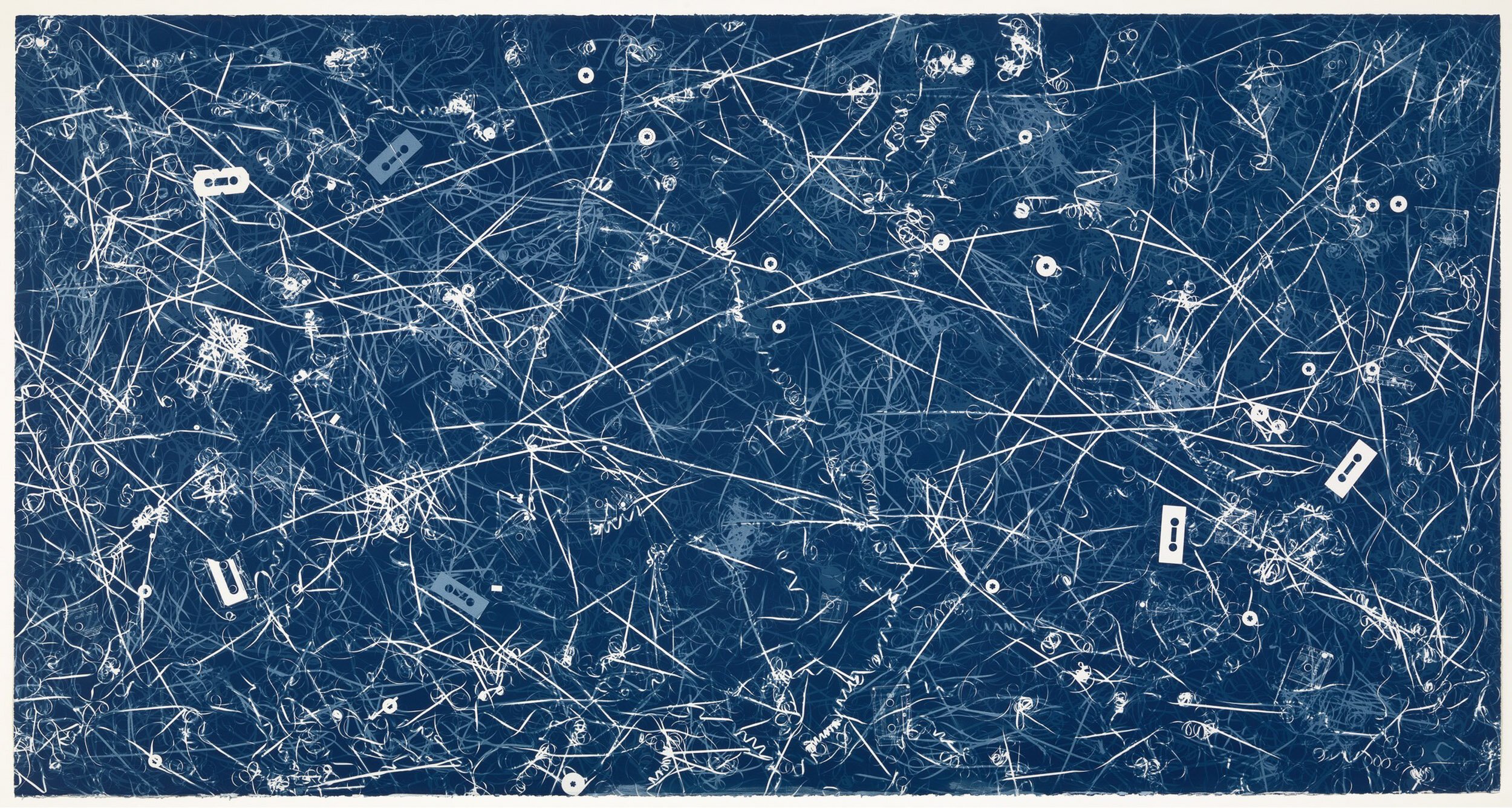
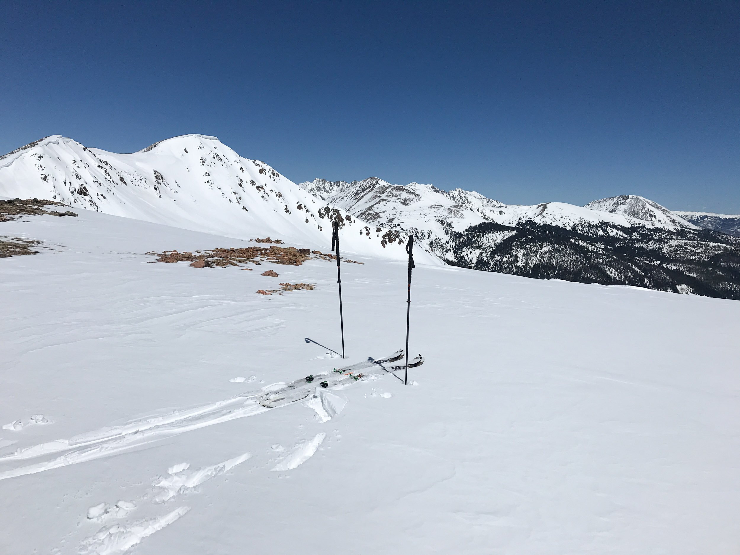
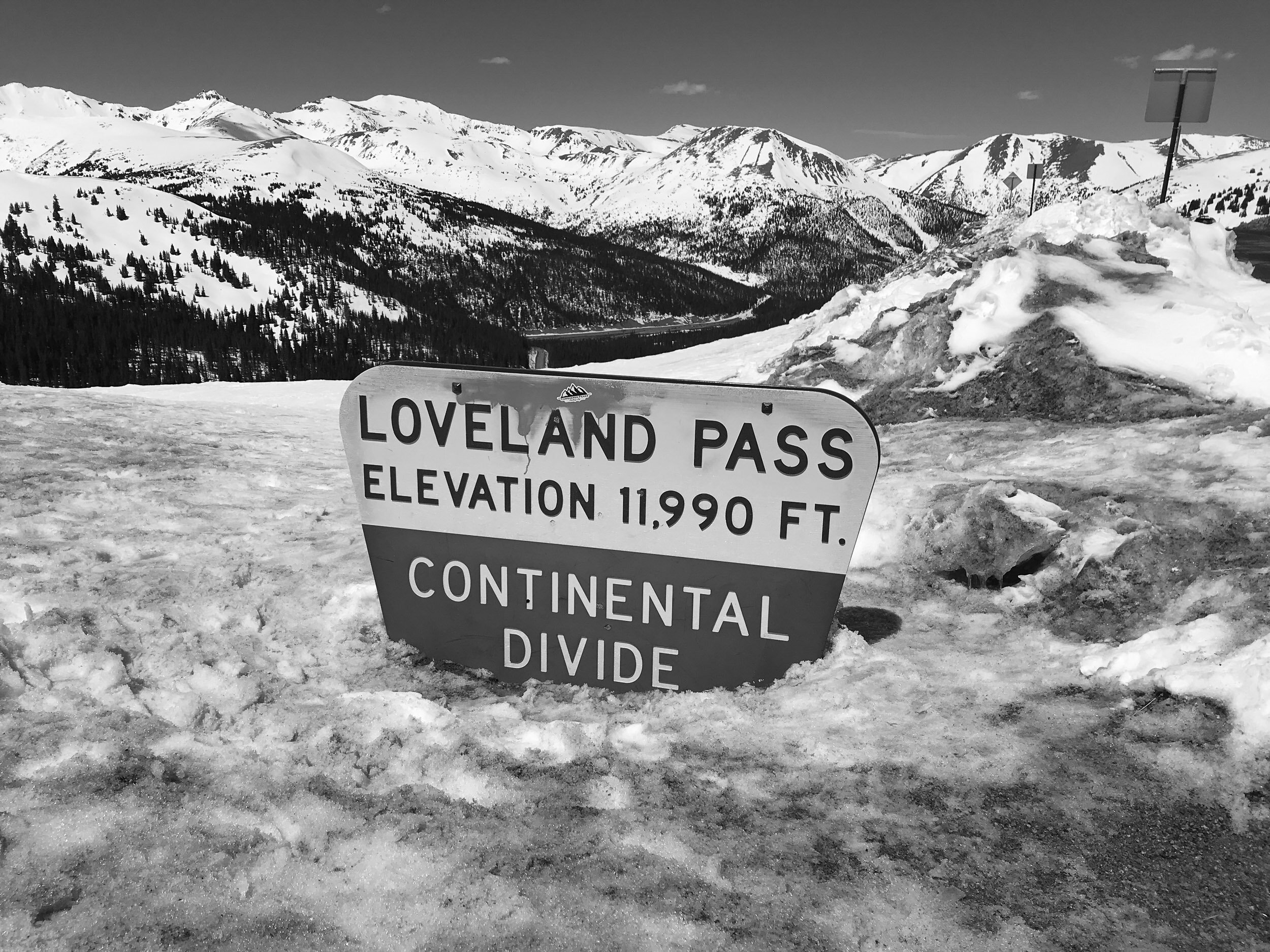
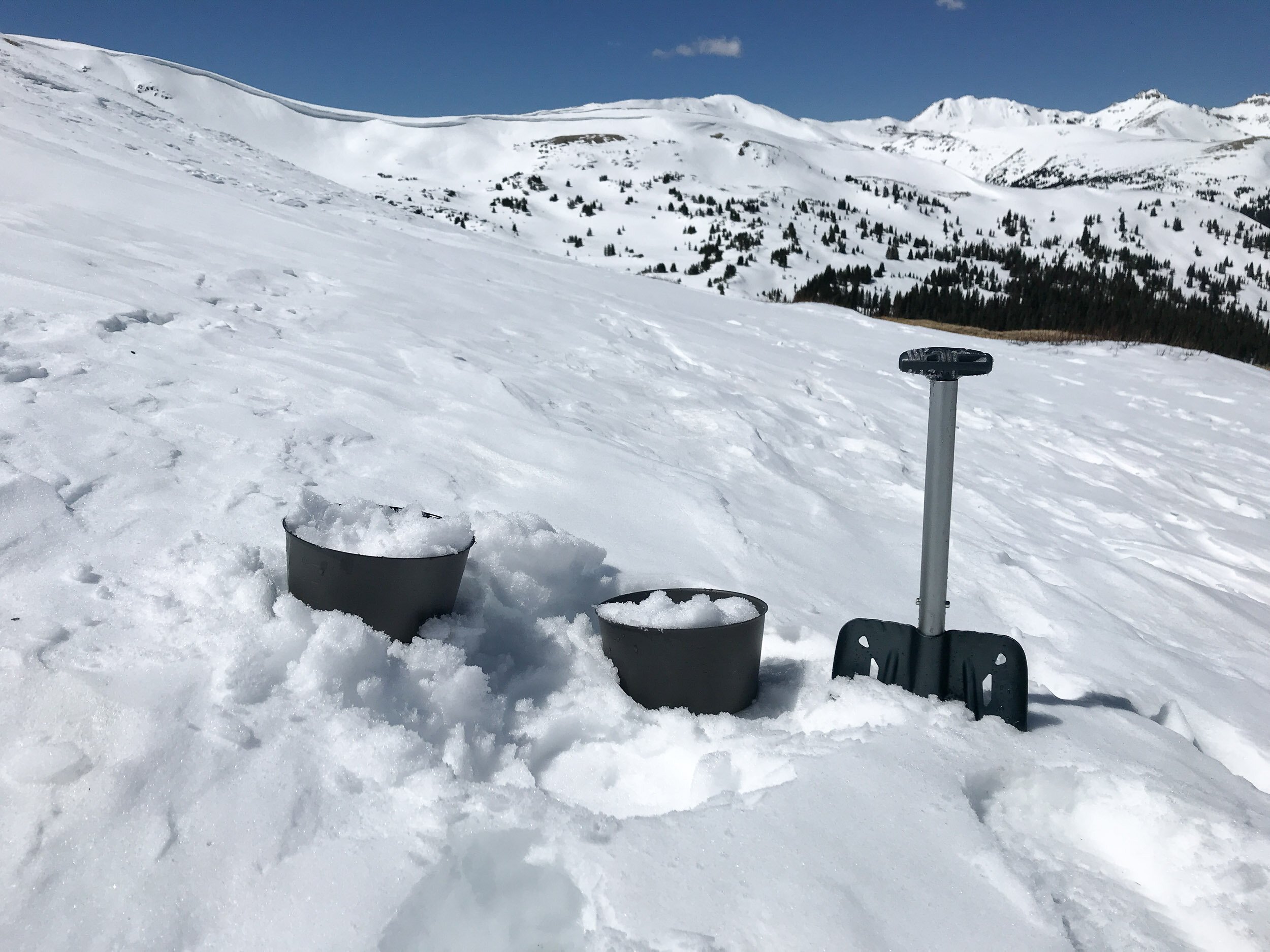
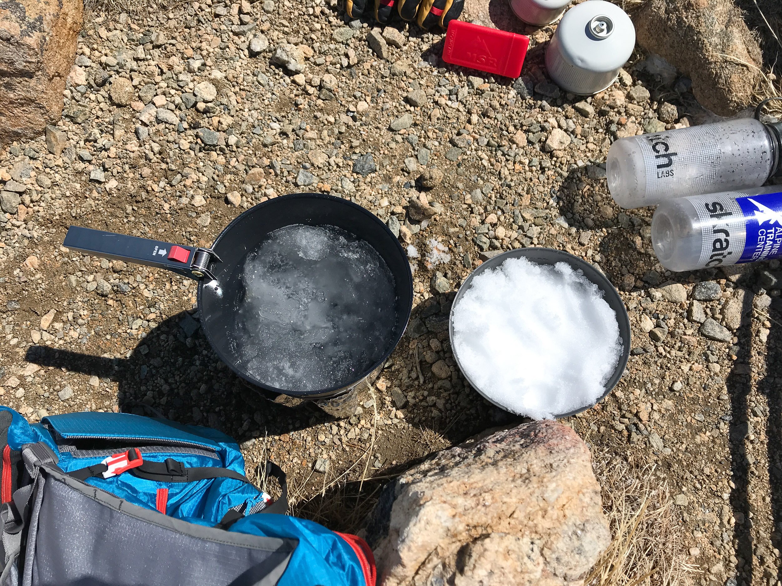
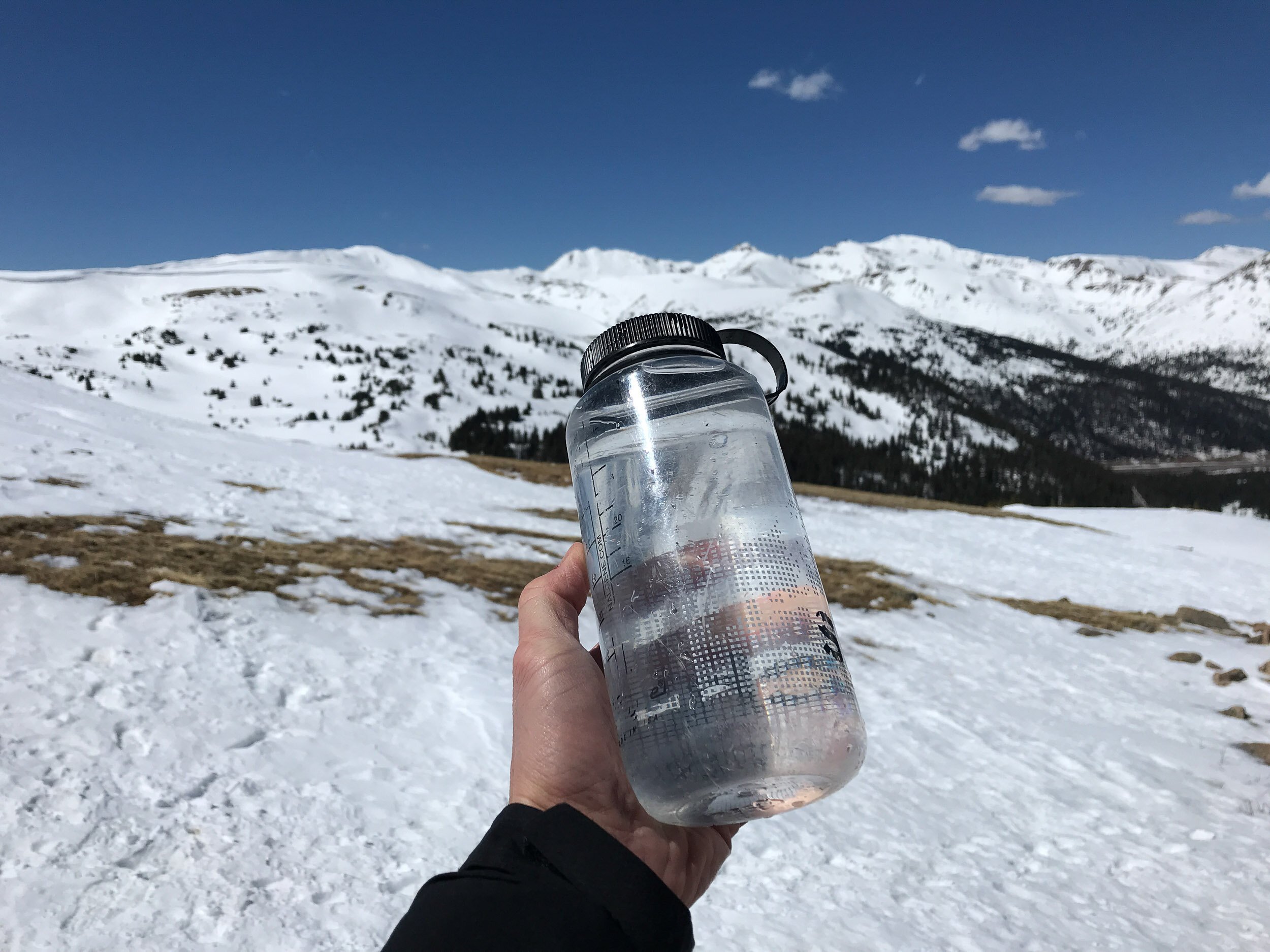
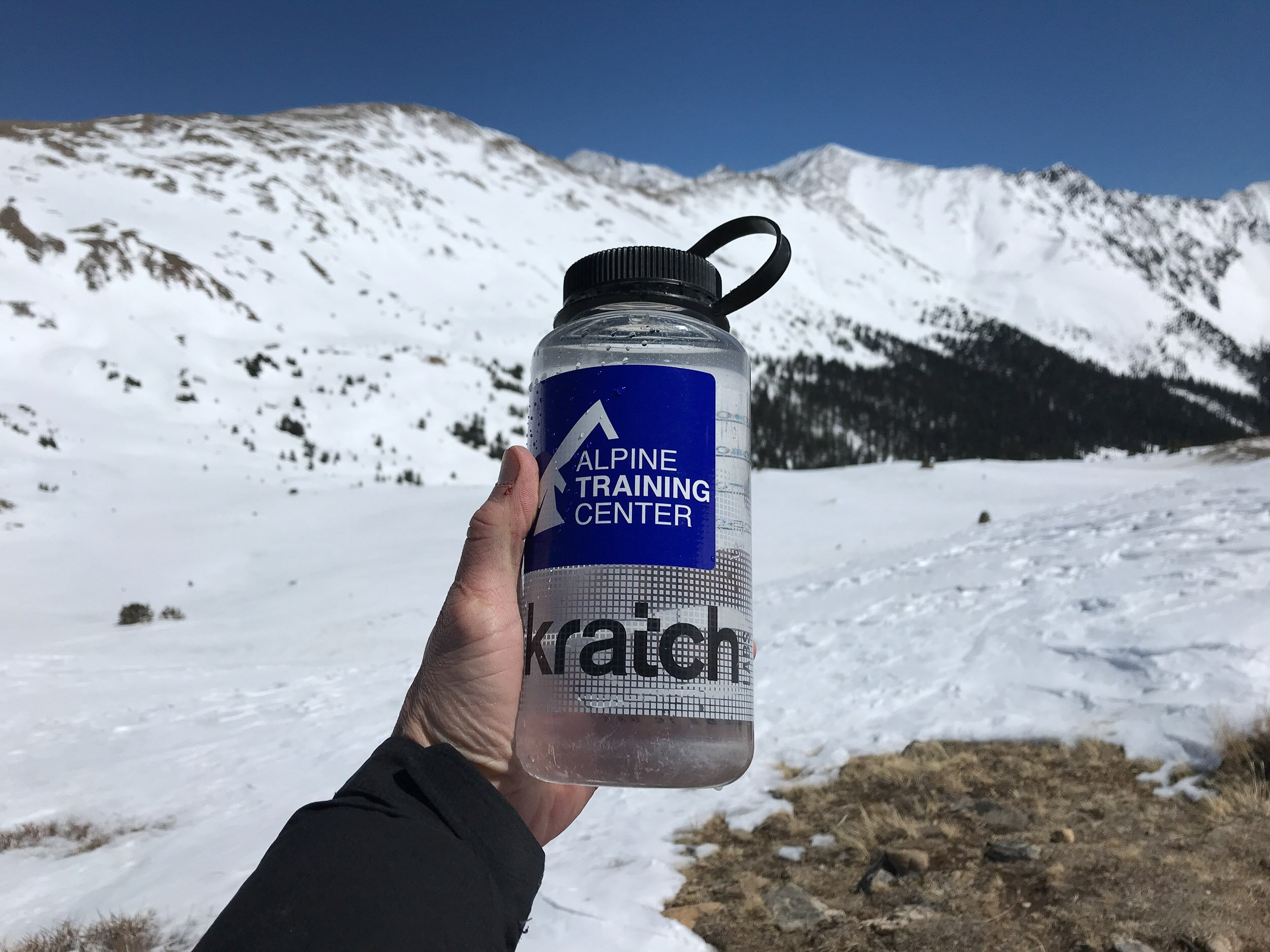
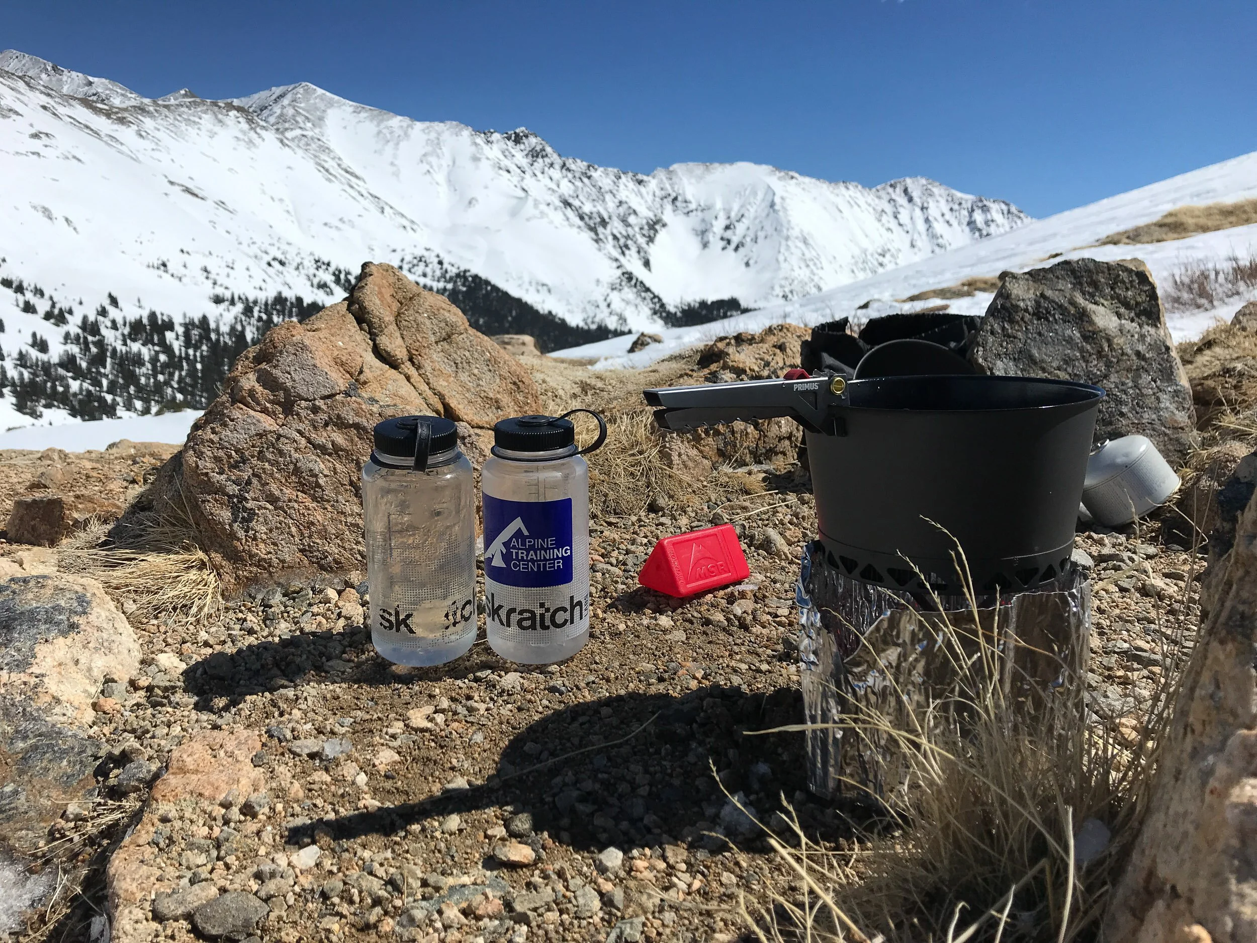
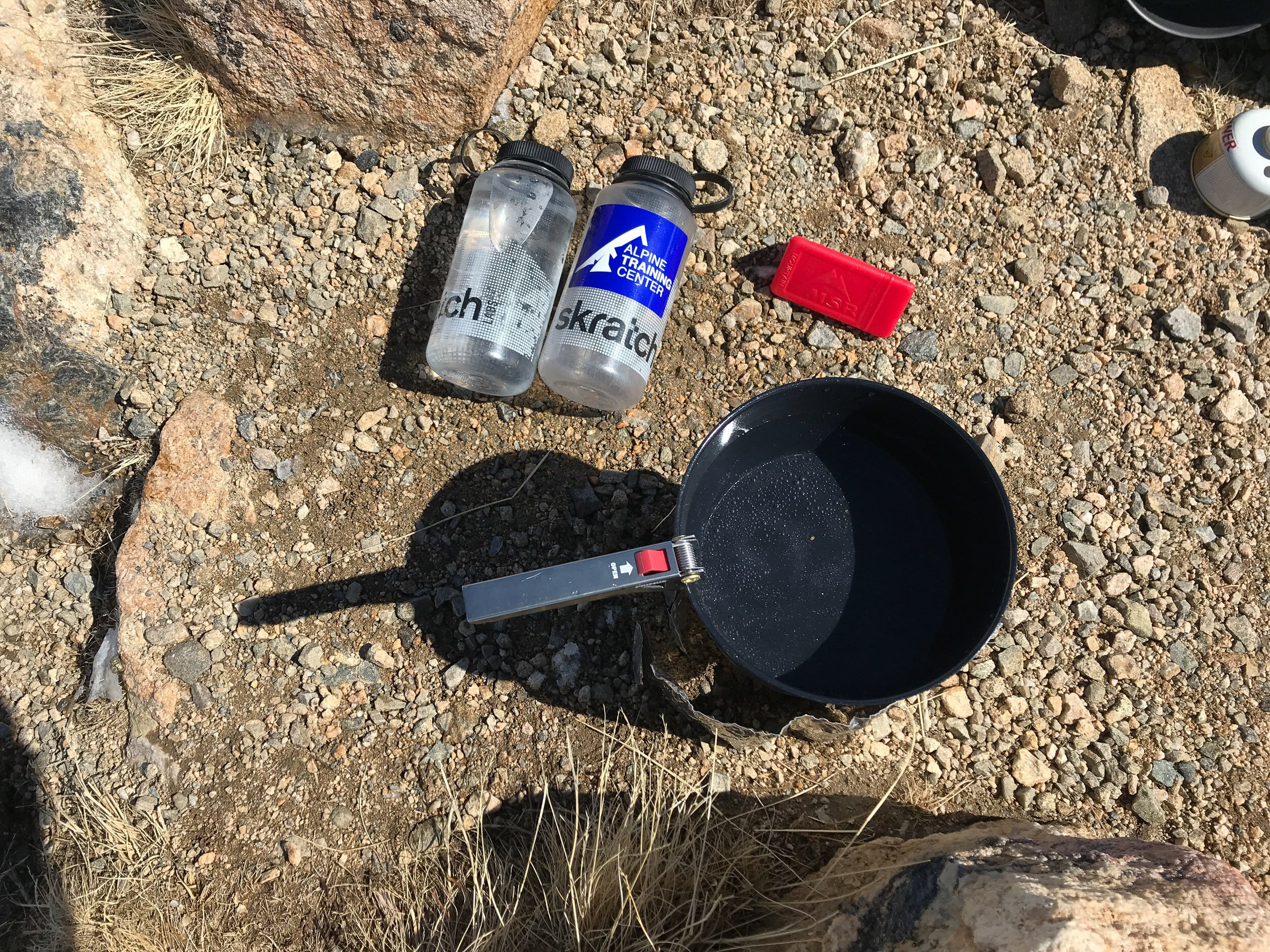
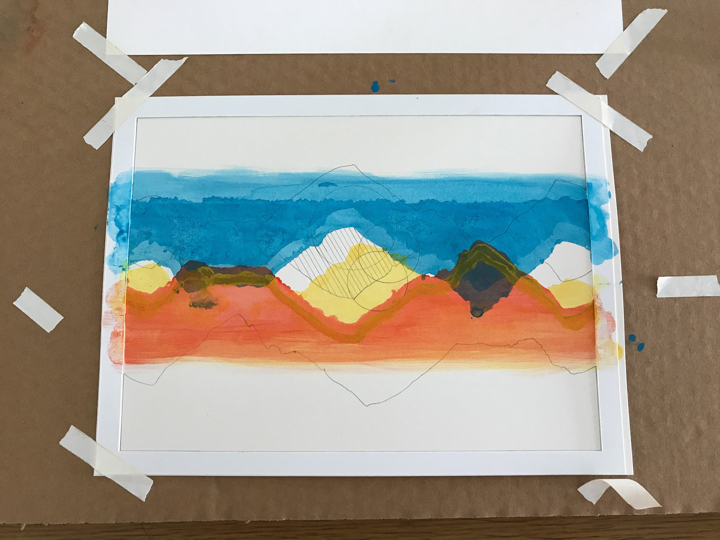
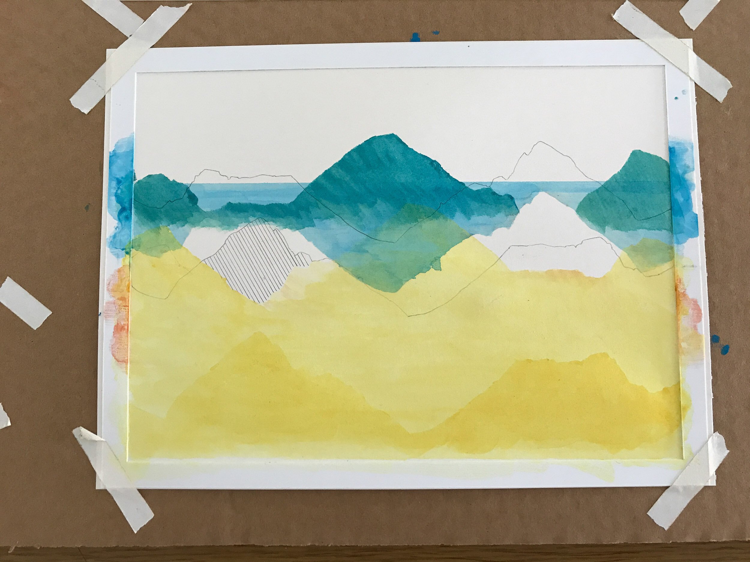
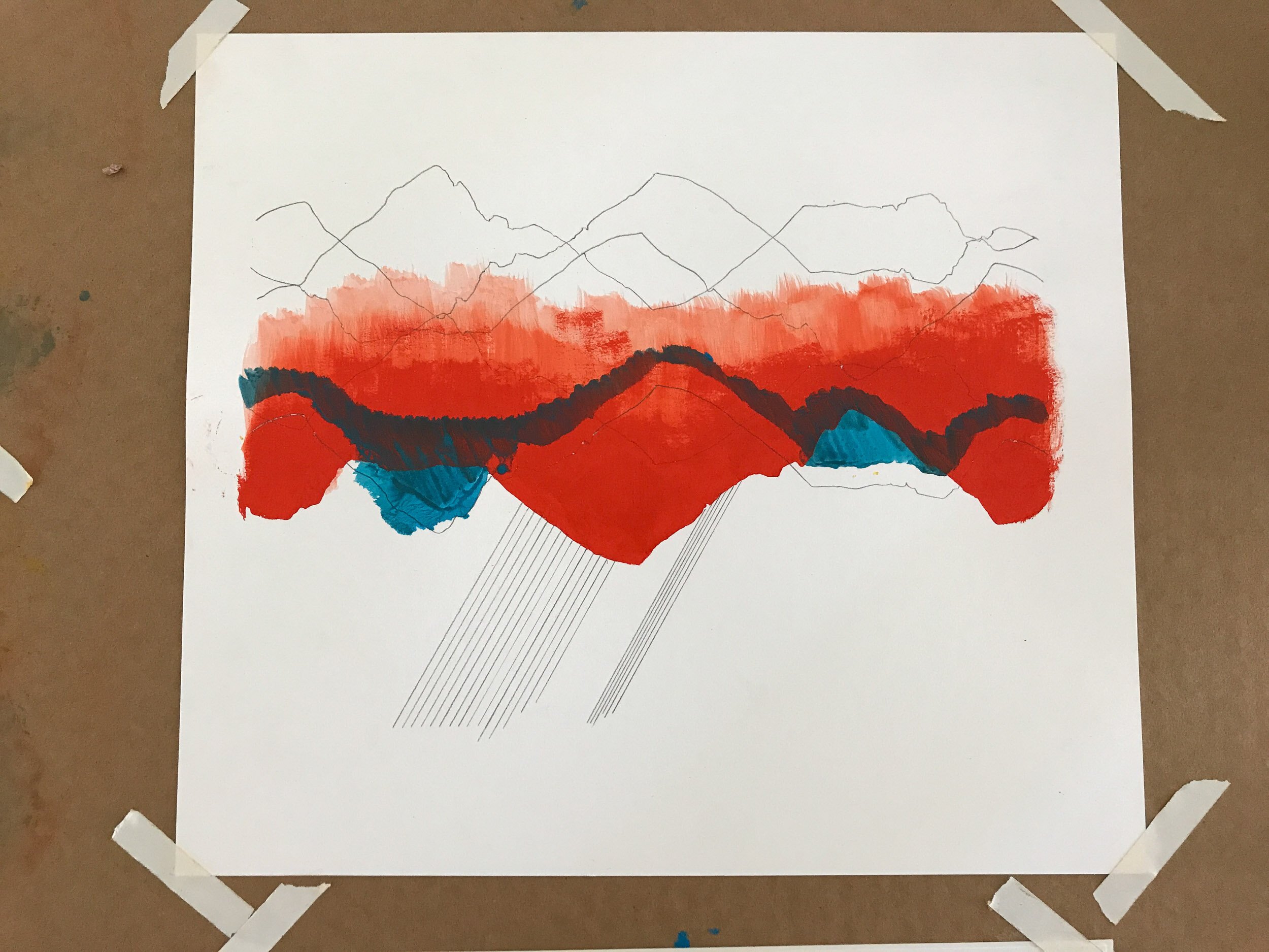
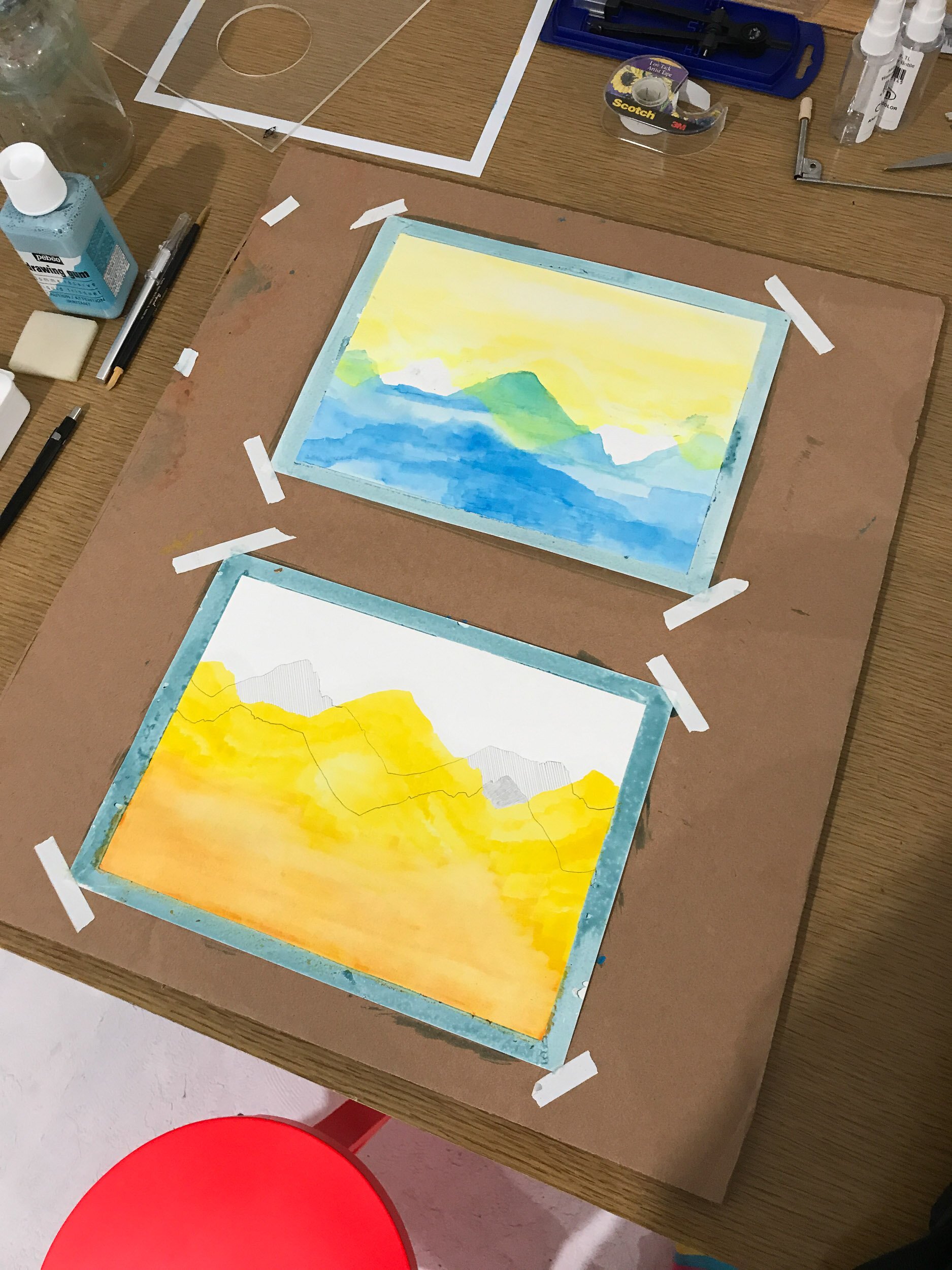
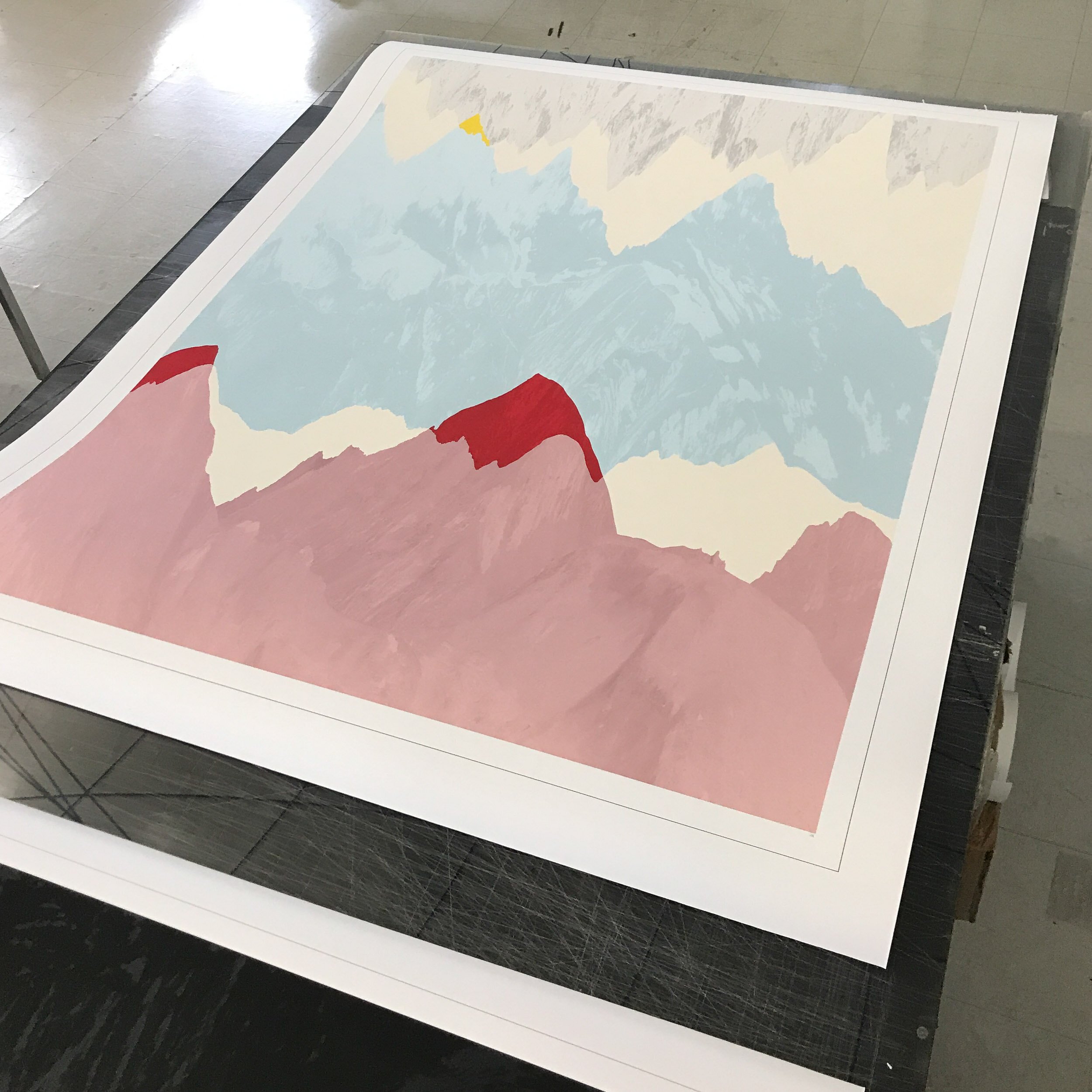
In an effort to directly connect the medium to the message, I wanted to find a way to use water from the Continental Divide for this project, so I went to Loveland Pass and skied to a high ridge. I took snow from both the Pacific and Atlantic sides of the ridge, and melted it into water using a small stove, filling two bottles with snowmelt. My plan was to take these geographically diverse waters, mix them each with watercolors and create works made from overlapping lines using stencils made from the contours of the Continental Divide ridge lines.
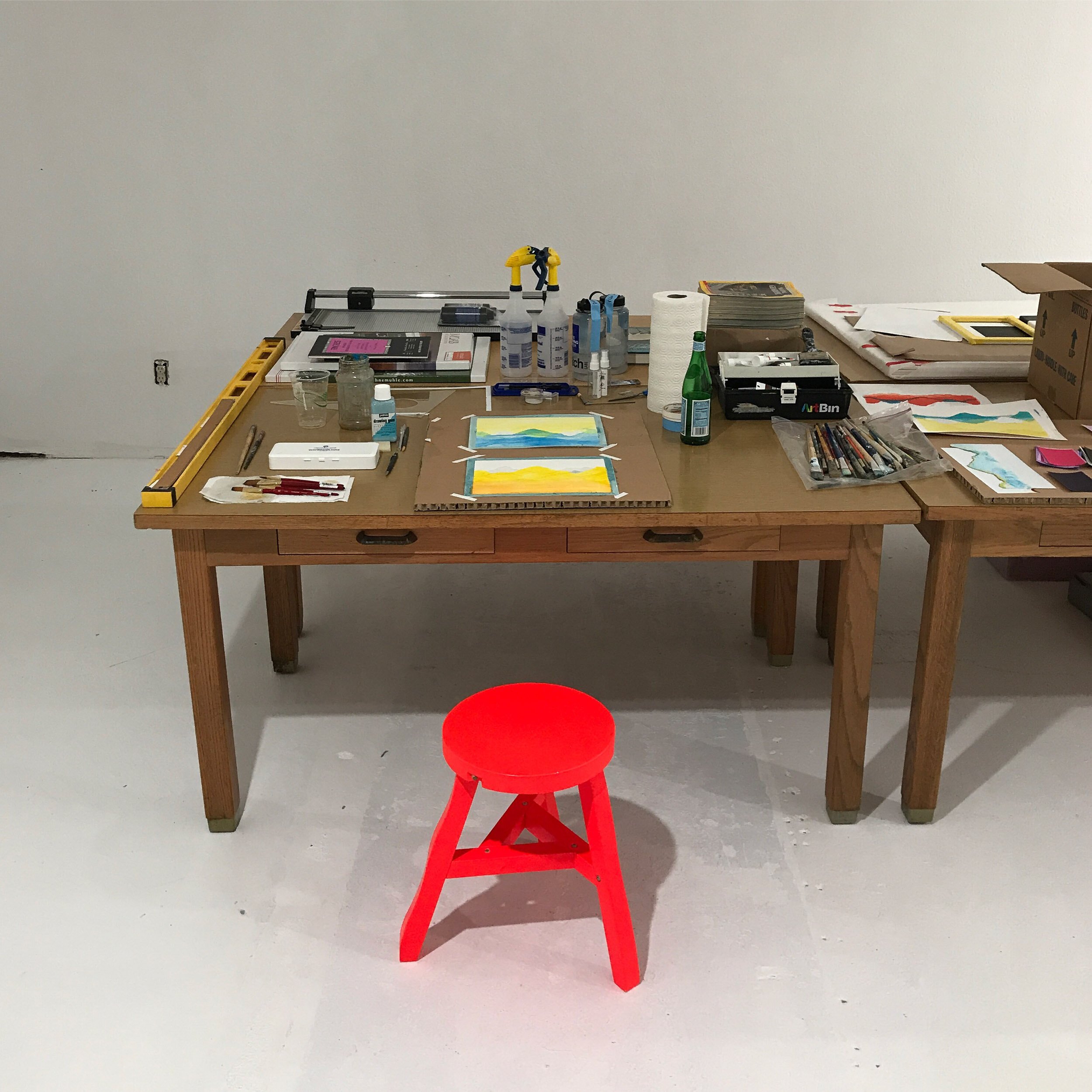
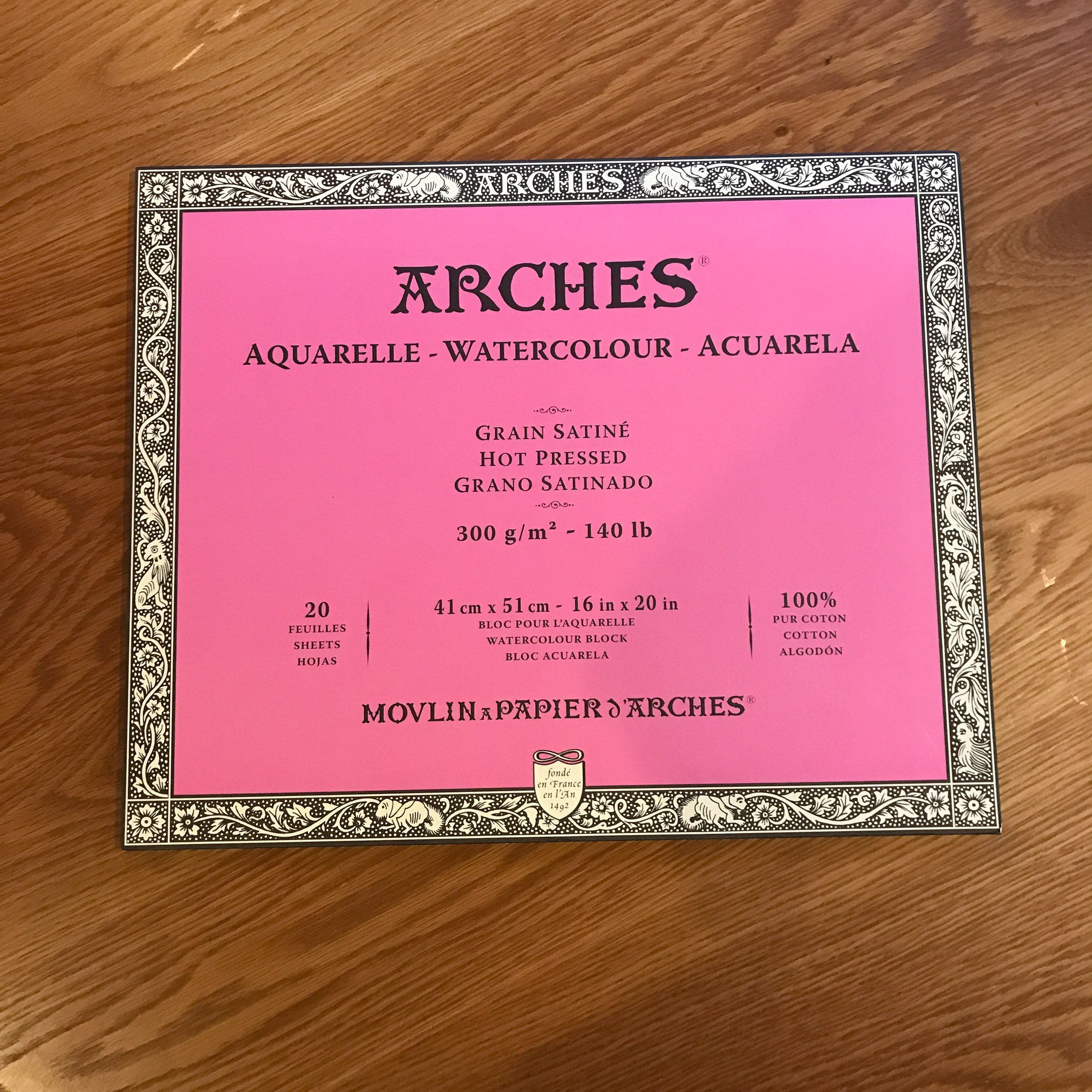
This was where I really felt like a beginner. While I’ve done a number of paintings, and am pretty comfortable with acrylic paint, my decision to use watercolors was ill fated. I couldn't get the colors where I wanted them or the lines crisp enough. I had an idea in my head of what I wanted to make but the gulf between idea and reality started to feel unbridgeable within the decade. After struggling through too many uninspiring watercolor paintings, I made the decision to abandon ship and go back to the tools that I know.
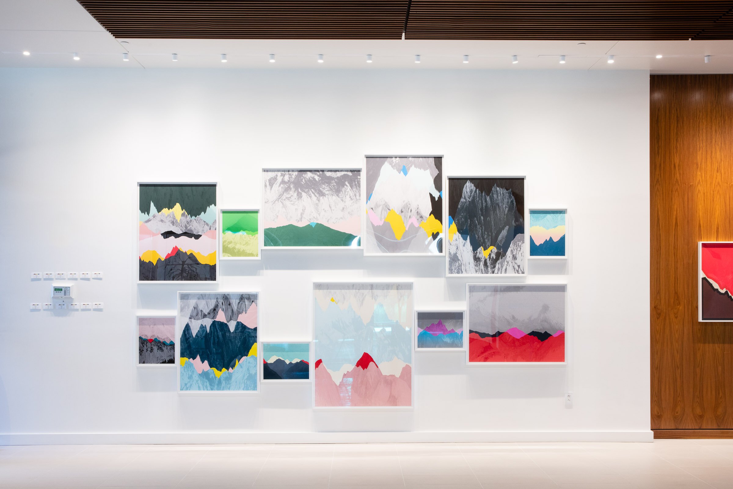
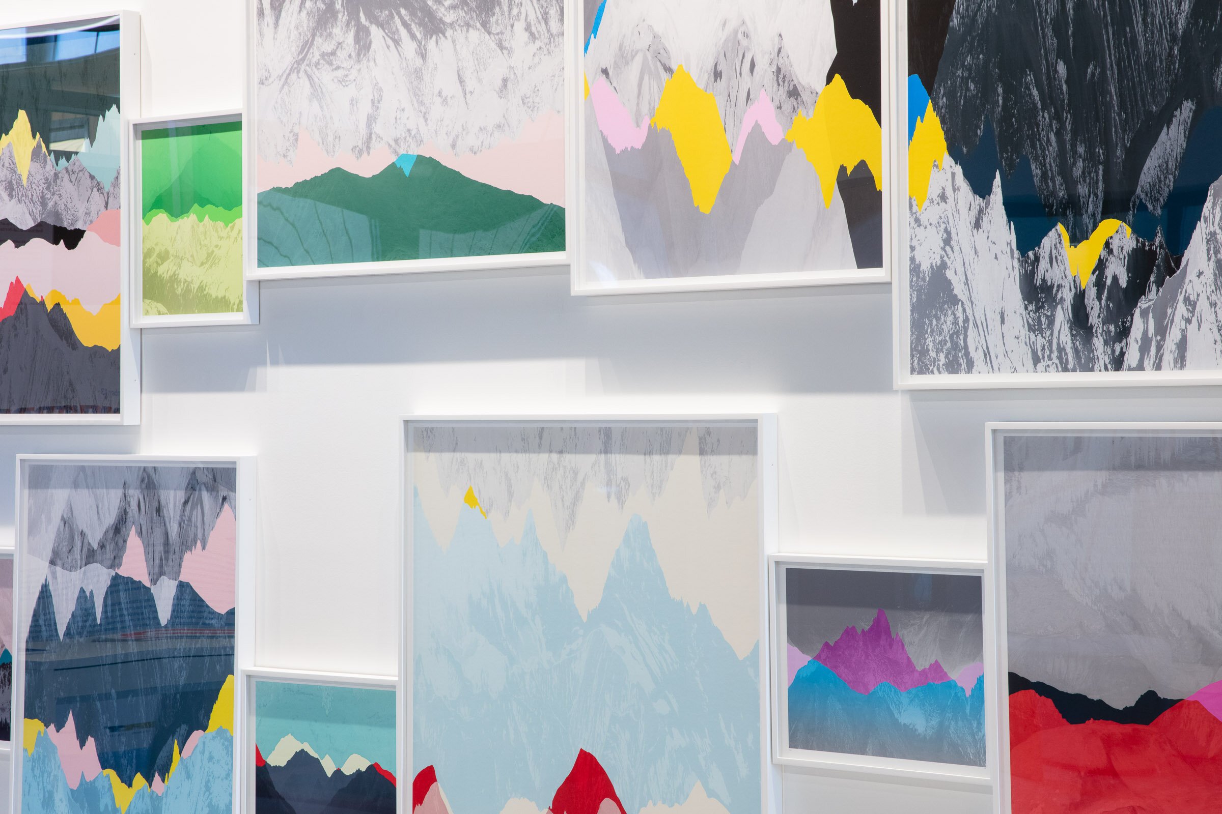
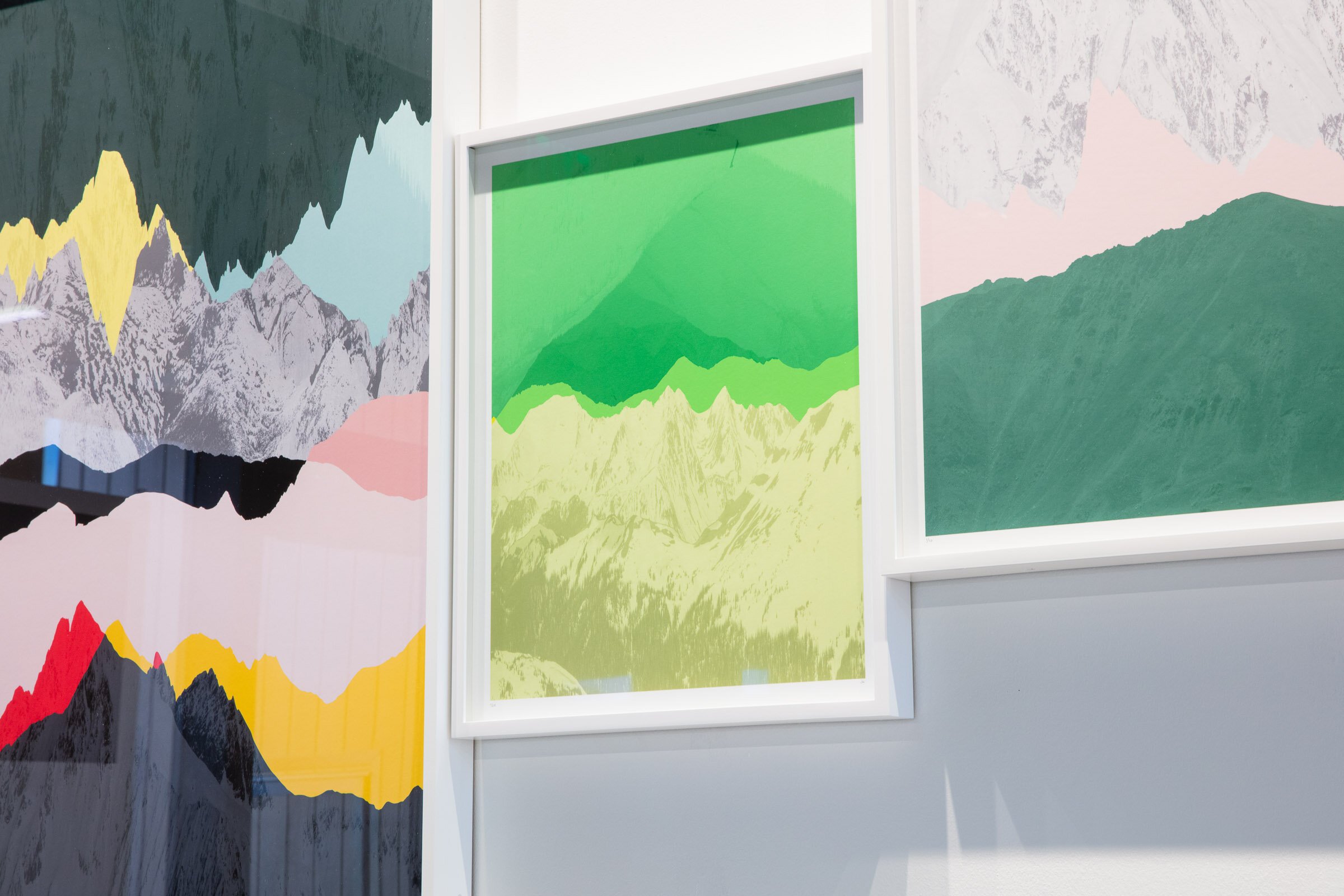
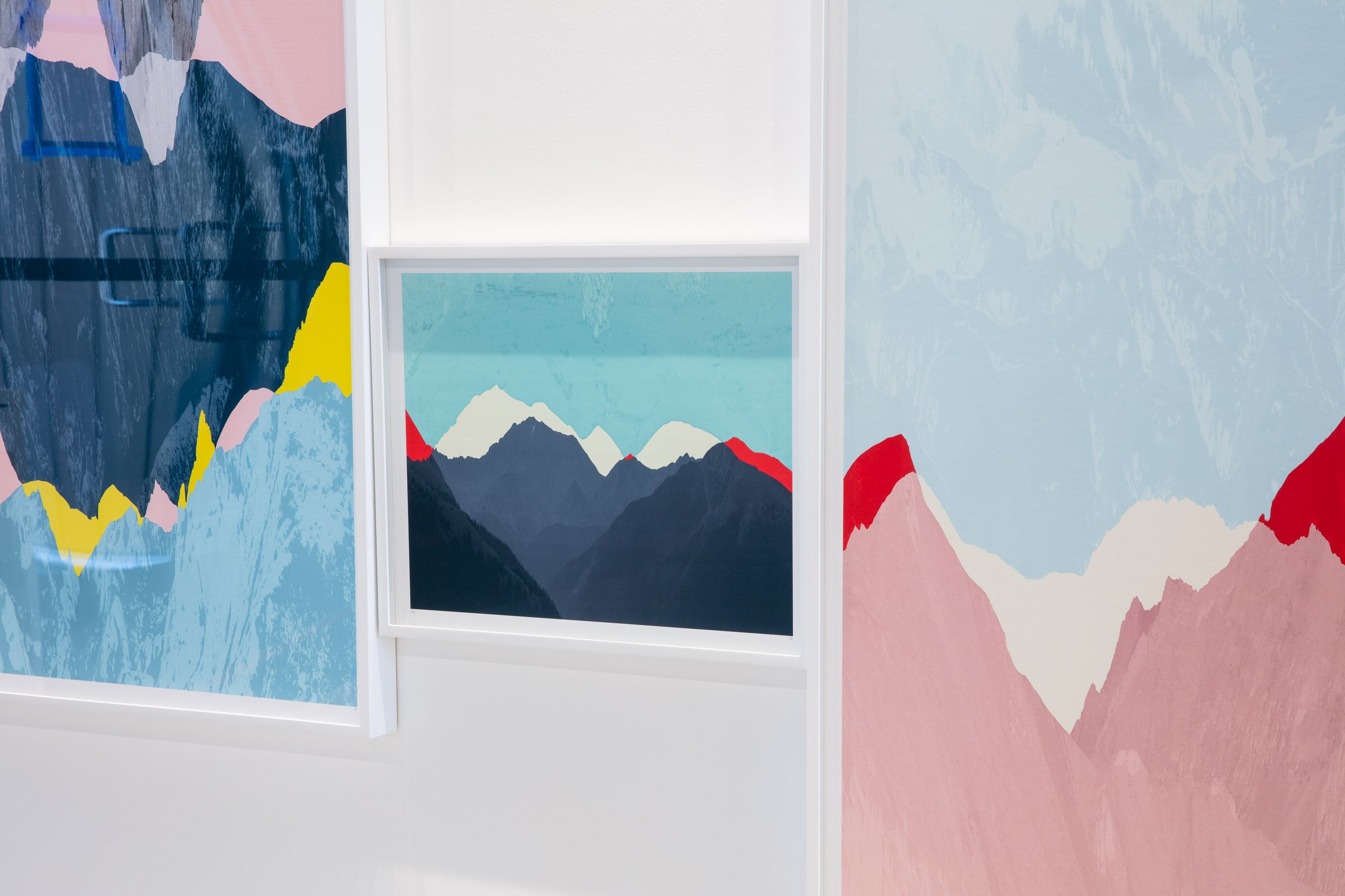
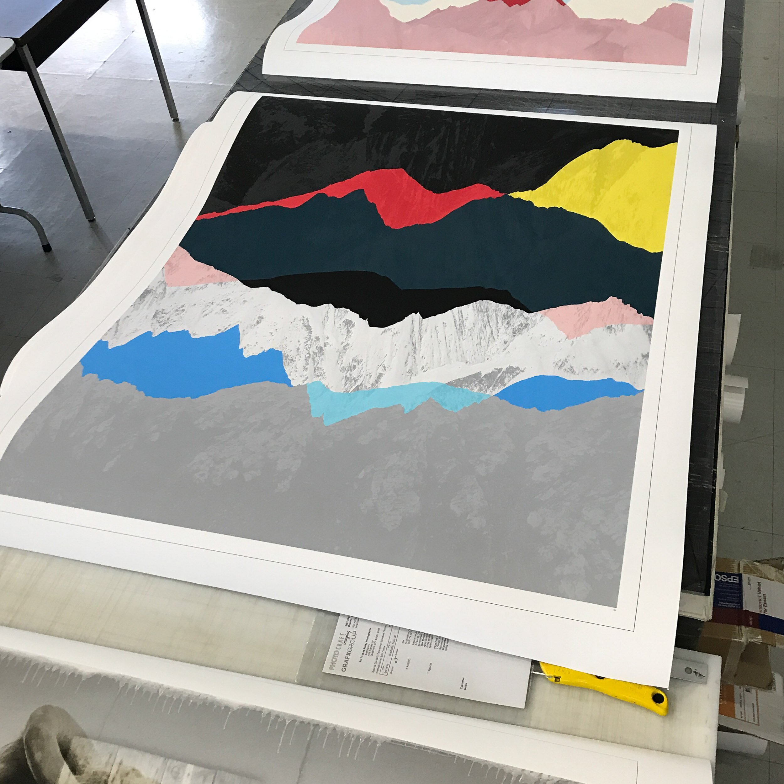
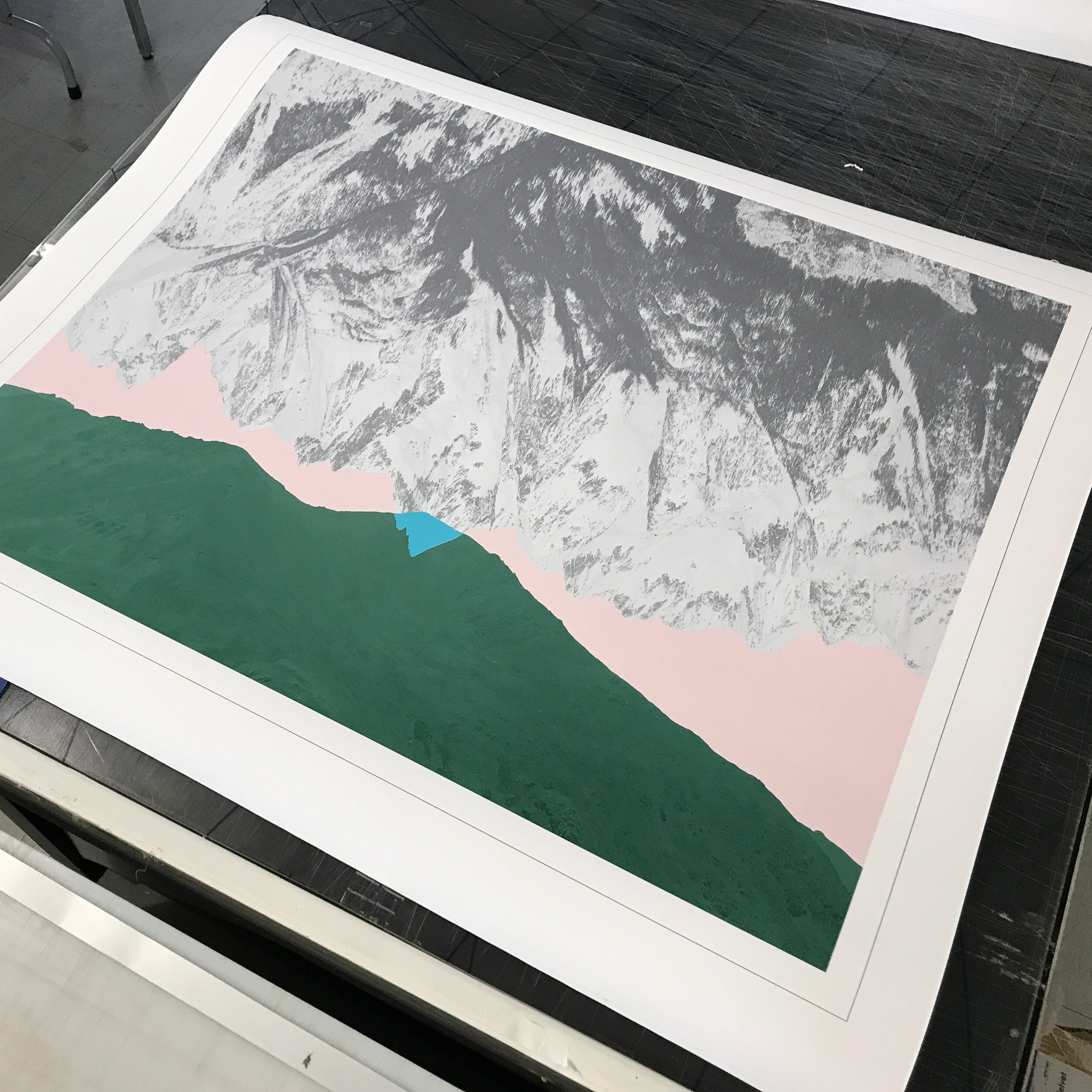
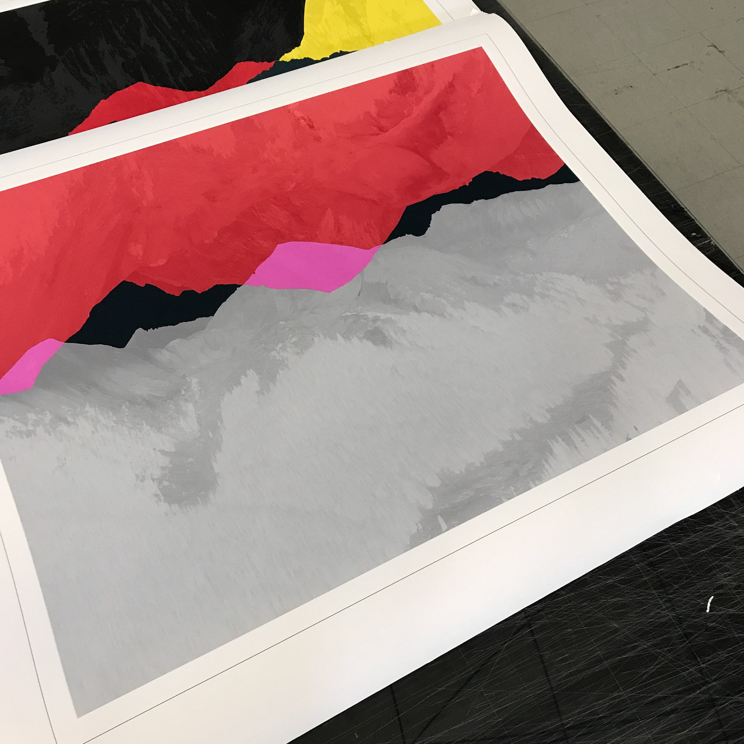
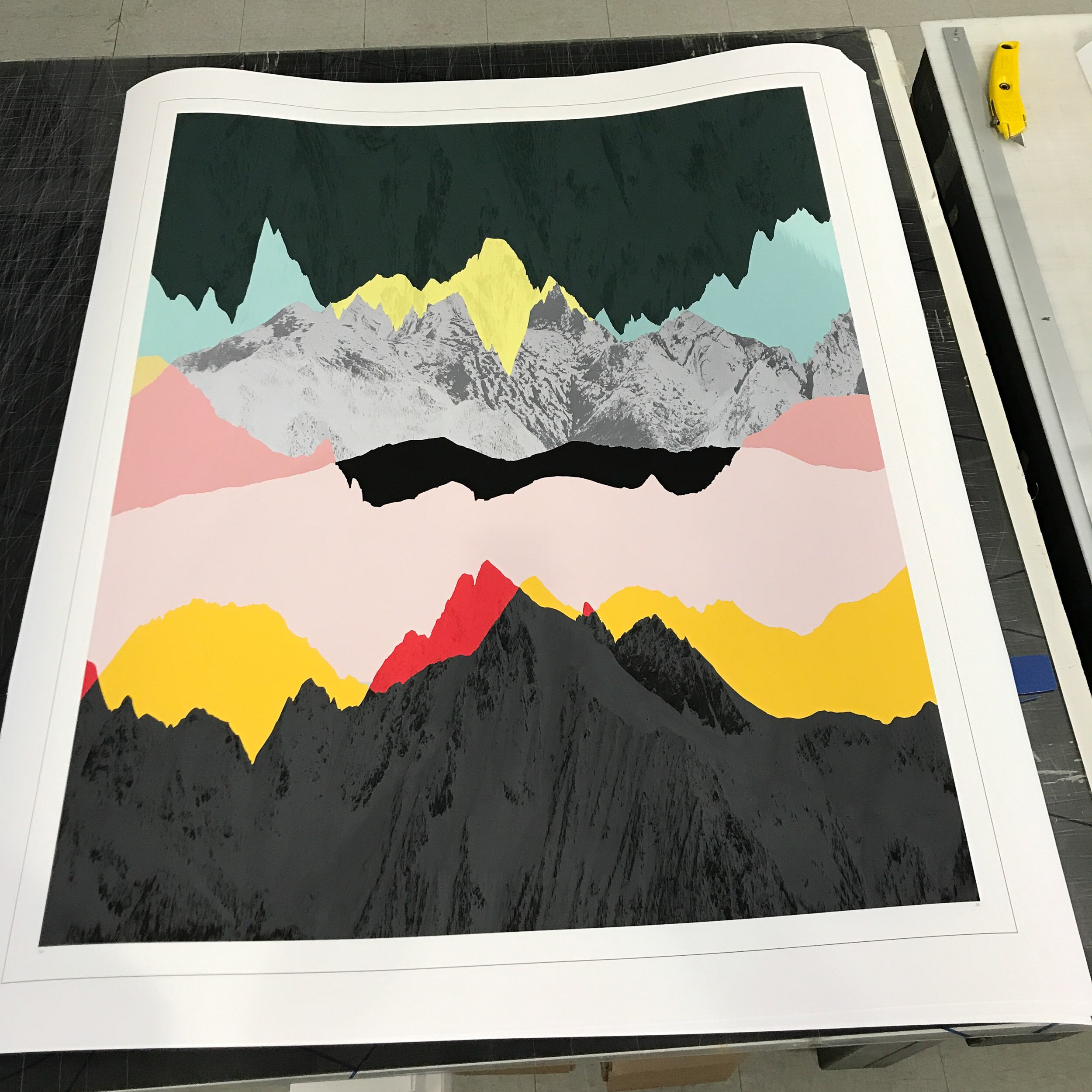
06 — Printing
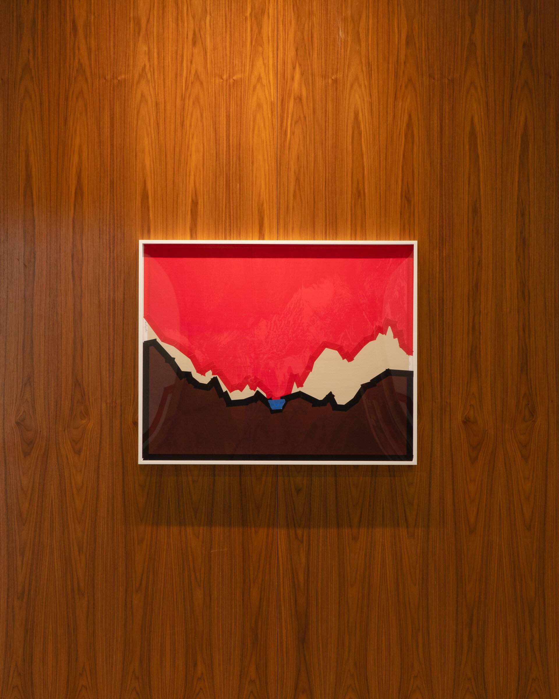
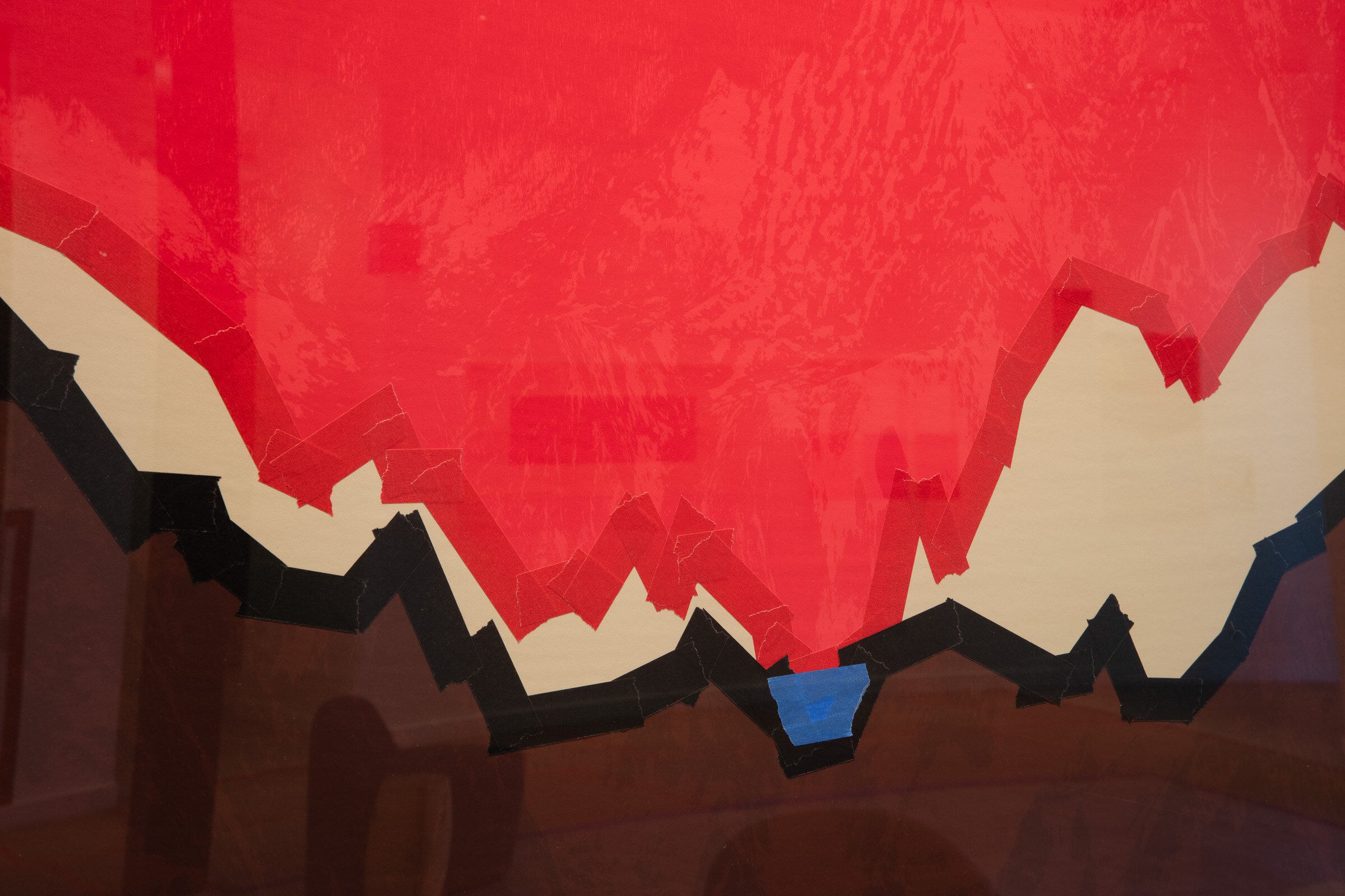
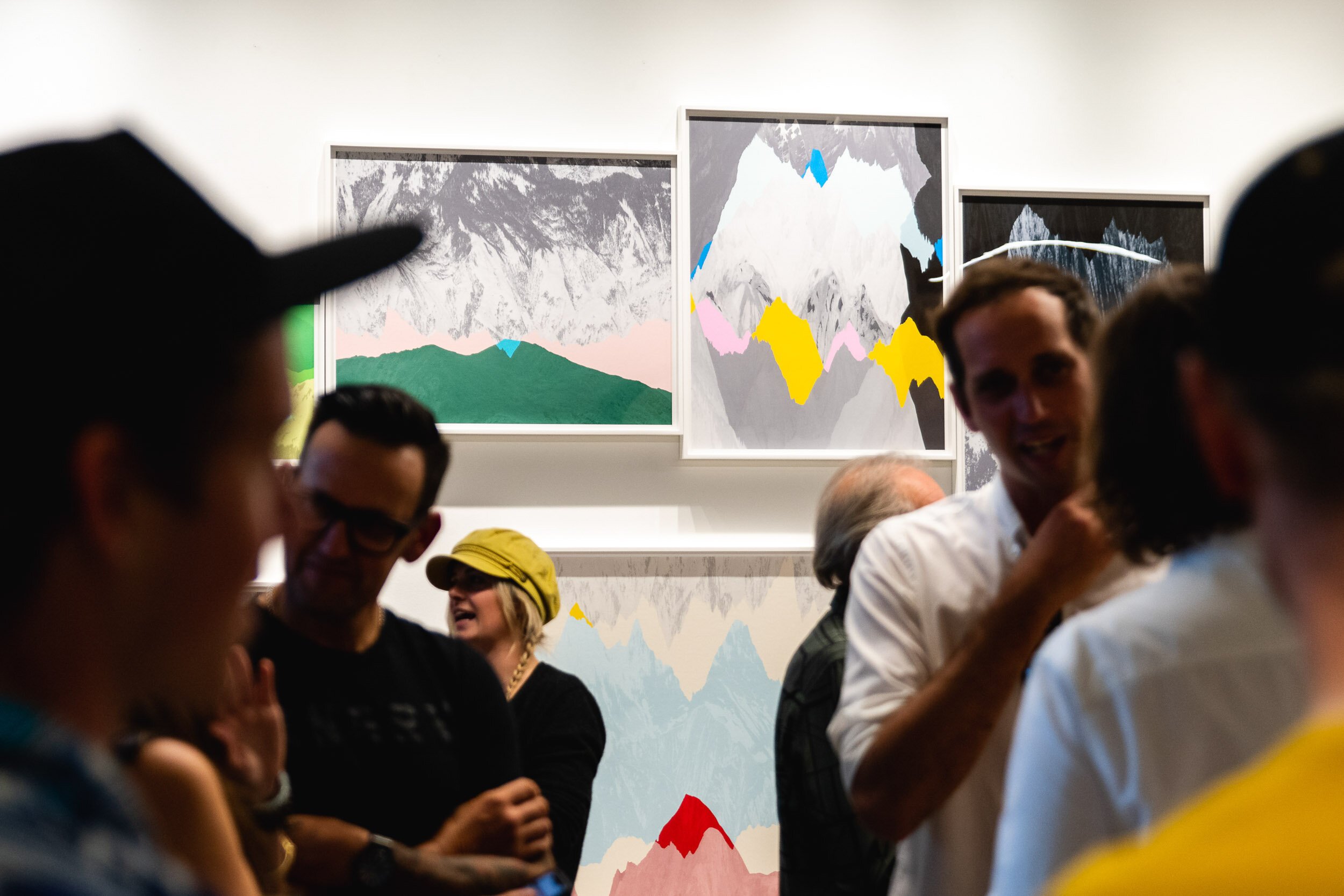
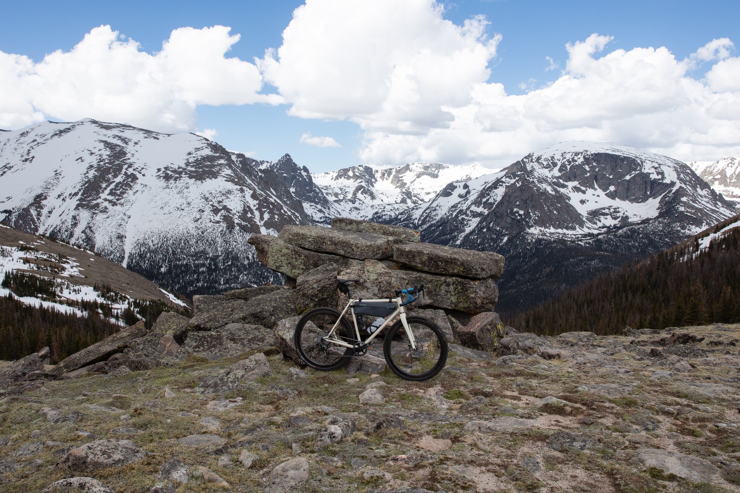
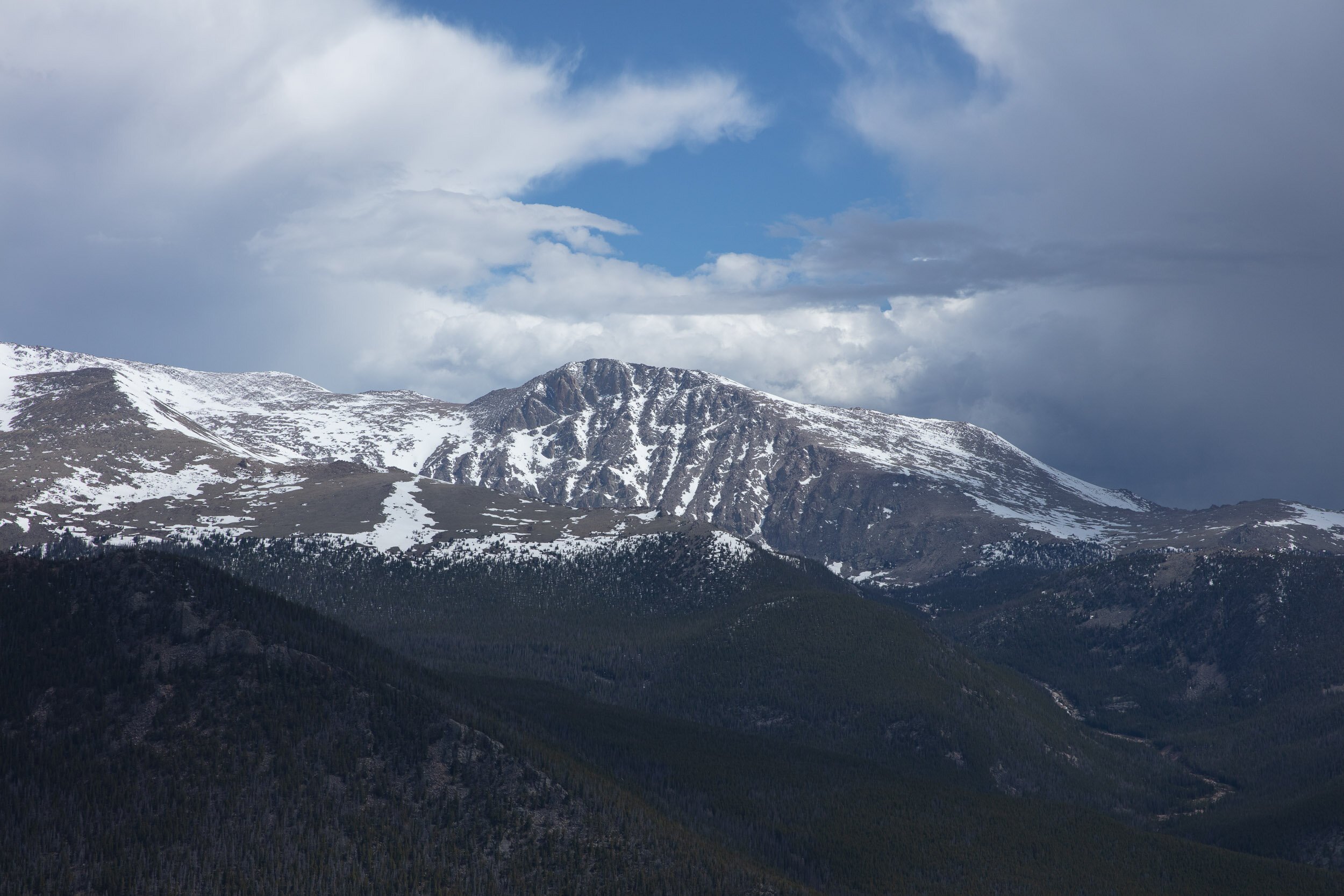
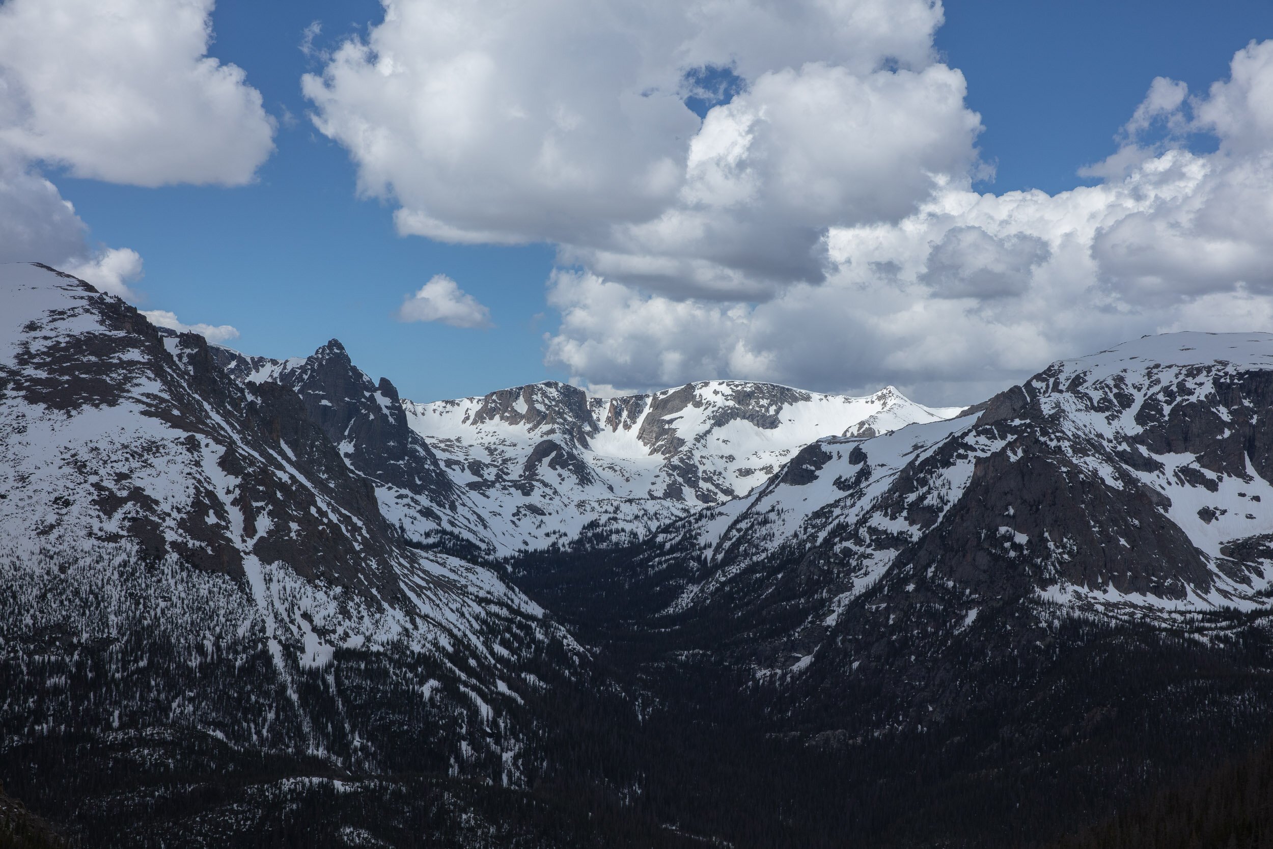
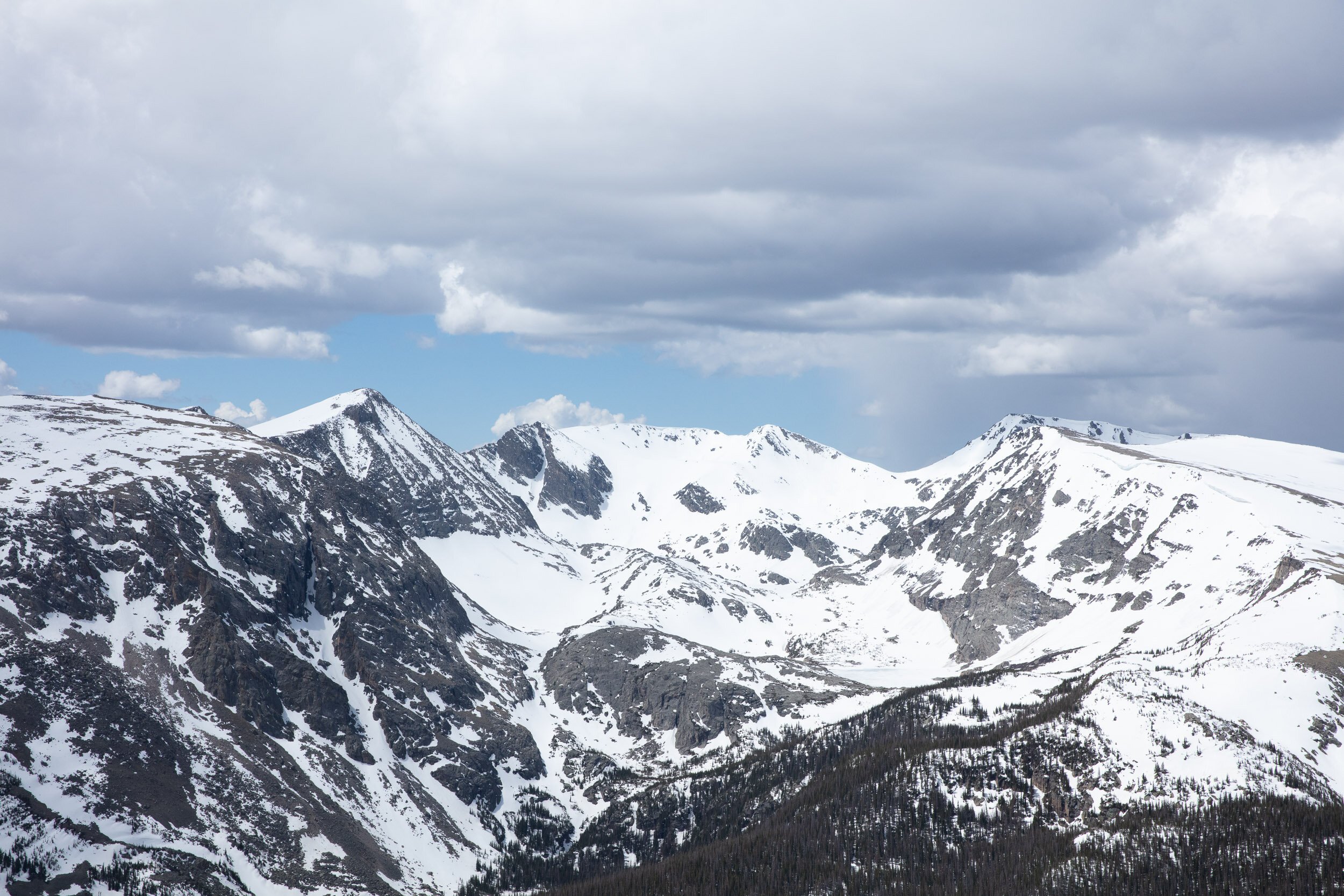
Having committed to making these works digitally, I set out to make more high resolution images of the Continental Divide, which would form the building blocks for these pieces. In late spring, there is a road in Rocky Mountain National Park called that offers sweeping views of the Divide, and up to a certain day in Spring, it’s closed to cars. So I took my bike and rode past the gate to the top of Trail Ridge Road, photographing all along the ridge. Using these images, I was able to trace the contours of where the mountains met the sky to make detailed lines.
In this process of photographing the Divide on Trail Ridge Road, I realized that I had been photographing the Divide for years. It crosses through passes all over Colorado, where I have been biking, skiing, hiking, and working since I have lived here. In a way, I felt like I had taken my relationship with my home mountains to a newer, deeper place.
07 — Opening
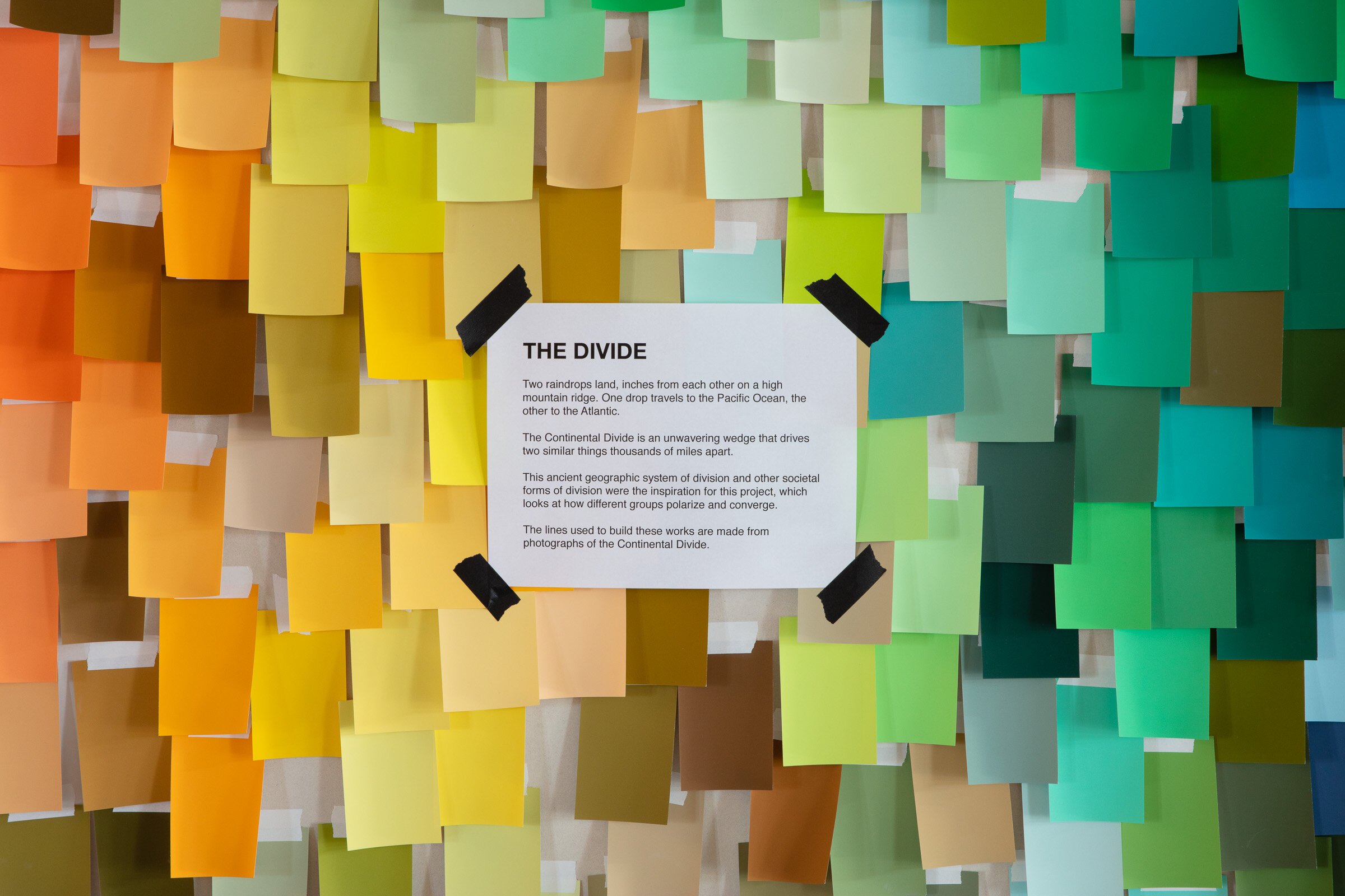
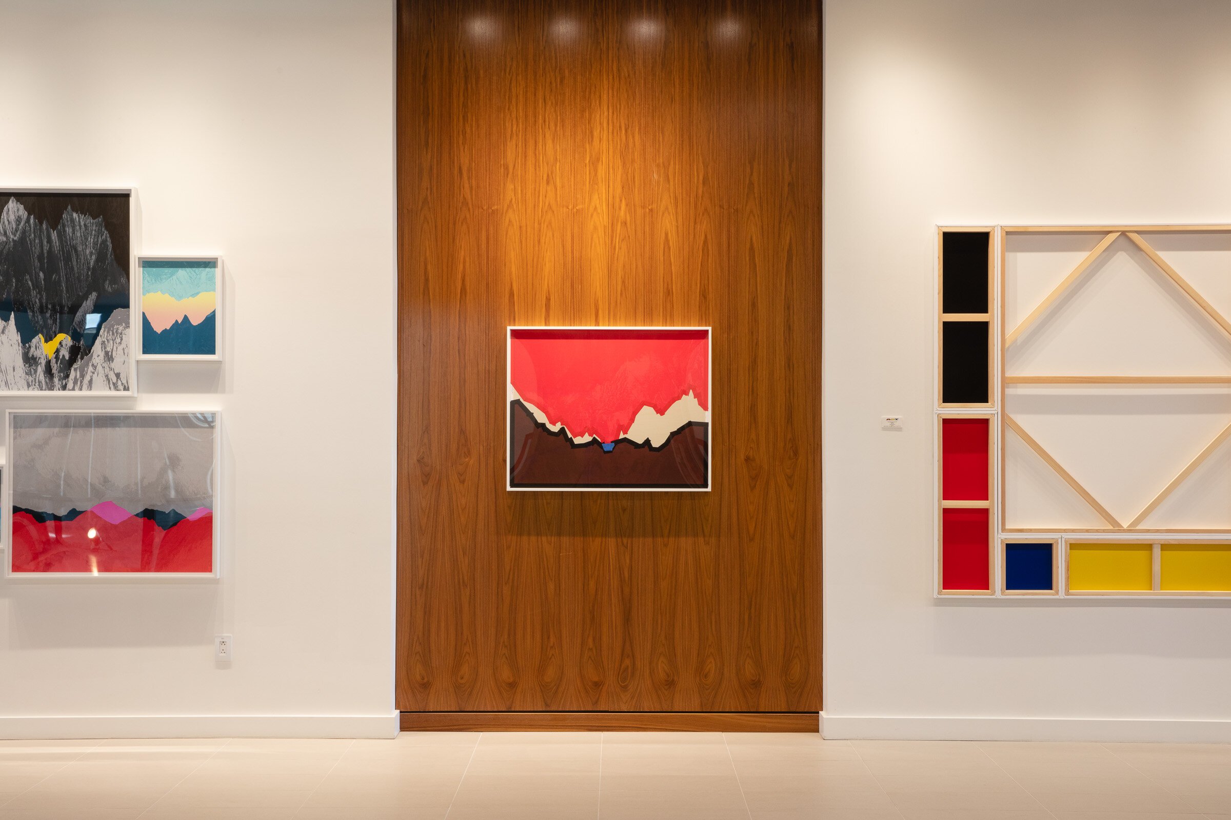
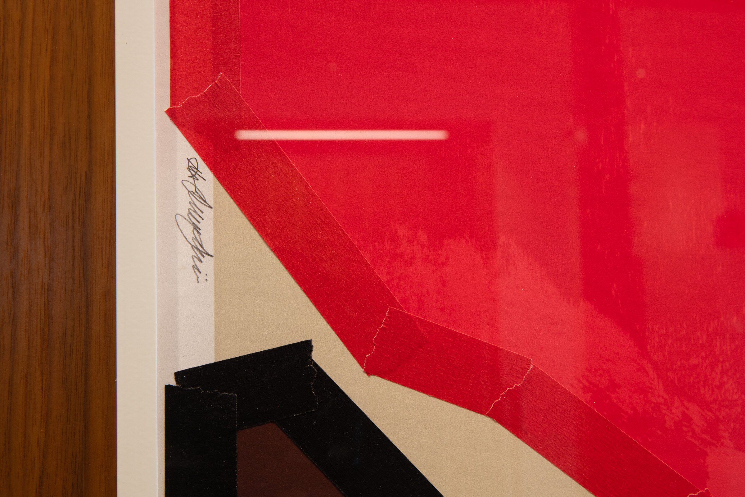
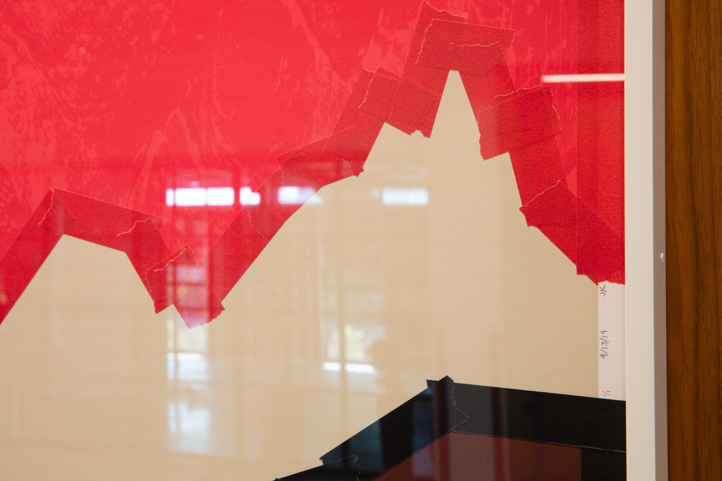
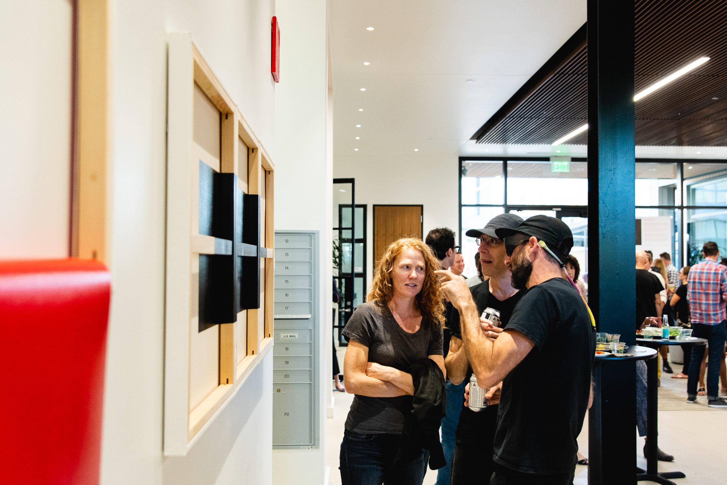
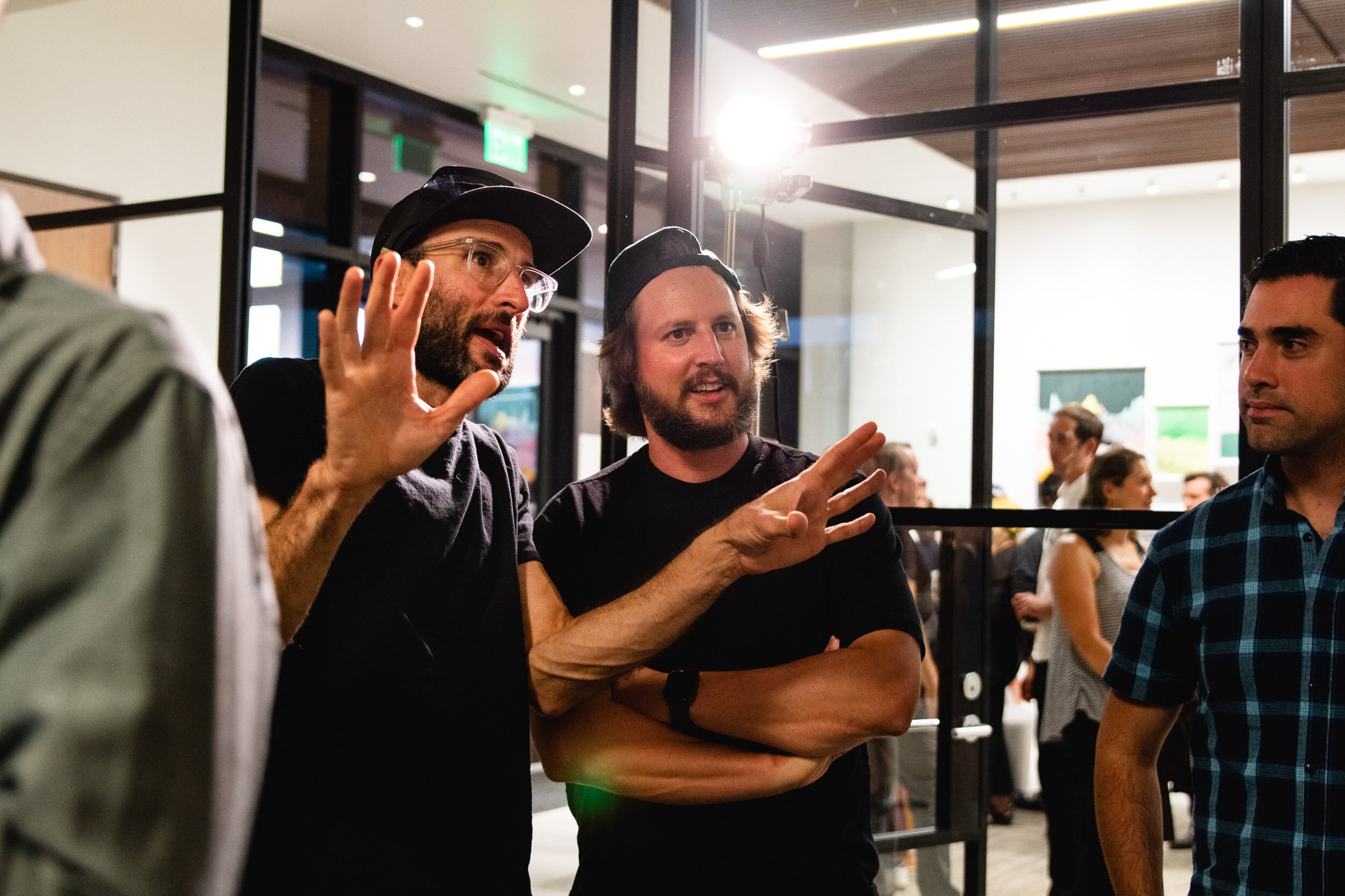
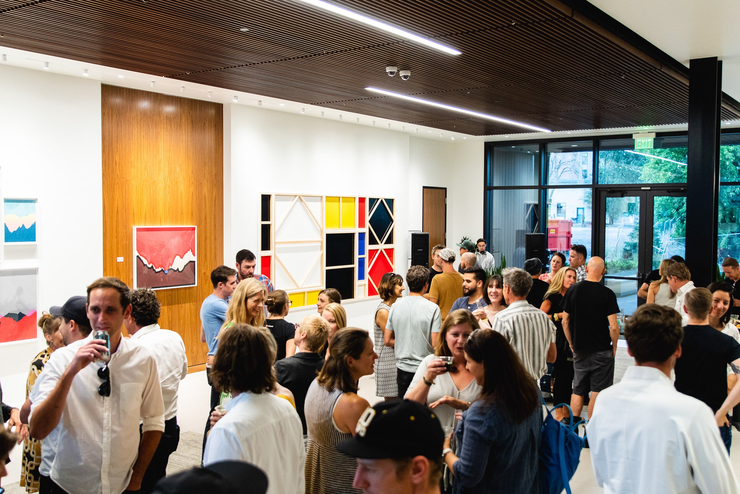
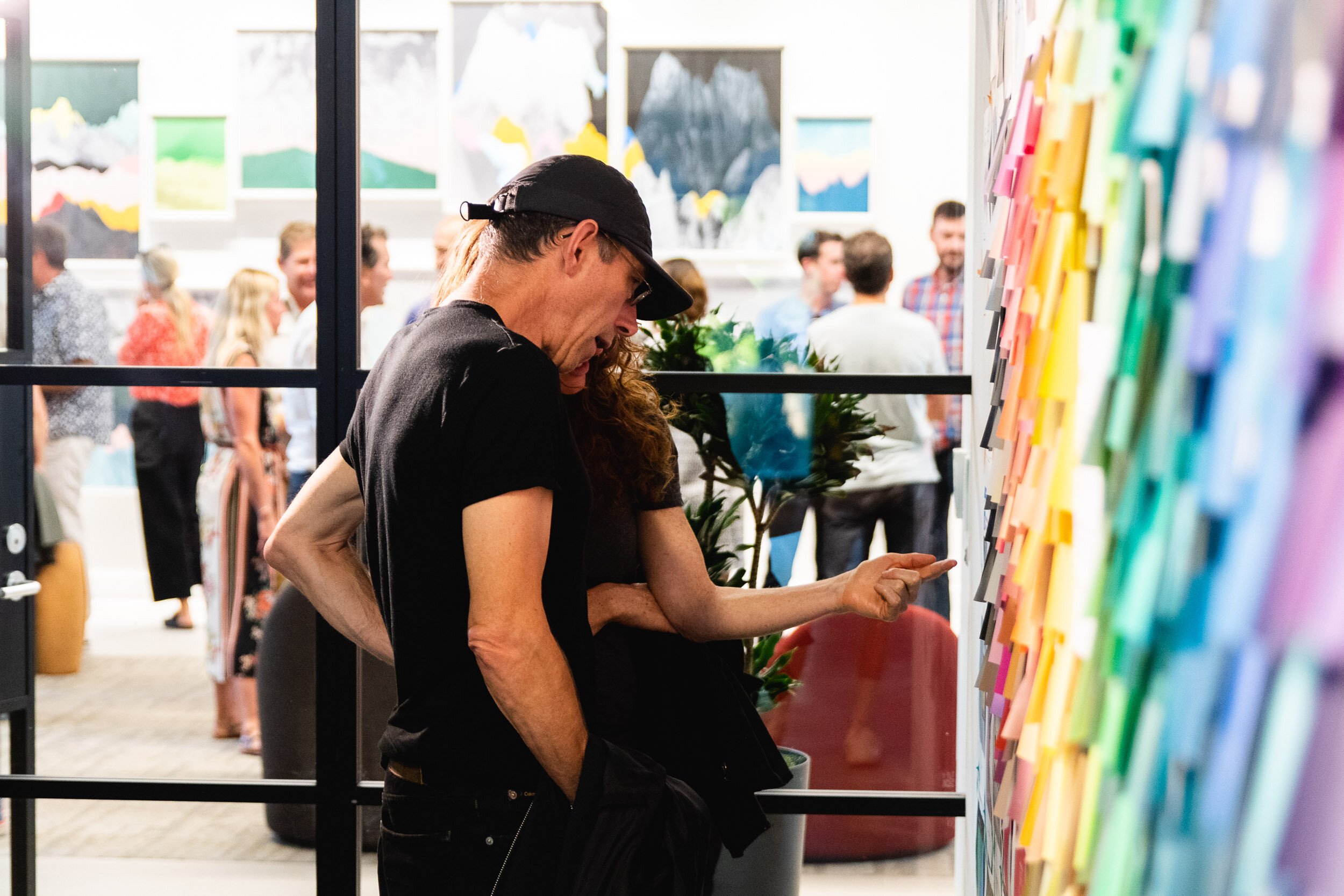
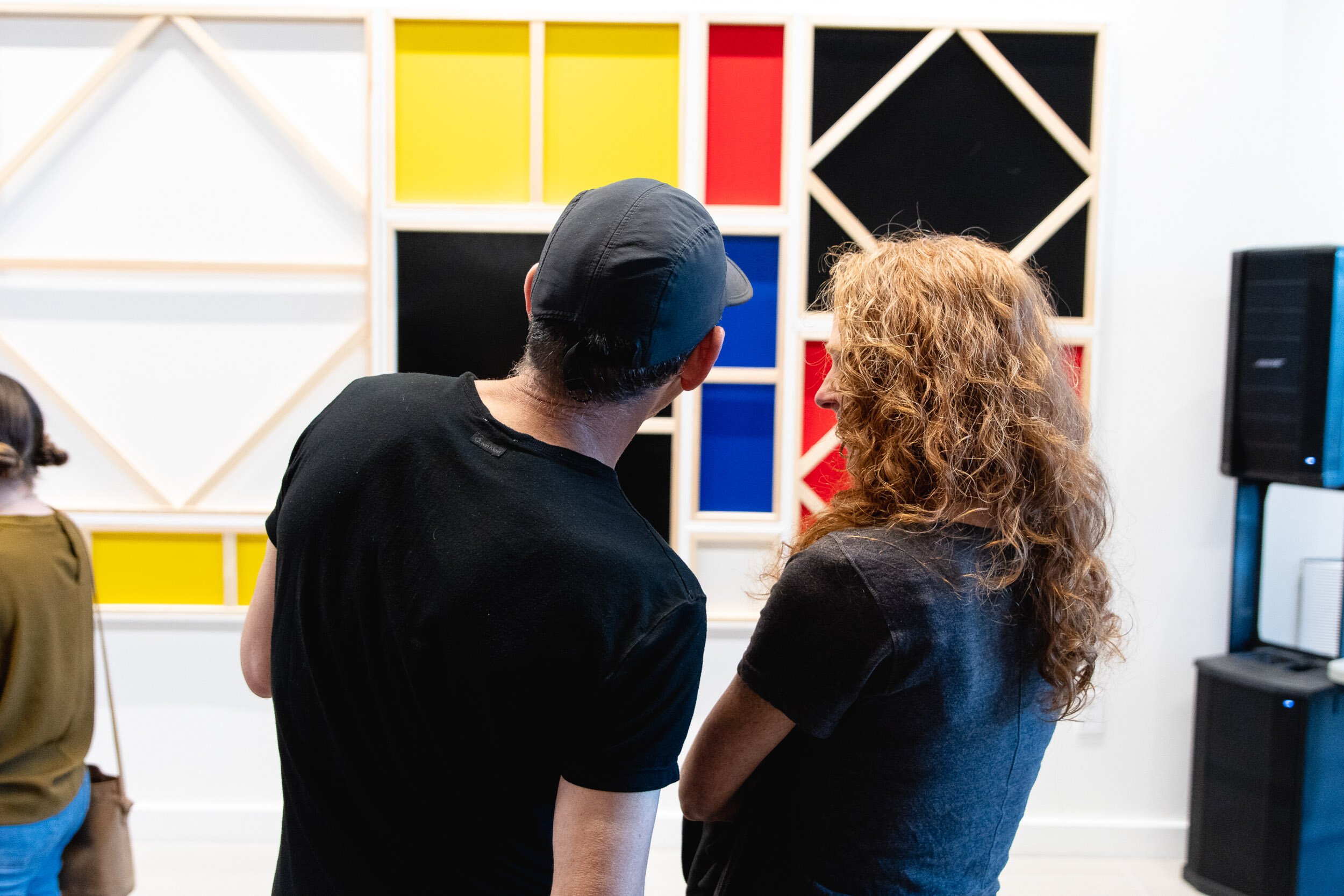
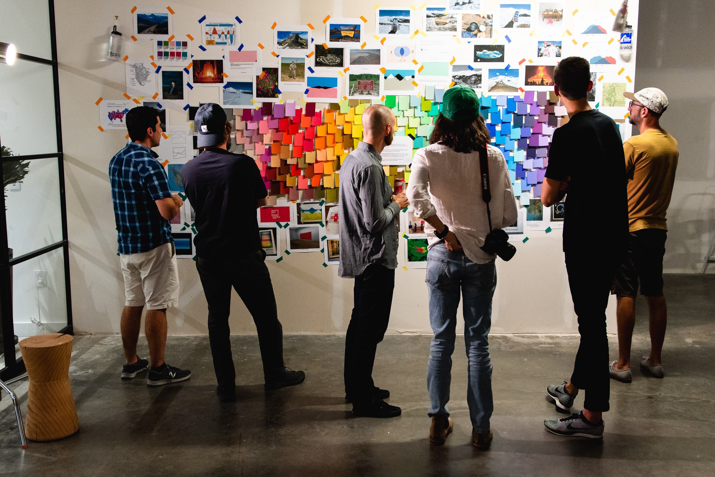
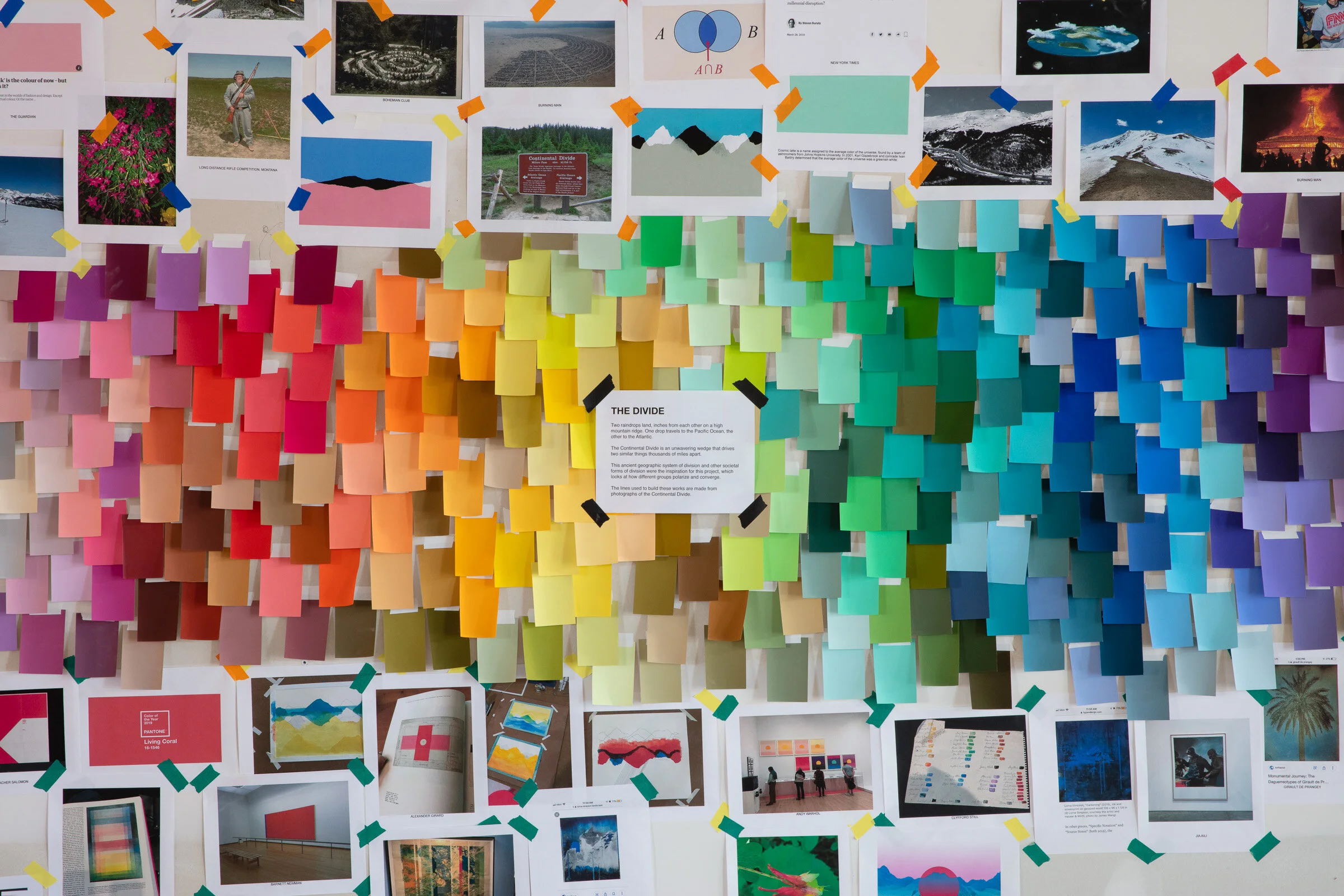
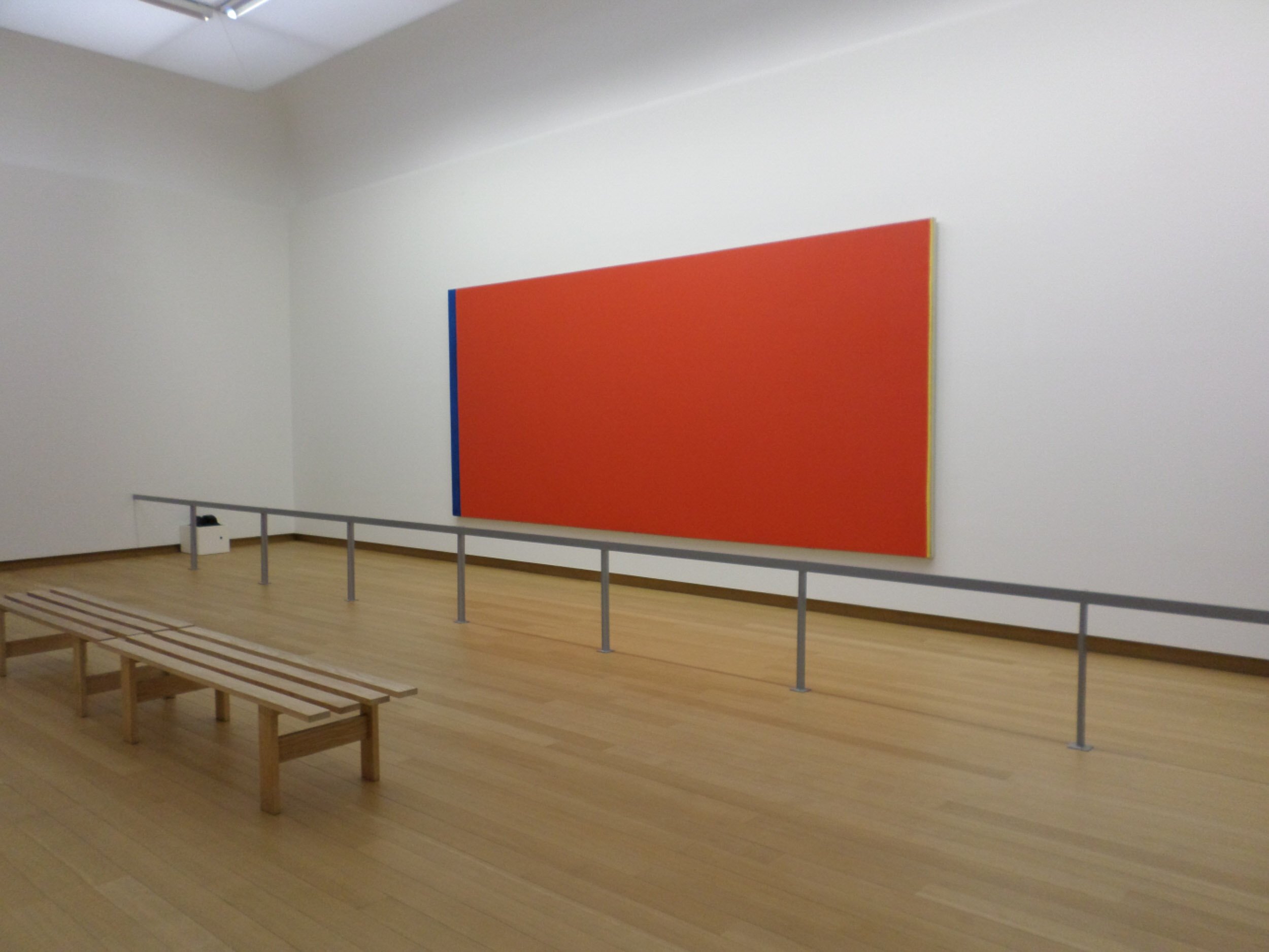
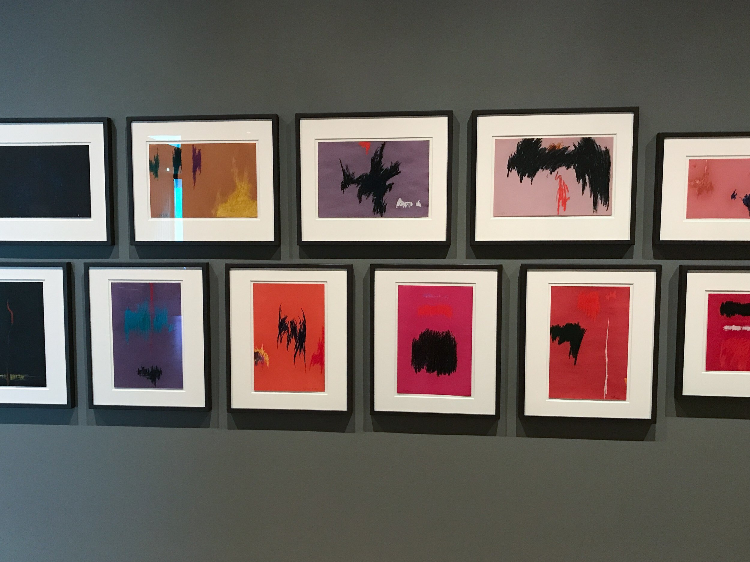
The first step of installation was building what I eventually called my “process-statement.” I started by putting up all 314 unique Color Aid cards. Then I surrounded the cards with all the other materials from the project journal I’d been keeping, using color coded tape to differentiate other people’s work from my own. I still had the two bottles of snowmelt, which I hung at opposite ends. To the show, I also added four water-based monoprints that I had made Anderson Ranch. The opening exhibition, titled Convergence was a joint show with my friends Berger & Fohr. We also collaborated on one piece, where they took one of my prints, and traced the mountain ridge lines with masking tape. Only at the very end of the installation after all the pieces were up did I write my statement, which I still consider a small, optional piece of the larger picture:
“Two raindrops land, inches from each other on a high mountain ridge. One drop travels to the Pacific Ocean, the other to the Atlantic. The Continental Divide is an unwavering wedge that drives two similar things thousands of miles apart. This ancient geographic system of division and other societal forms of division were the inspiration for this project, which looks at how different groups polarize and converge.”