Gas Station
A few months ago, I shot a project with Venables, Bell & Partners, for their client, Phillips 66. The P66 brand family, which includes 76 and Conoco, was updating the designs of their service stations, and wanted to update their imagery.
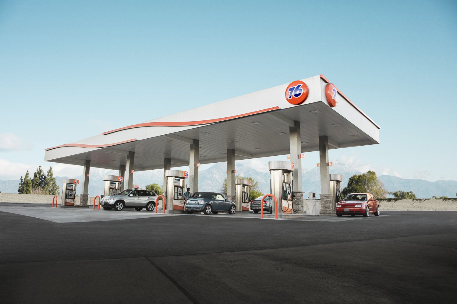
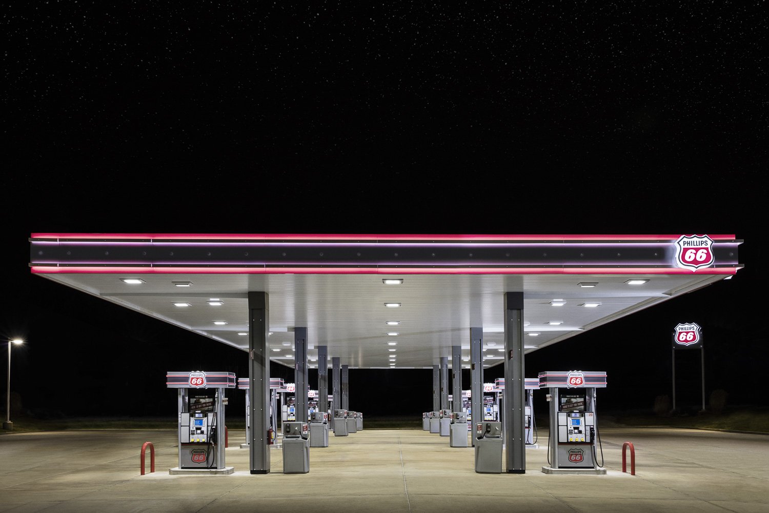
After discussing the project with the AD, the first image that came to mind was Ed Ruscha’s iconic Standard station. It's one of my all time favorite images, and if I had a spare £82,850 I’d get one. I wanted to bring that clean, graphic, sensibility to my own images, and thought a lot about composition and color. And I thought a lot about Mr. Ruscha’s image:
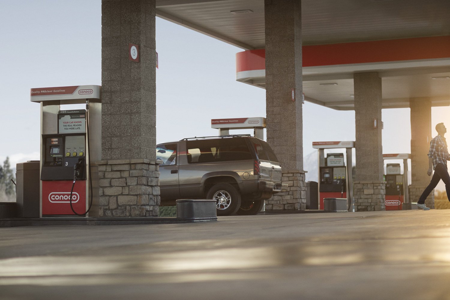
In preparation for the shoot, I did my own test at a Conoco station in Boulder, using my friend’s vintage 911. In the process of making this image, I learned that gas stations are busy places with lots of visual clutter. And they’re dirty. There would be a lot of variables to control on our production if we were going to make great work and be efficient. In addition, there would be a lot of post production on these images to make them clean, graphic, and iconic. Here is the finished test image:
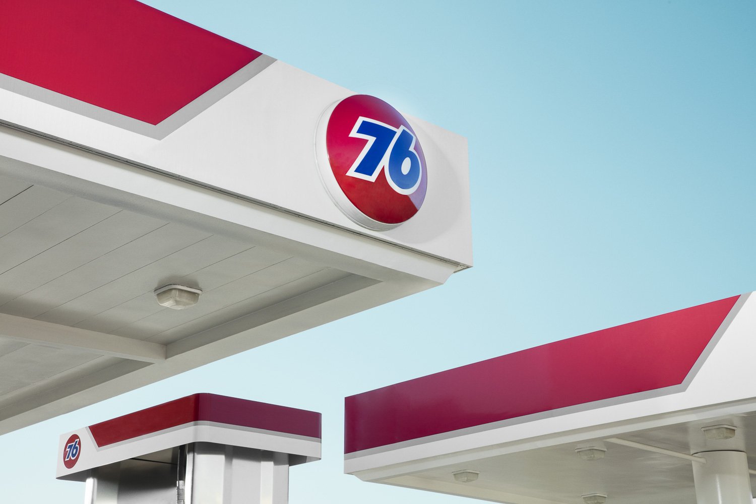
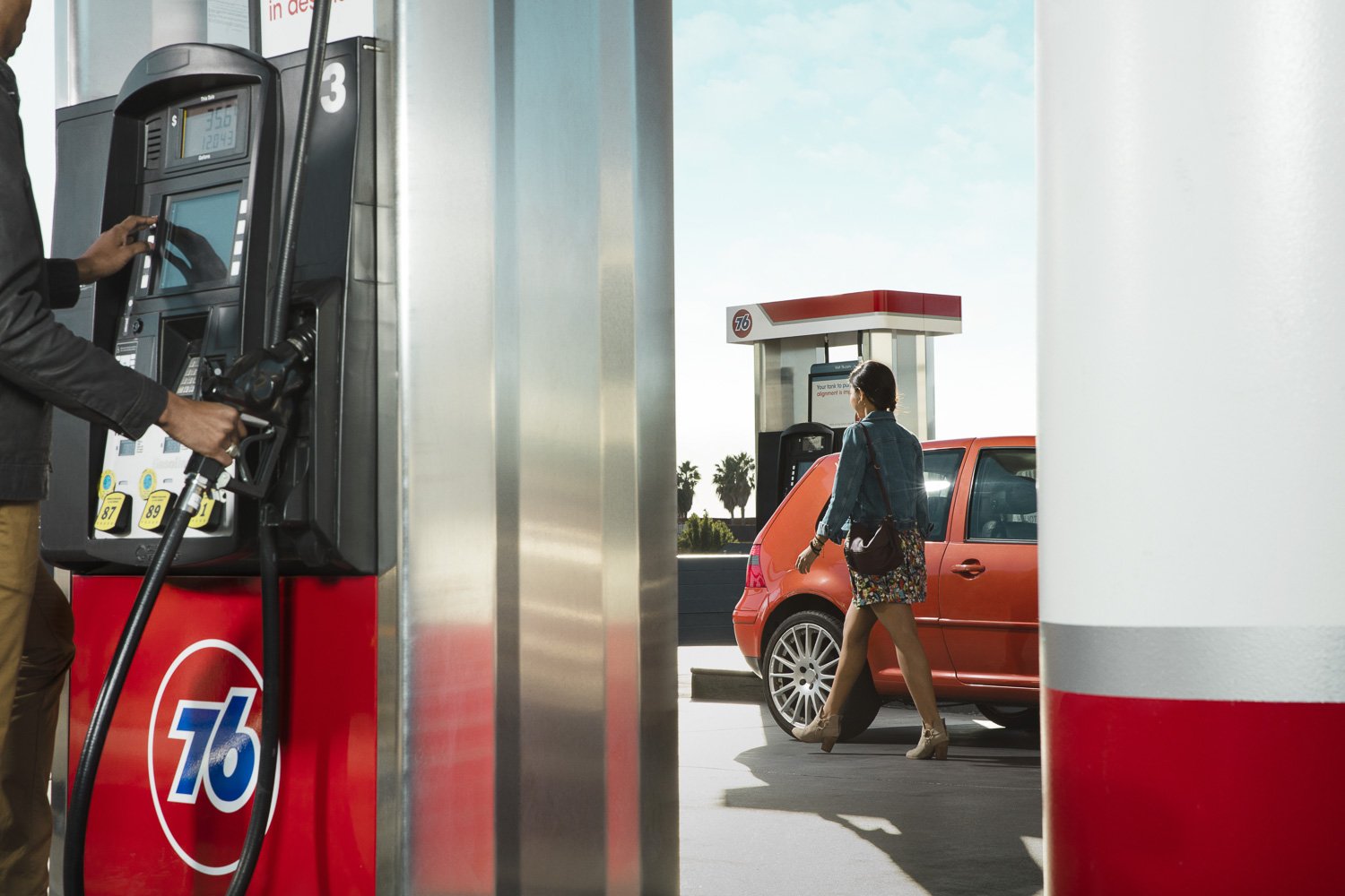
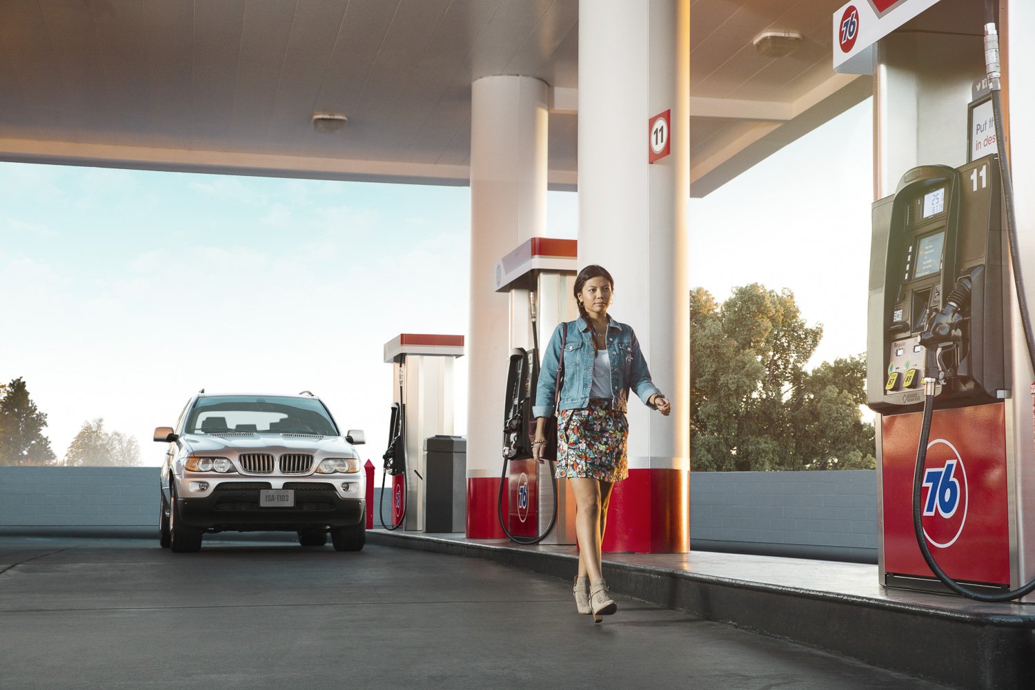
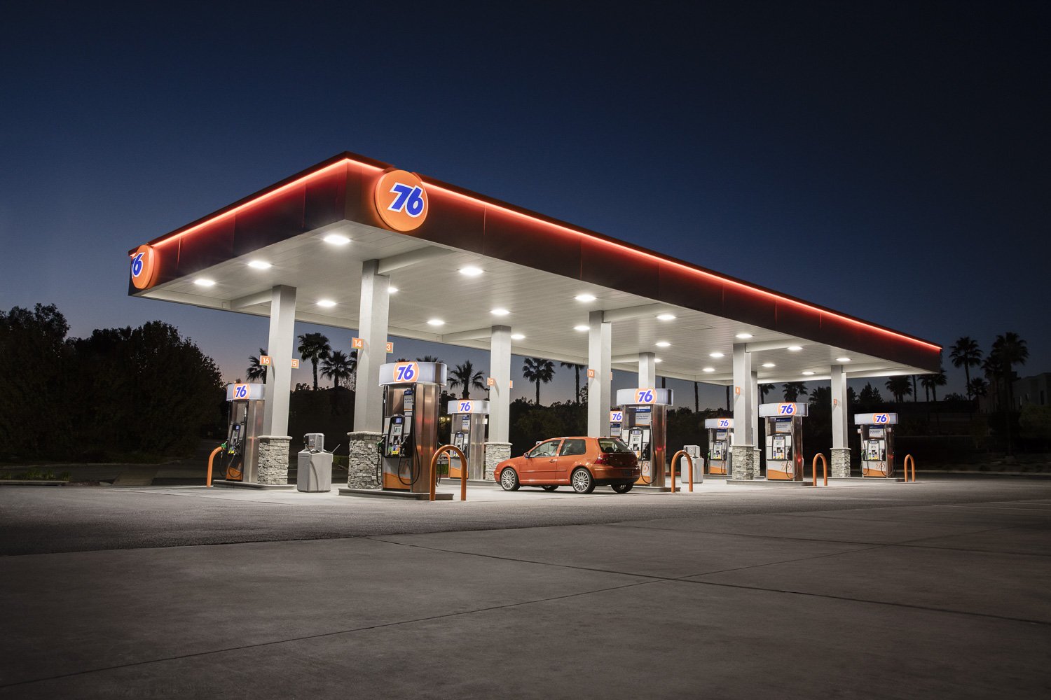
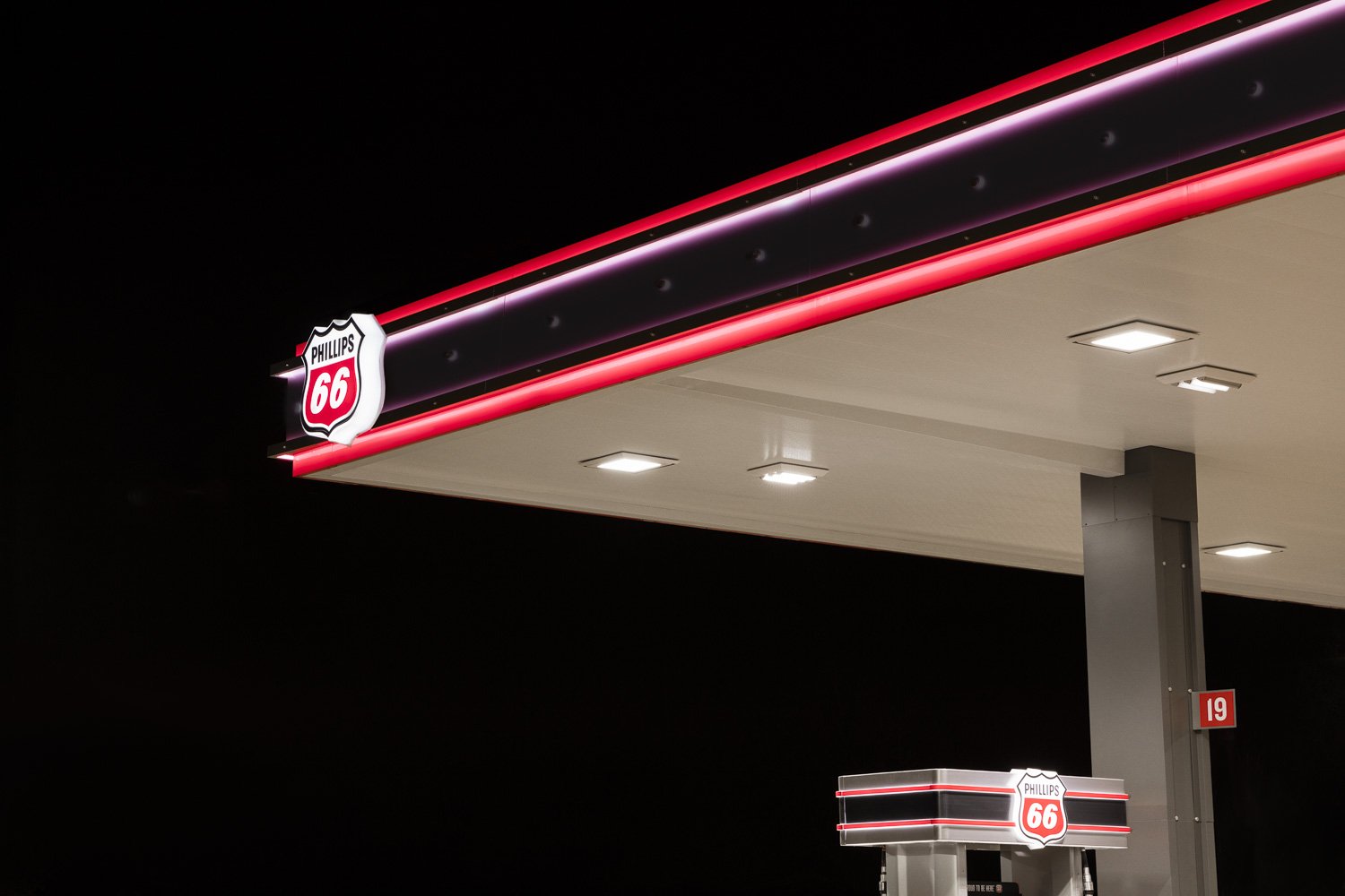
We selected four service stations that had interesting visual elements that would give us some variety with our compositions: Two in LA, one in St. Louis, and one in Denver. On each shoot day we’d close down the pumps, bring in a range of prop cars and talent that were brand appropriate, and arrange them into compositions. To visually differentiate the brands, we used constant lighting for Phillips 66 and Conoco, and strobe lighting for 76. Each has its unique advantages, and I’m equally comfortable with either, but the workflow for each is very different. Which makes the images different.
Of course there were obstacles to overcome: Including the client’s signage / branding in every shot in some way. Scheduling the shot list to work both with the sun and the shade. Controlling car traffic. Controlling foot traffic. Removing snow (we were shooting in December) to make it look like Summer. Removing power lines and cars and oil spots and Taco Bells to make everything look better.
But the main challenge with this shoot was coming up with many different and interesting ways to photograph gas stations, when really they’re all basically the same. In the end, we delivered a comprehensive library of images for all four brands. Some images are straightforward, and others have been worked on extensively, with many elements rearranged, removed and rebuilt. Huge thanks to the team at Danklife, who brought loads of expertise and vision to this project.
That said, here are a few of my favorite images. See more of the project here.